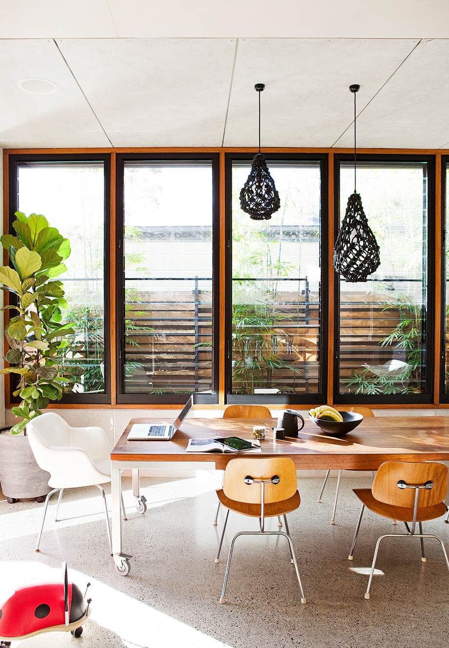
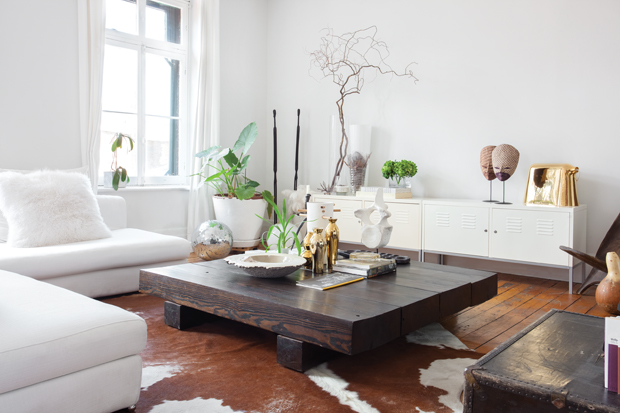
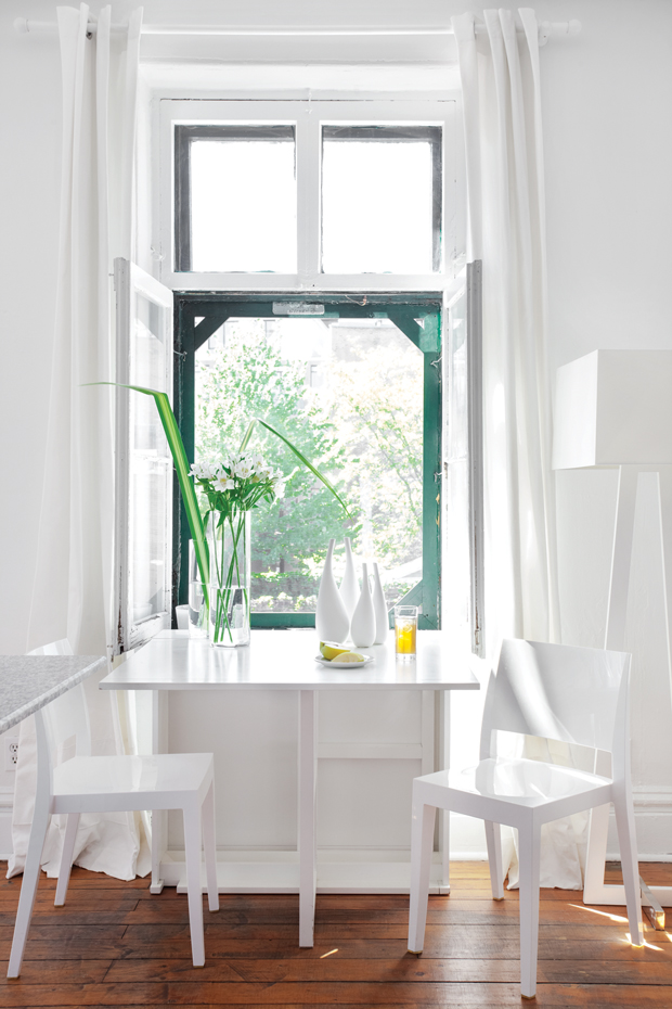
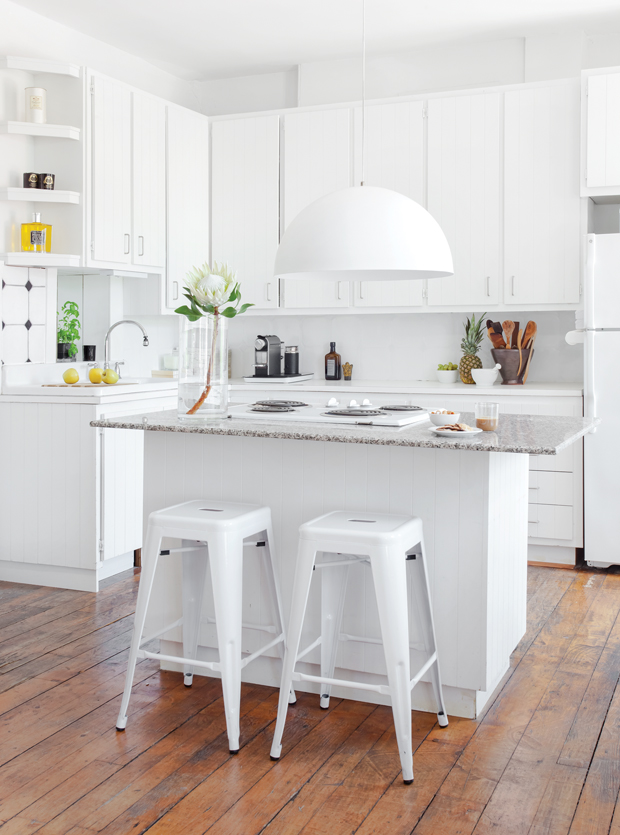
This kitchen is so calming and sleek.
You’ve got to check out the before photos.
Design by Erin Hiemstra. Styling by Cassandra LaValle. Photos by Kara Mercer. Via Style By Emily Henderson.
This kitchen is so calming and sleek.
You’ve got to check out the before photos.
Design by Erin Hiemstra. Styling by Cassandra LaValle. Photos by Kara Mercer. Via Style By Emily Henderson.
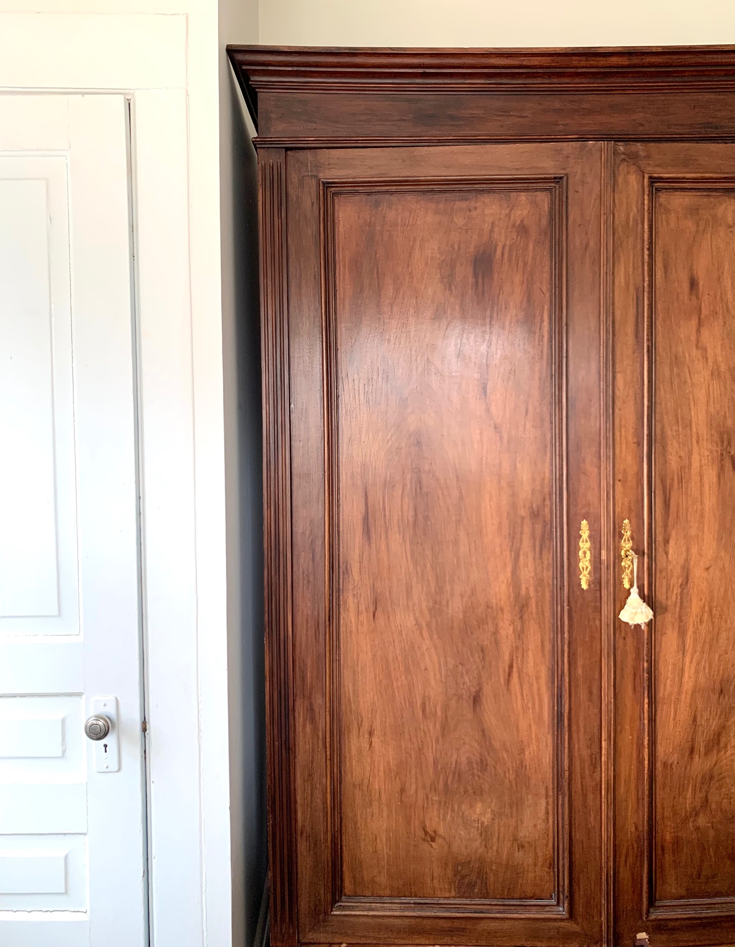
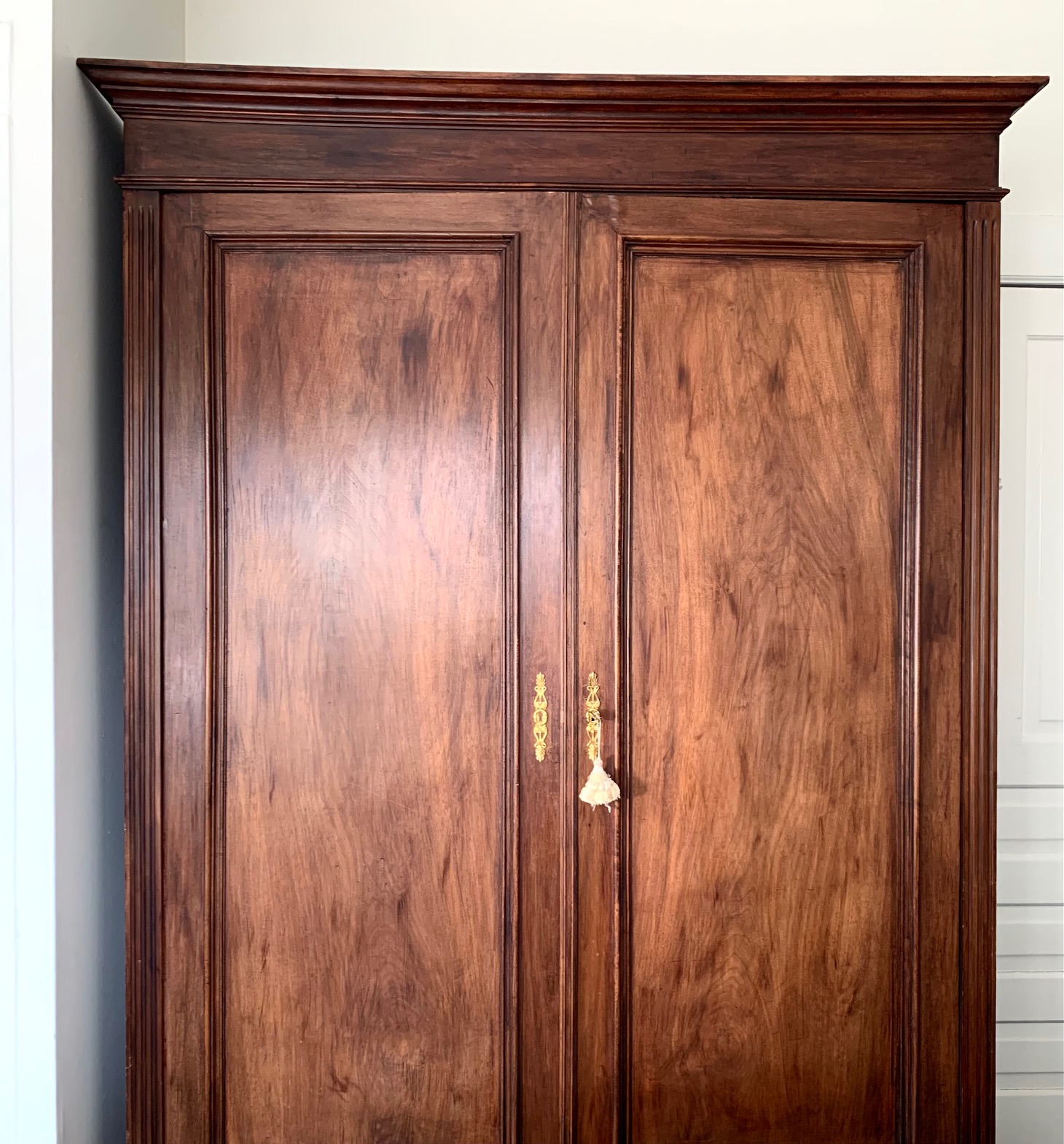
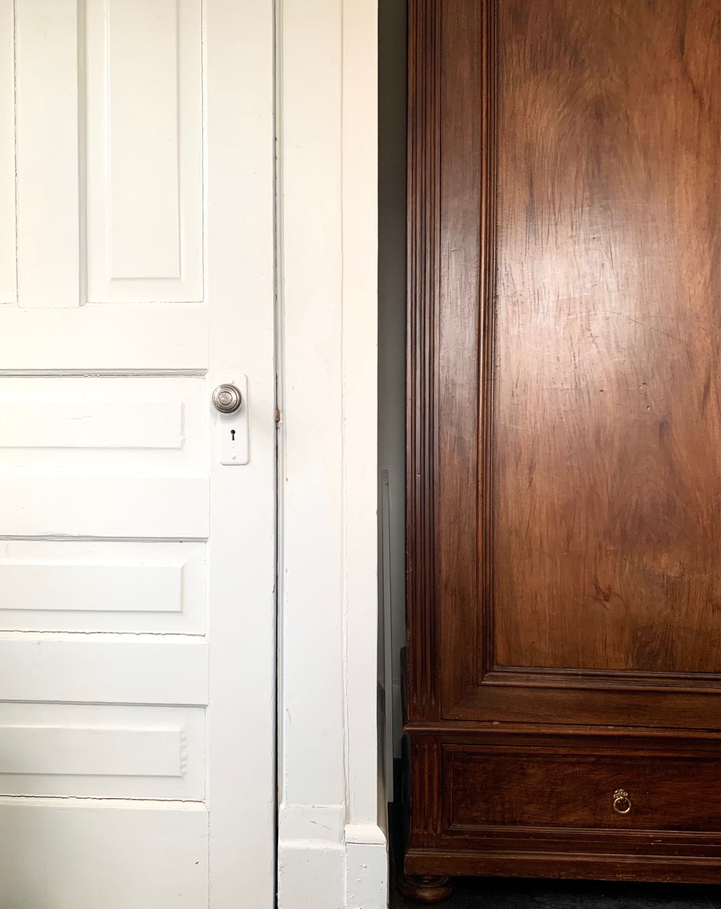
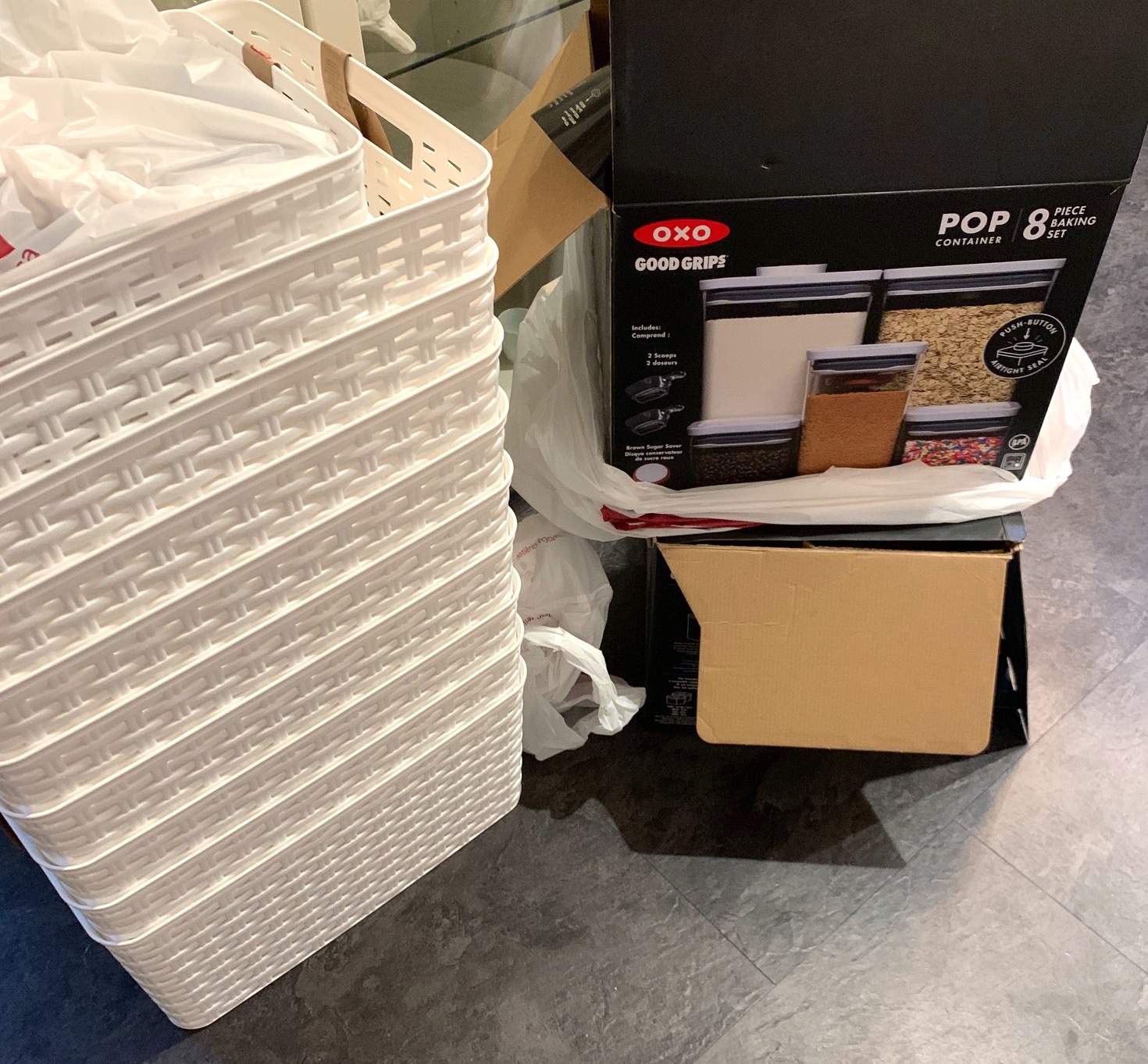
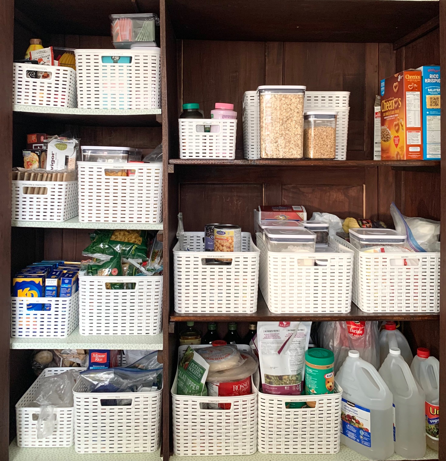
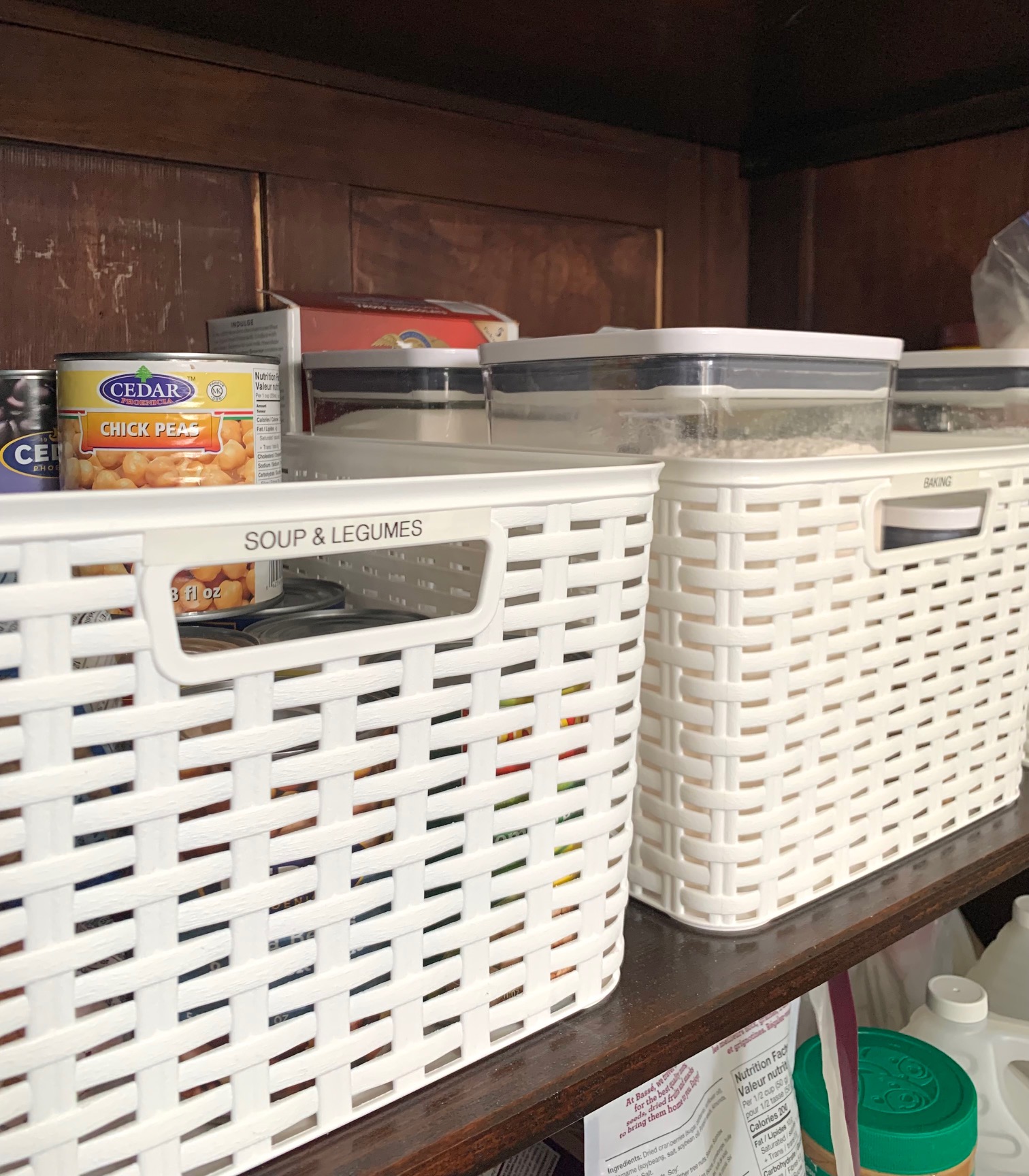
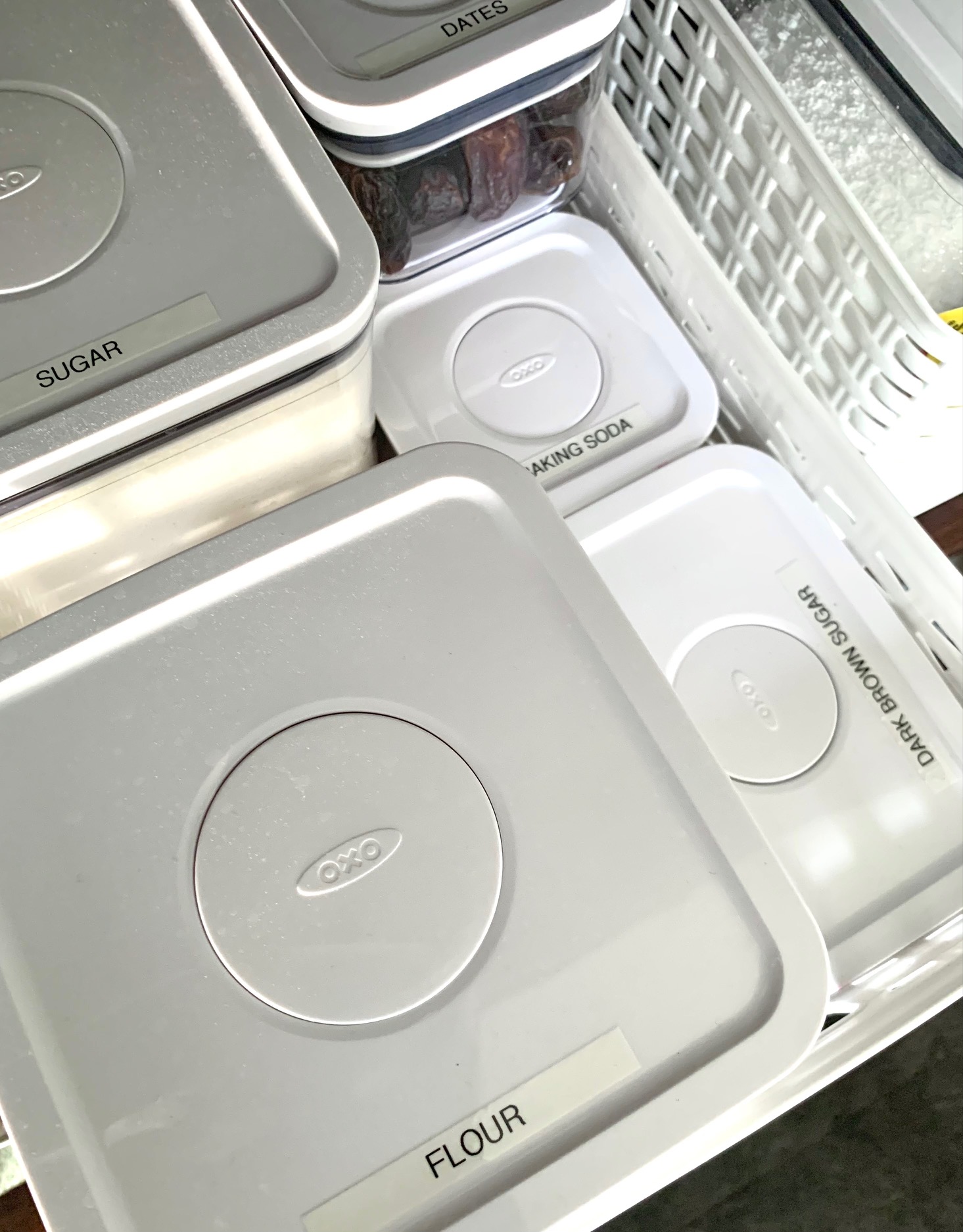
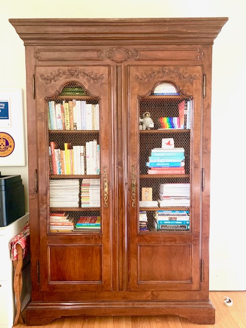
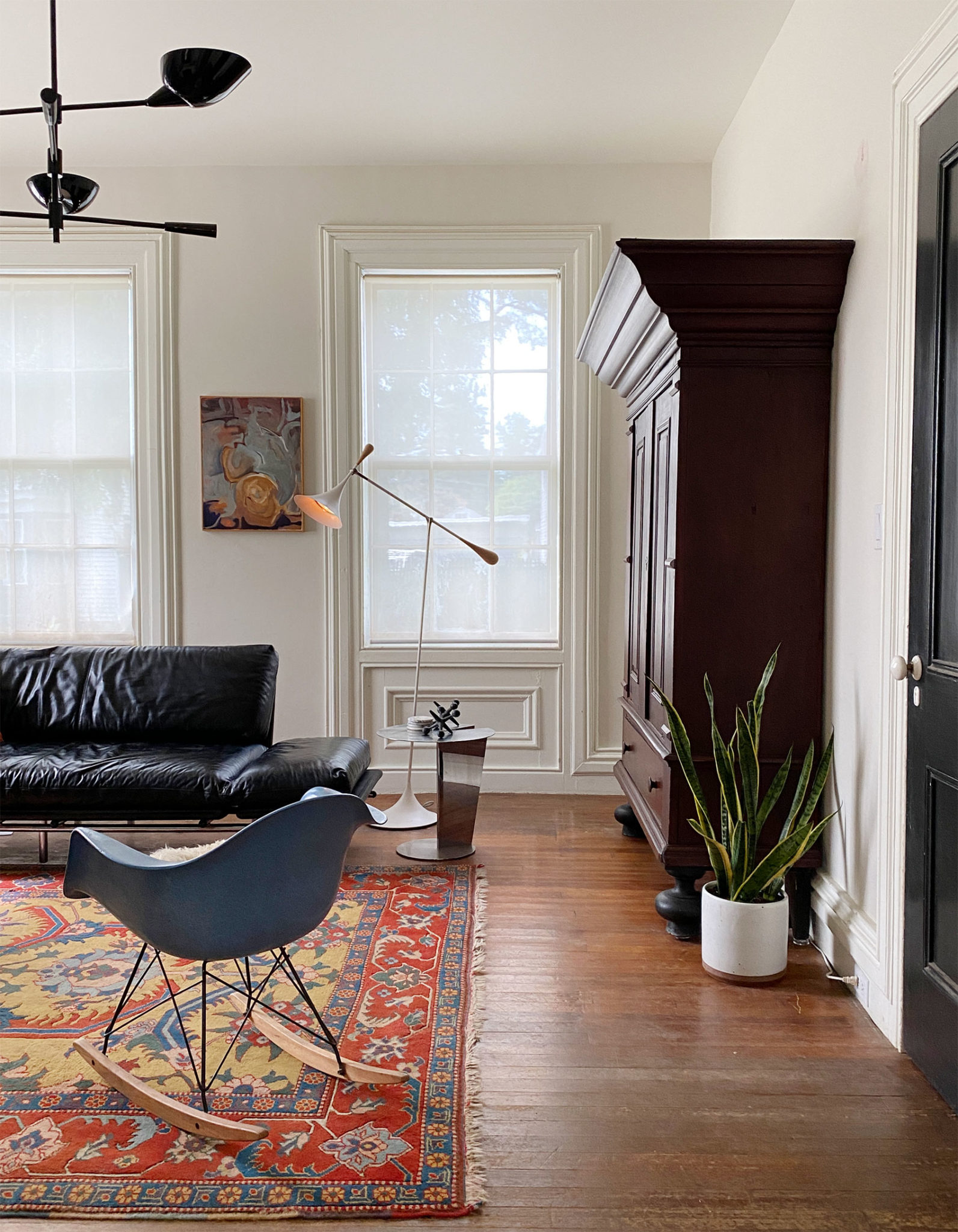
By now, many people know that I’m collecting antique armoires for our new home. I have a beautiful Italian armoire in my office that I use as my bookshelf. In the kitchen, we recently added a large French armoire (one of the ones that come apart…a knockdown armoire) to use as our pantry (which replaced an open bakers rack that came with the house). This very old piece of furniture has travelled from France to Switzerland to Guelph and now it has a new home with us in Waterloo.
It brings me joy.
You know what else brings me joy?
Organizing it!
After a bit of inventory analysis, I stocked up on supplies at Homesense (yes, this kind of organization system is an investment of time and money). I opted for white plastic baskets to house categories of items (e.g., pasta, crackers, tea & coffee) and OXO Pop containers for decanting items (e.g., flour, sugar, oatmeal). Then, of course, I labelled everything!
On top of all of this goodness, we have made friends with the previous owners of this armoire. What joy!
I’m sure you’ve come across many shocking before and after home renovations, but this one, I think, should be moved to the top of the list.
Up until one year ago, this house in Waterloo was a frat house. It was awful. Inside and out. The house was such a disaster that it made news beyond the city borders (e.g., on Narcity, Reddit). If you want to have a peak at how some 20-somethings like to live, check out this virtual tour. Warning: It’s awful.
But there’s really great news to share about this historic house. An ambitious and confident couple took on this project and have transformed it into a beautiful, three-story, single-family home. It’s absolutely lovely!
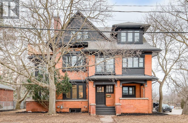
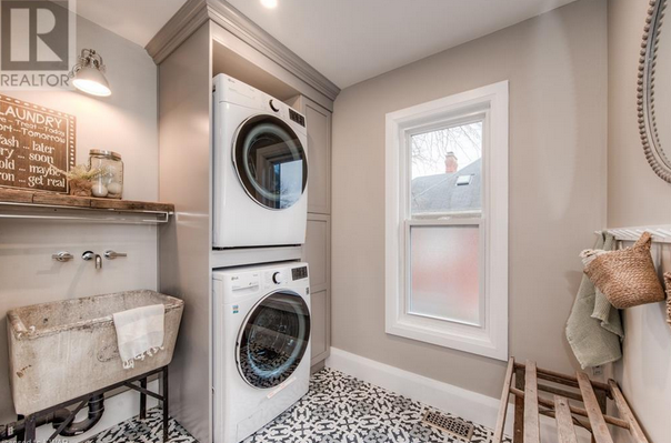
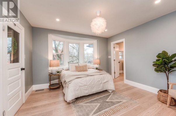
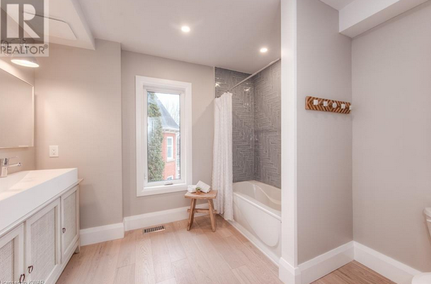
Images via Realtor.ca.
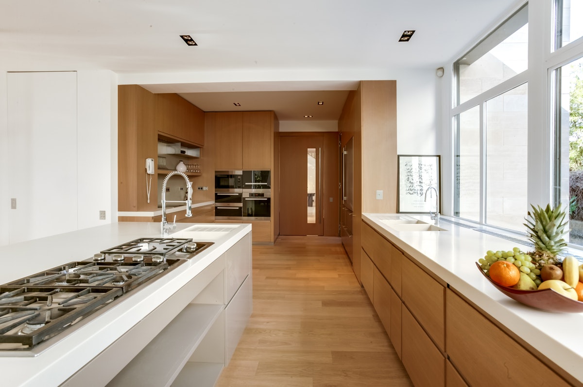
I’ve got my travel bug back, which means I’m dreaming and scheming, and coming across so many incredible places to stay. Wow. Jaw dropping interiors! Here’s a peek into a modern and elegant home in the South of France.
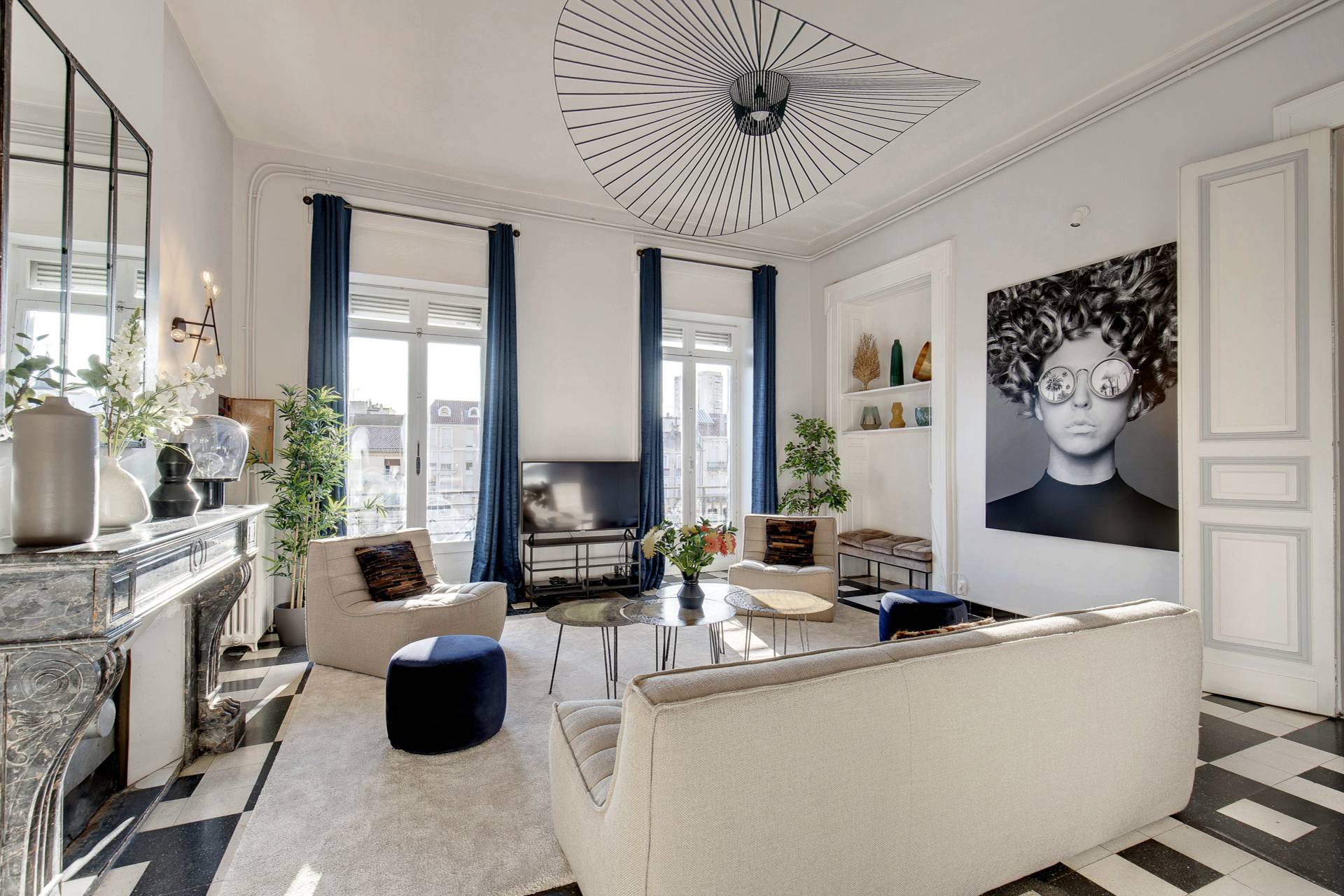
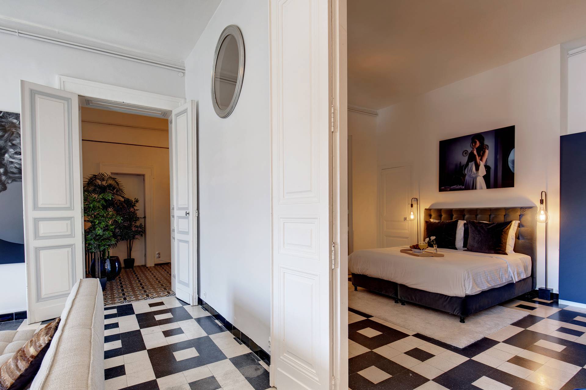
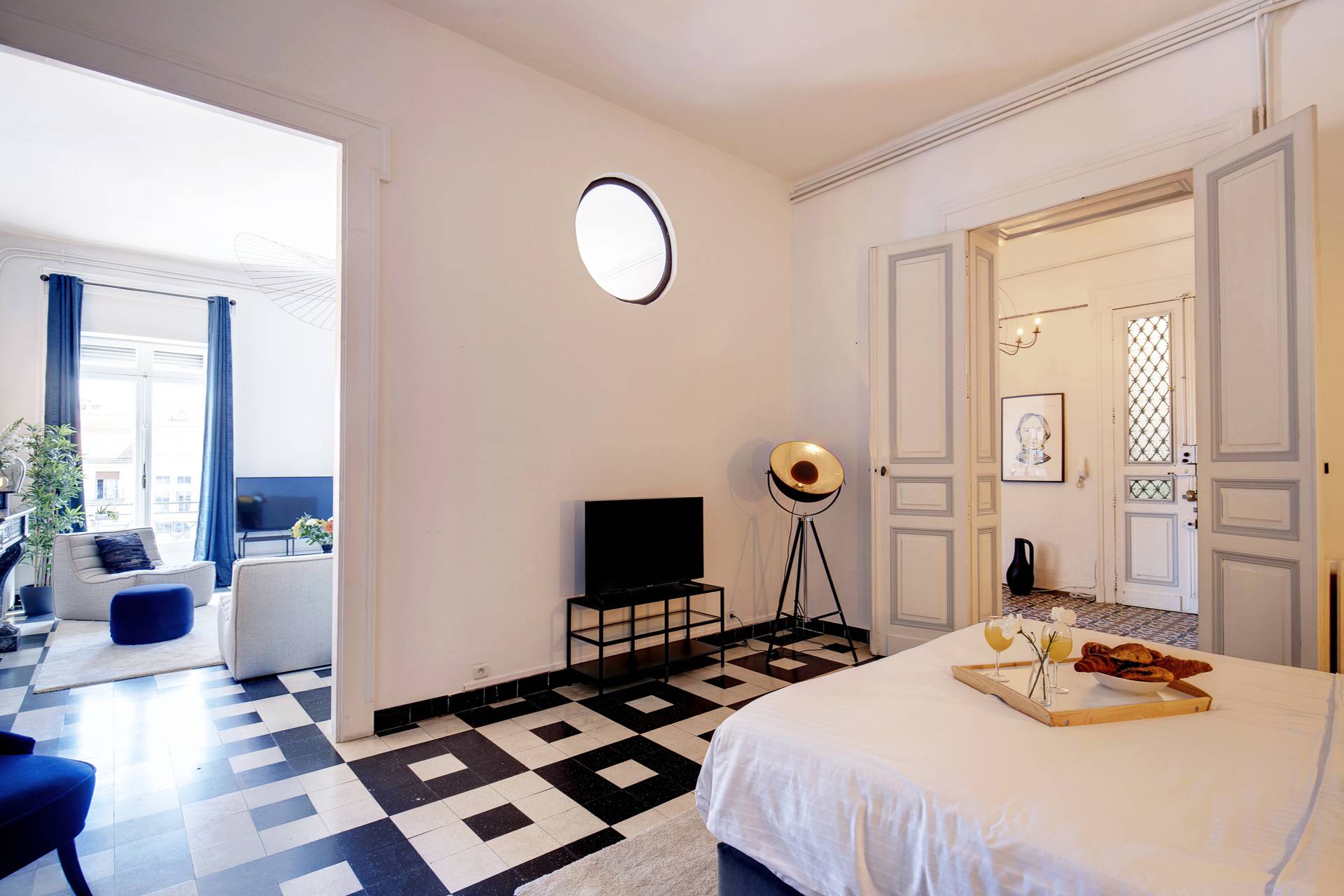
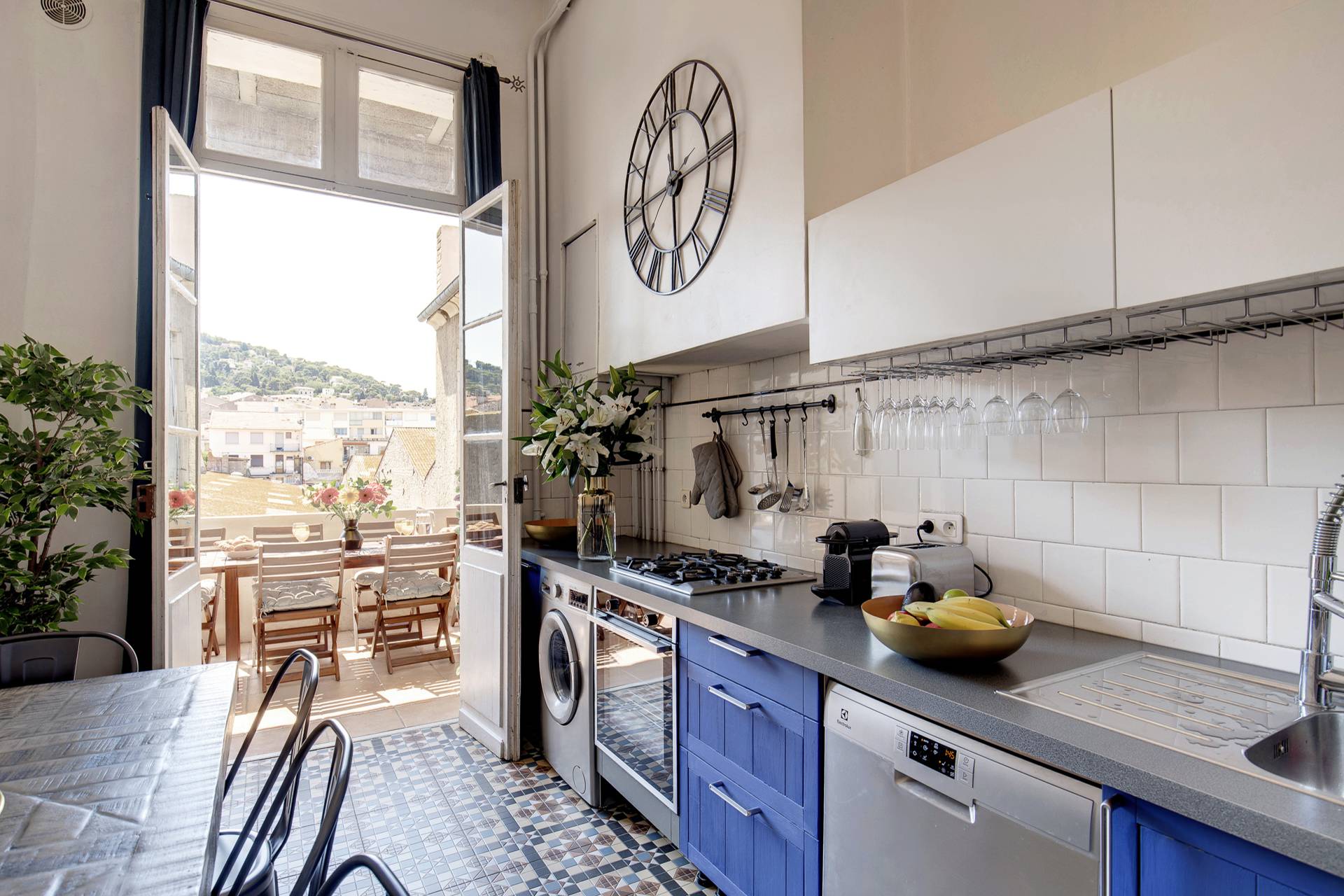
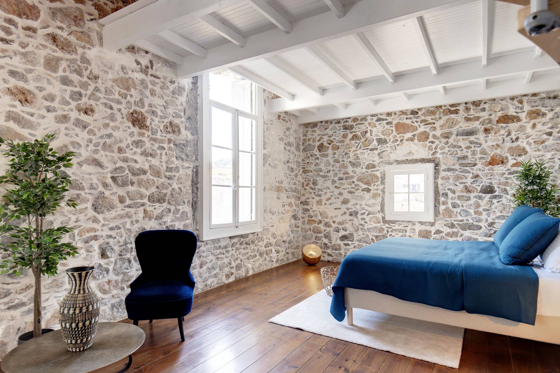
All photos via Hometown France.
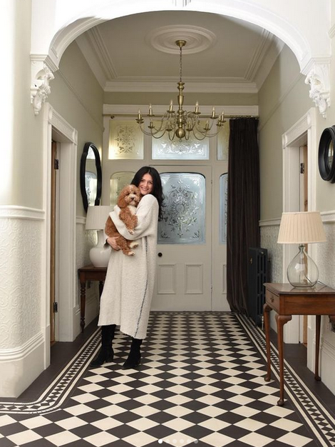
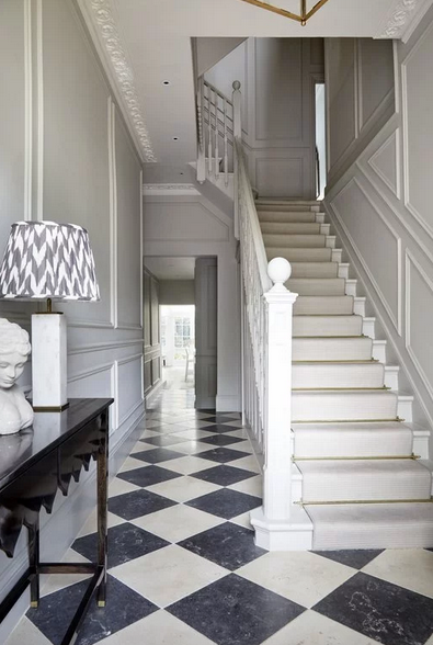
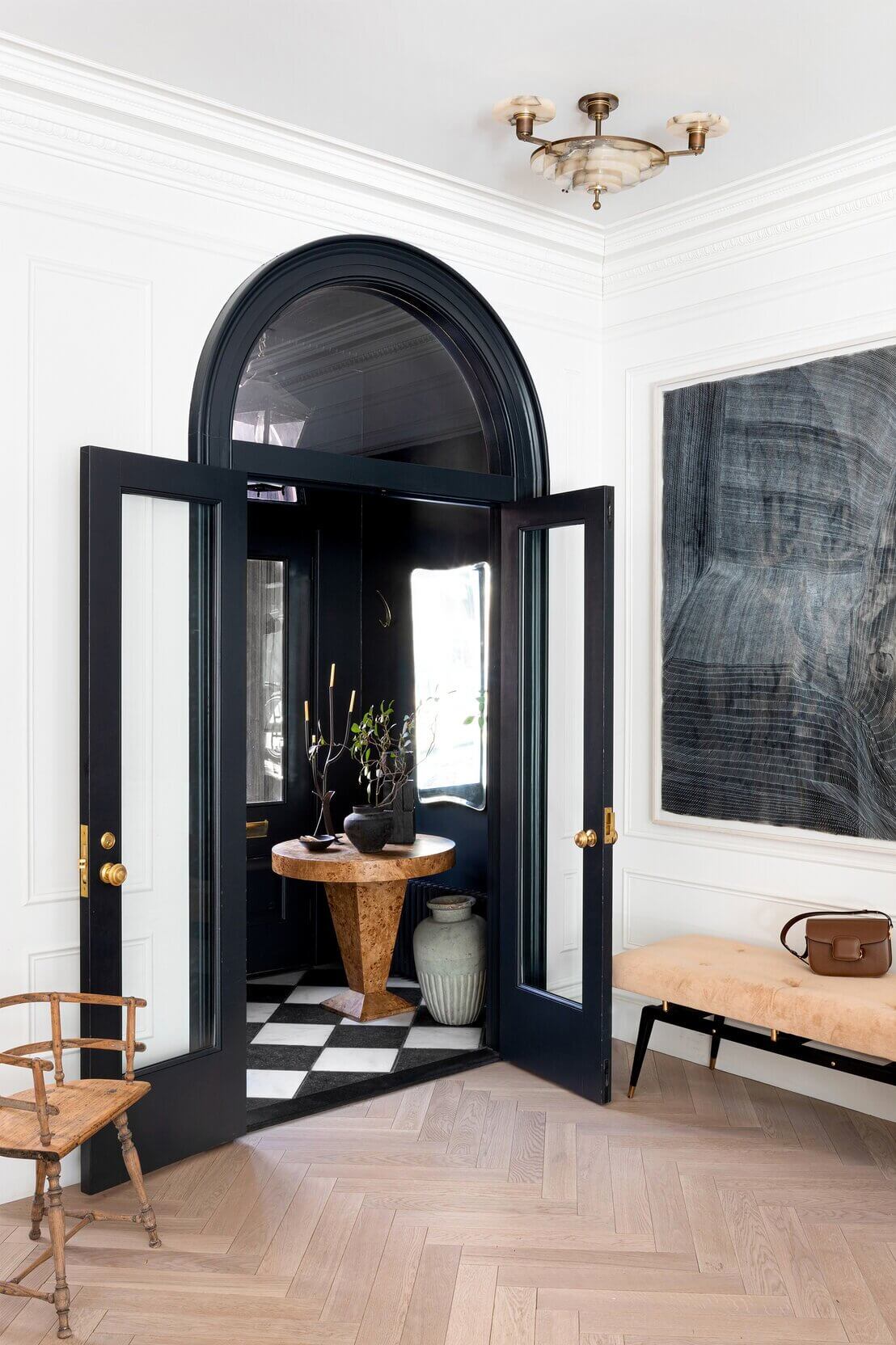
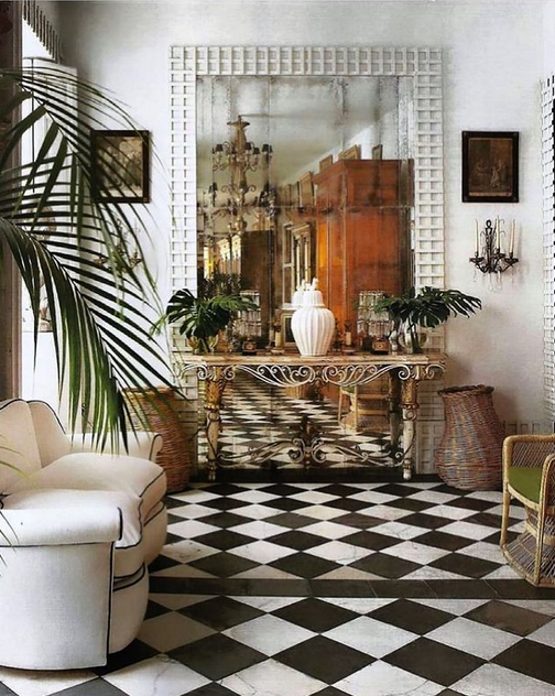
When I look at the photos I’ve been taking and saving recently, there are some commonalities. One common feature is the black and white checkered floor.
I seem to have always been keen on checkered floors; I wrote this post about checkered floors back in 2016! My plan is to add a checkered floor to our entryway (hopefully I’ll get to it this spring). I think it’ll be so pretty.
Two interiors I’d like to see more of are:
2. Leanne Ford‘s all-white spaces everywhere!
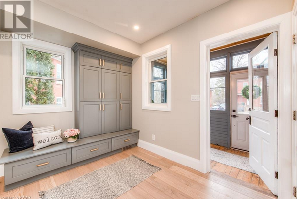
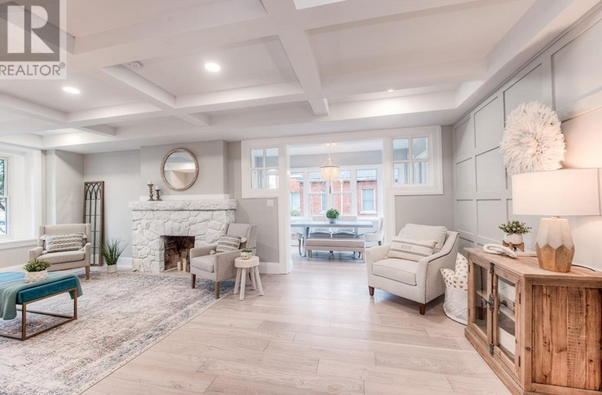
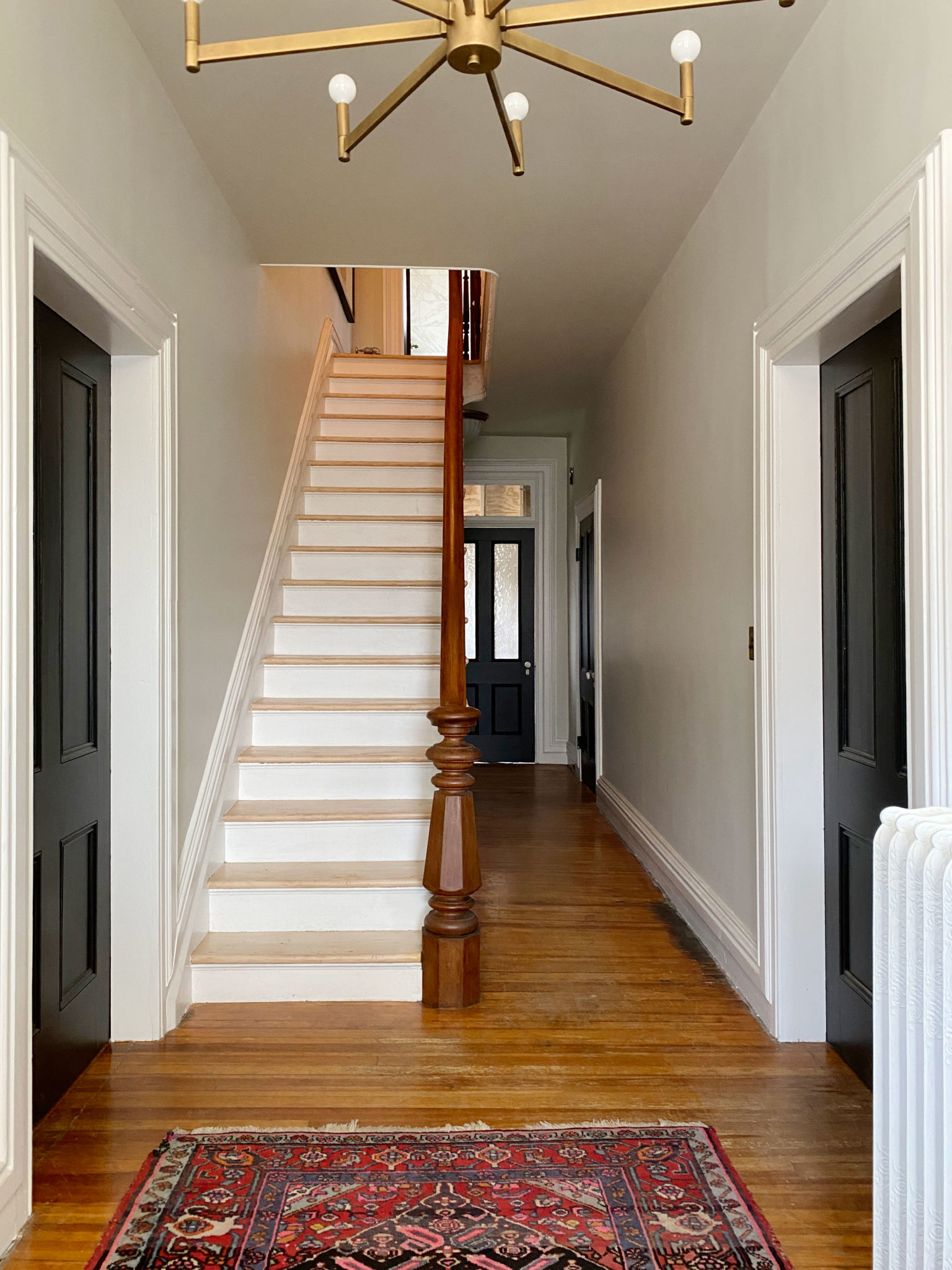
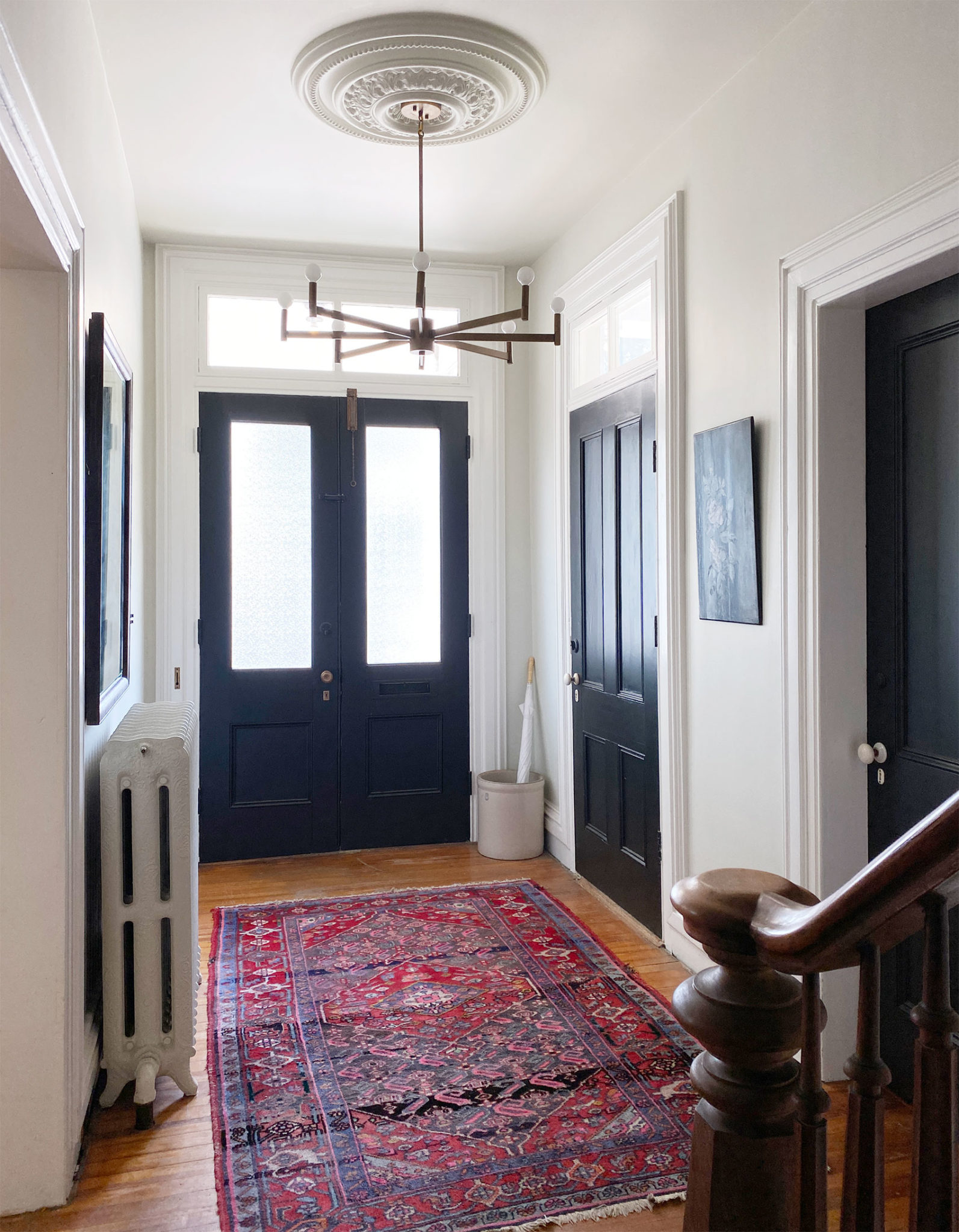
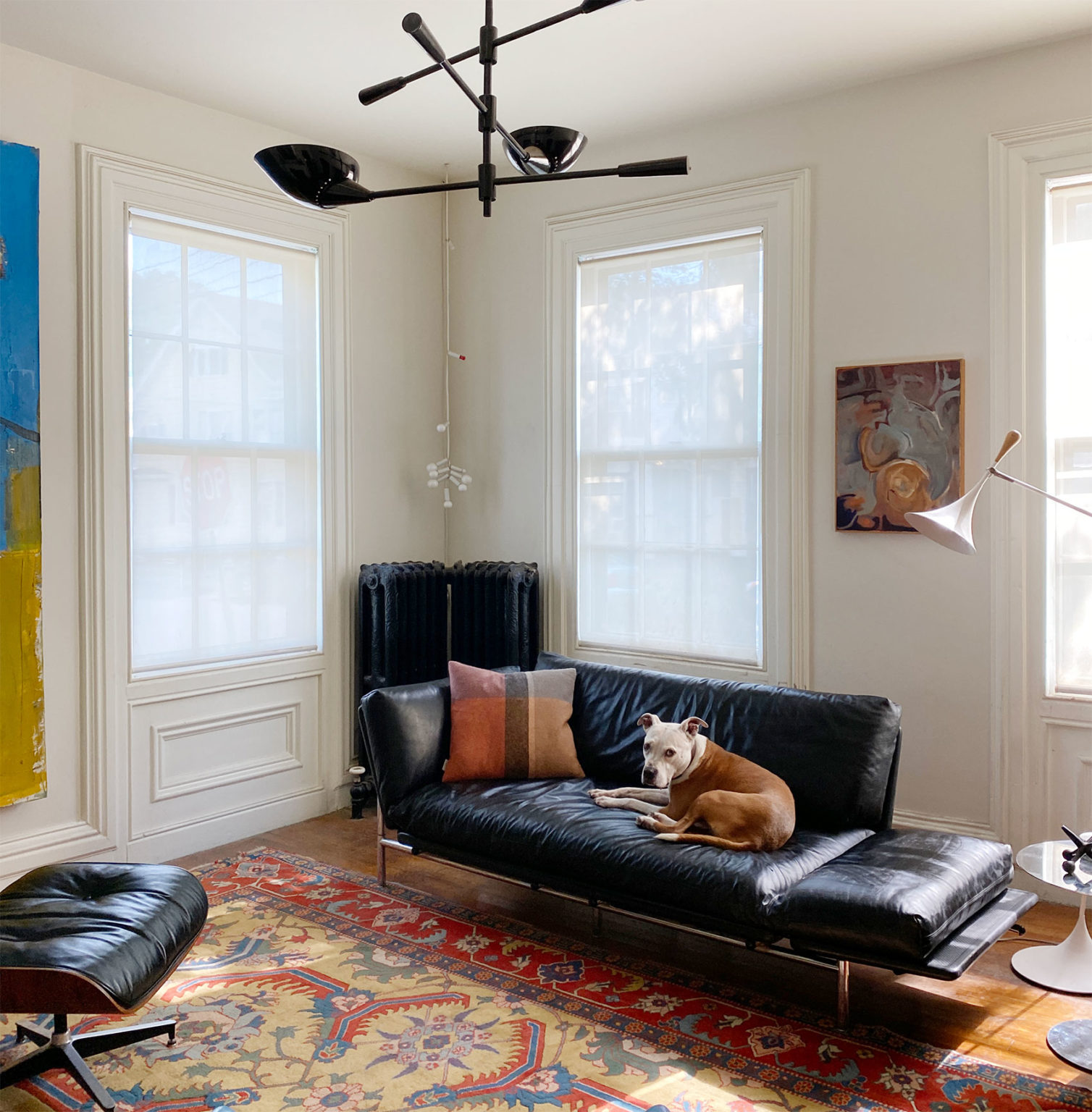
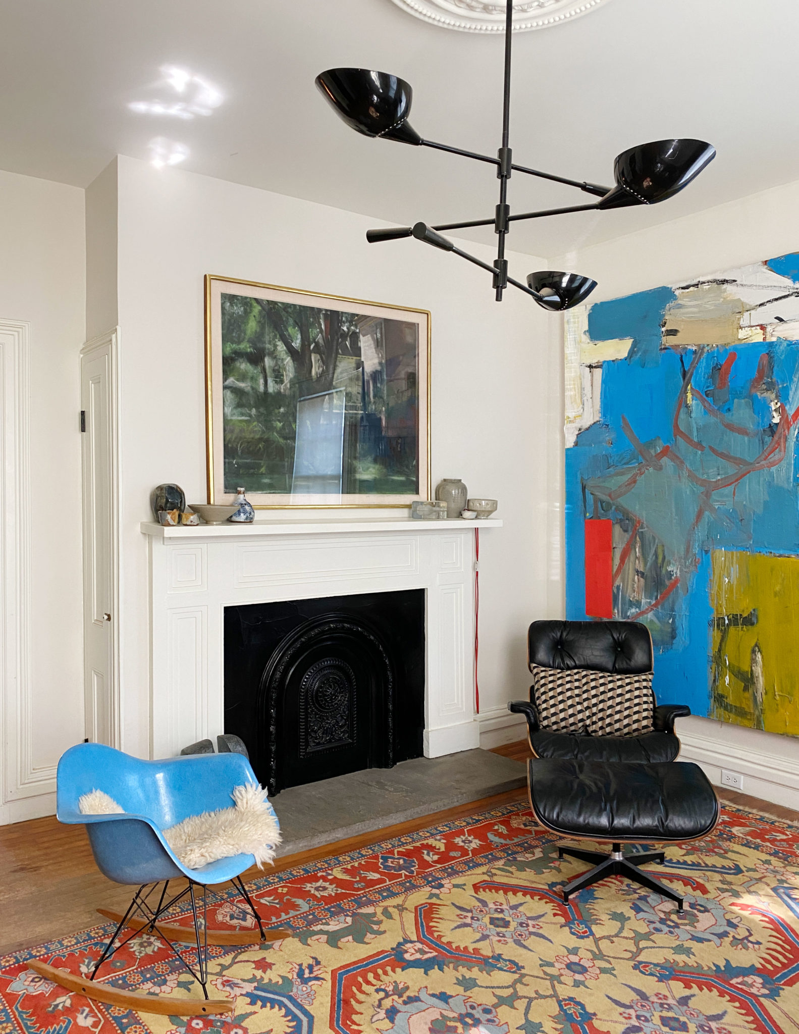
Our home is absolutely lovely. It’s a special place with an interesting history. There are unique nooks and crannies. And there are so many windows.
With every house, no matter how lovely, there’s always work to be done to upkeep it and to make it one’s own. Since moving in June, we have tackled a few minor projects, and we’re really trying to prioritize tasks to align with our needs and budget. This has been hard for me because I want to do everything all at once!
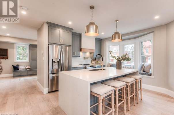
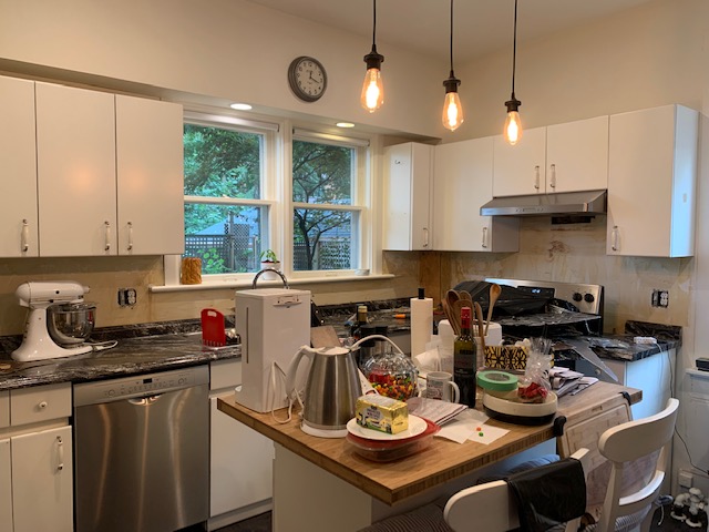
One of the areas that will need the most work in the future is our kitchen. It is large and fully functional, but we have ideas about what how we may want to change it to maximize the space and increase efficiency. Our design dreams, however, are costly, and the changes we have in mind are in our long-term plans.
That said, there are a few things that we would like to change now to make the kitchen more functional and beautiful.
Here’s what the main part of the kitchen looked like just before we moved in.
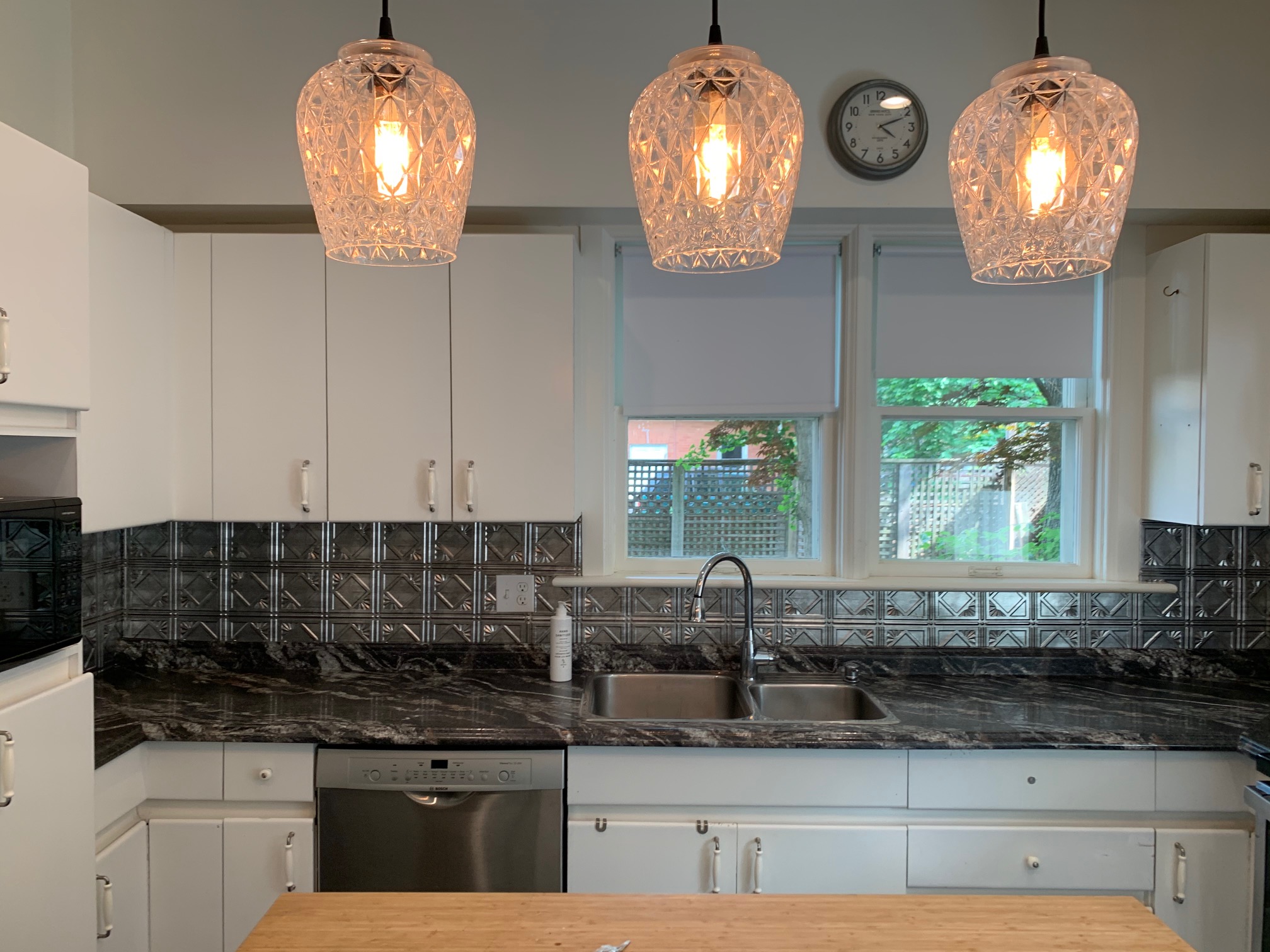
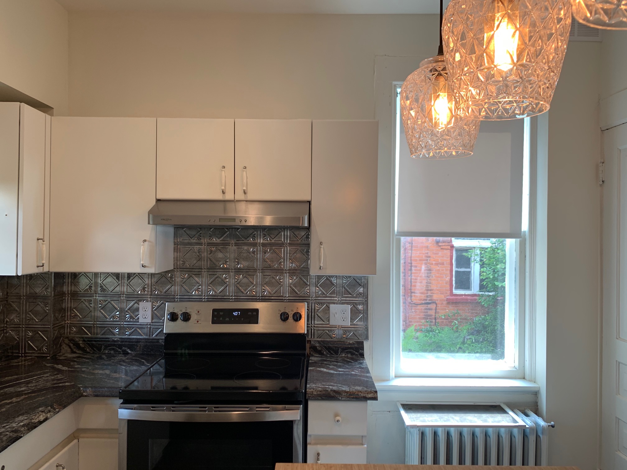
We like all the windows, the basic white cabinets, and the appliances, including the double fridges (what a luxury)!
The counter and backsplash isn’t our style. The faucet and sink don’t maximize functionality. The cabinetry doesn’t maximize our nearly 10-foot ceilings (future project).
The faucet is terrible. The pull down option is broken, and it looks and feels so inexpensive. It feels like it could break at any moment. When I suggested we get a new faucet, my beau told me that the sink was even more bothersome to him than the faucet. The sink is shallow and has two bowls (regular size bowl plus a 3/4 size bowl). The sink, to my surprise, was annoying him just as much as the faucet was annoying me! We discussed the possibility of replacing one or both items in the short-term or living with the existing set-up until we’re ready for a larger remodel.
In the end, we decided that we wanted to complete a mini makeover so that the kitchen would be enjoyable, functional, and pretty (more for me!). A mini remodel makes sense for us while we save money and plan a larger remodel for the future (similar to Tiffany’s approach). Essentially, this means installing a new sink, faucet, counter, and backsplash.
Step 1 of our mini makeover meant that on one rainy day, I ripped off the fake-tin, plastic backsplash panels. I then primed the walls as a temporary, cheap makeover. We removed the glass domes on the lights, too.
Step 2 will be to replace the faucet and sink. We’re getting some help with this thanks to my long-time partner, BLANCO Canada. (Remember my old laundry room? I was sad to say goodbye to that little space.) I was so happy to coordinate our current kitchen project with the BLANCO Canada team – they’ve always been a real pleasure to work with! And I love that their products are made in Canada (remember this BLANCO factory tour?).
On our wishlist:
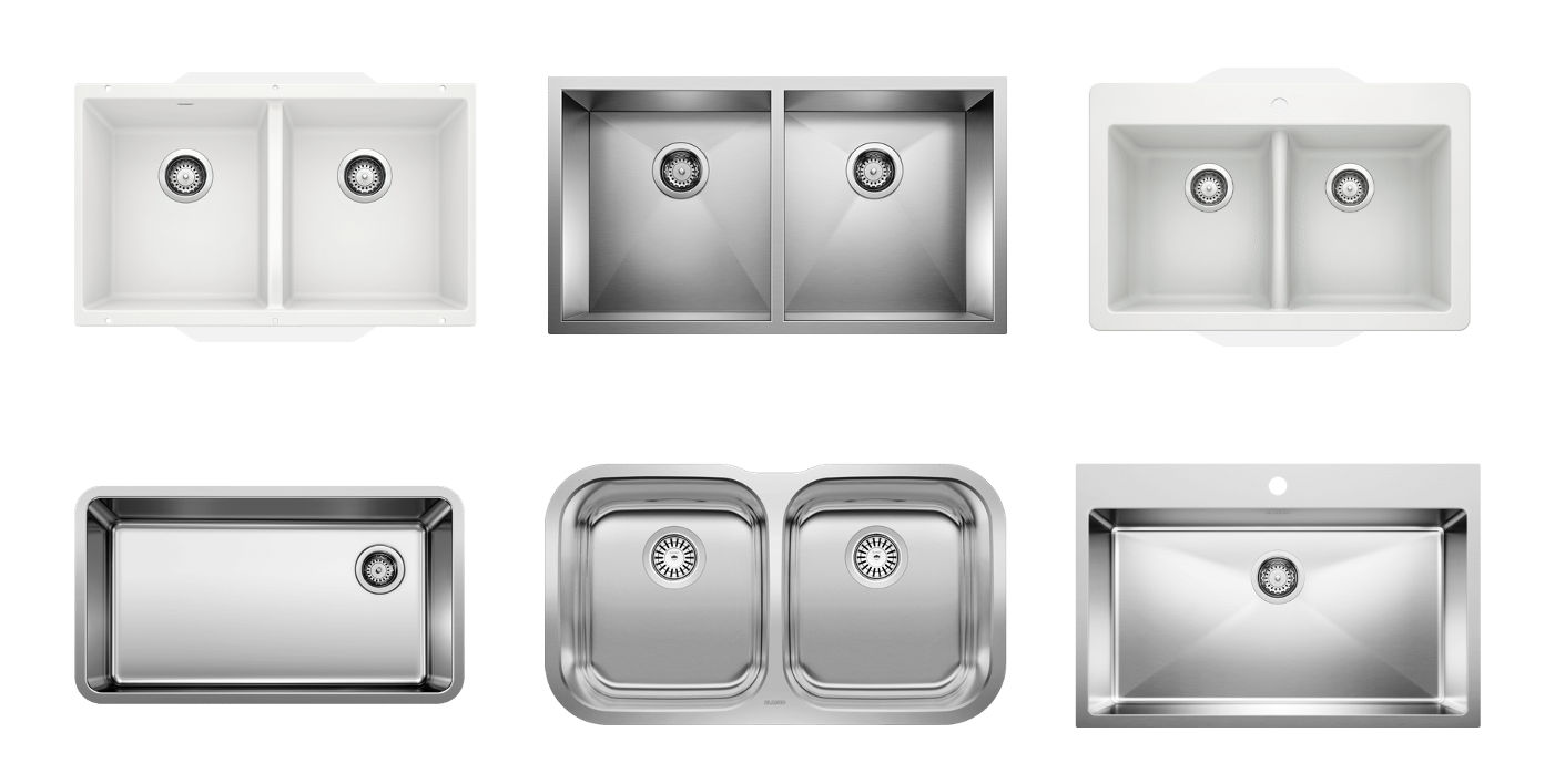
Here are the faucet and sink options we considered:
Step 3 will be to install a stone countertop (I’ve got my eye on carrara marble or a white quartz), backsplash, and door handles.
Our current mini-makeover design board looks like this:
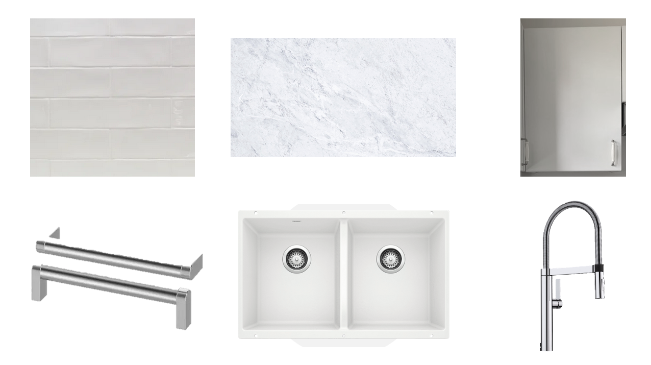
We liked just about all of the faucets in BLANCO’s collection. Everything was sleek and powerful. We wanted a high arc with a pull-down feature, and the BLANCOCULINA suited our tastes well.
We have chosen BLANCO’s Silgranit PRECIS U 2 sink in white. Daring, right? We debated between single and double bowl options, but decided that a double bowl might suit our current needs best. We were open to both stainless and Silgranit options, too, but I was drawn to the PRECIS U 2 in Silgranit because it’s unique. I have seen the Silgranit in action, and I am confident that the white will withstand the wear and tear of daily kitchen use. Tim and Chris have a white Silgranit in their kitchen, and they let me know that it has been easy to clean.
And this brings me to the end of the first post about our kitchen mini-makeover. In a few weeks, I’ll be sharing some progress and after photos.
This nearly $10M heritage home in Toronto’s Rosedale neighbourhood is so lovely. Each room is so well-appointed with elegant furnishings and beautiful art.
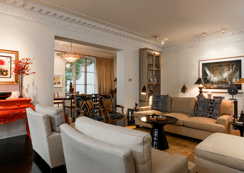
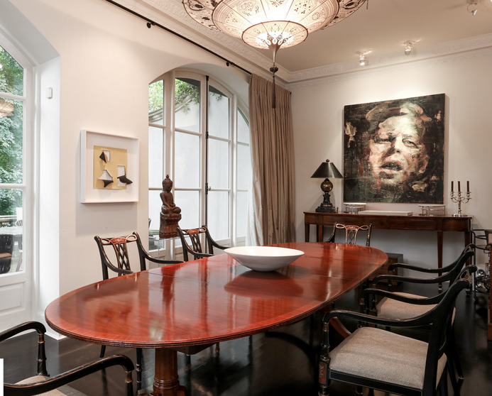
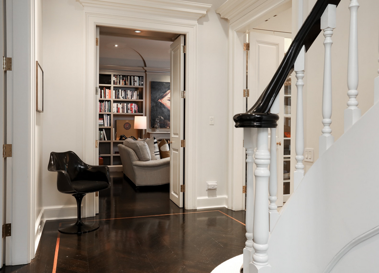
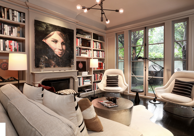
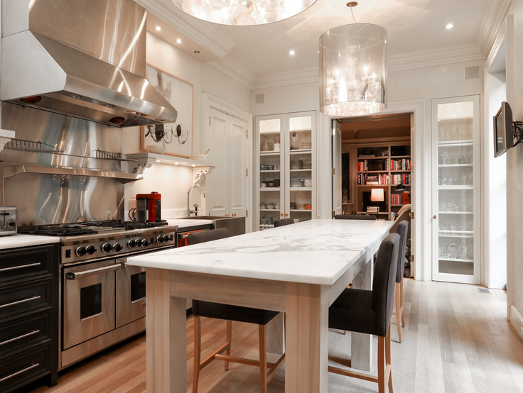
Images via Paul Johnston.
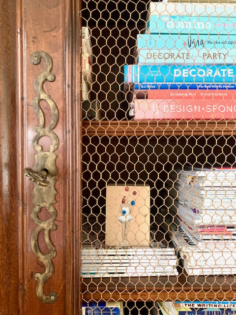
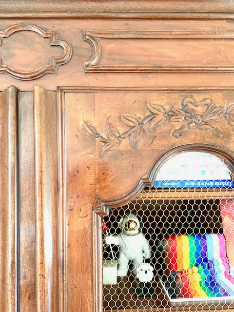
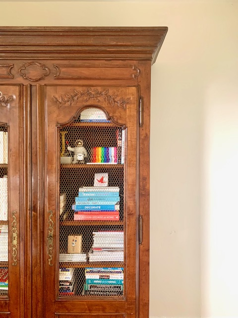
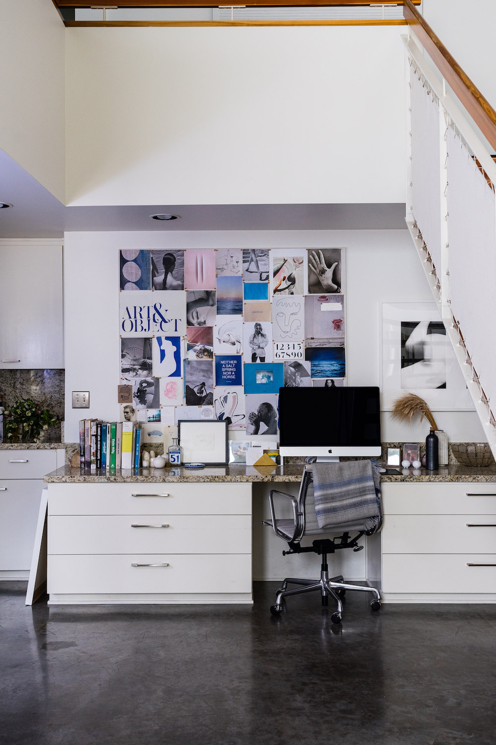
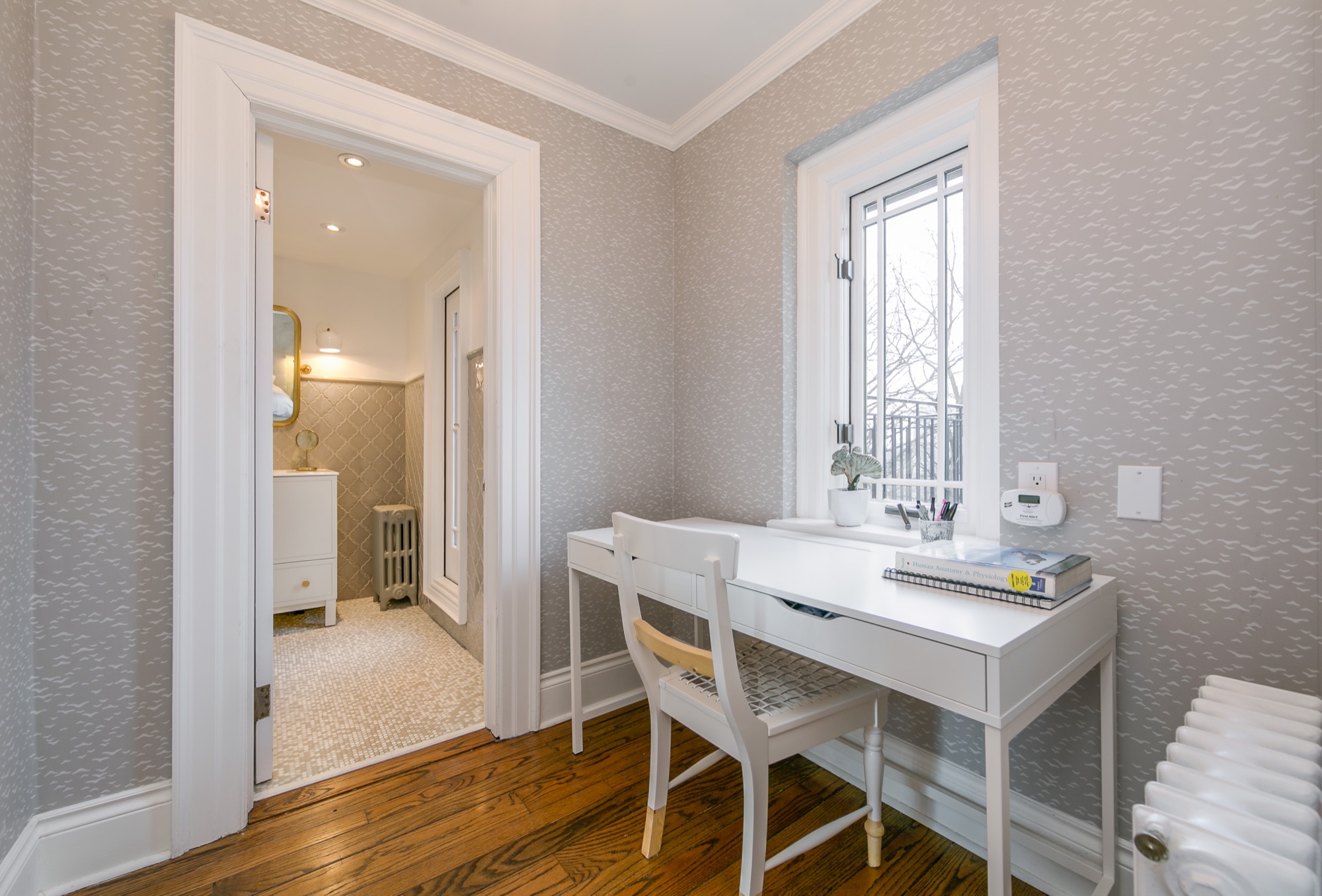
I have now acquired the two major pieces of furniture for my home office – the desk and bookcase (my office design plan is coming true!). Both pieces are absolutely stunning, and they make me so happy. Isn’t it funny how furniture affects us? Is it just me?
Although my office is still in a state of disarray, I love working in it. The light that shines in at this time of year is just perfect.
I now enjoy this view from my desk.
It’s not white! (And I won’t be painting it.)
My antique Italian armoire is 7 feet tall, and it fits all of my books (and more). The solid bottom of the doors hides my not-so-pretty binders and academic books, and I’ve been able to add trinkets and art among shelves of my non-academic books and magazines. I do quite like the wire front panels, but I can easily trade this out for glass, mirror, or fabric in the future.
Once I find a rug and modern light fixture, then my office will be just about complete.
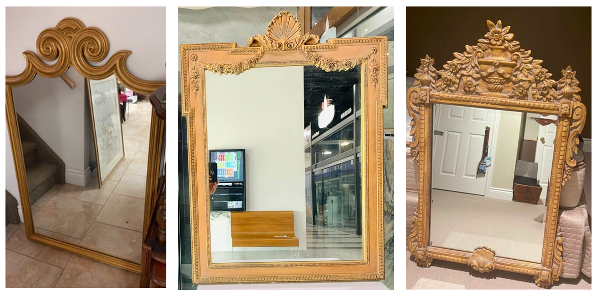
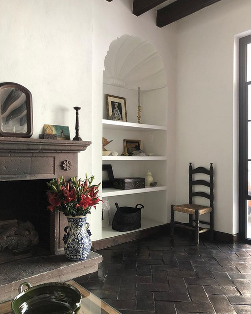
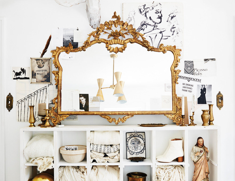
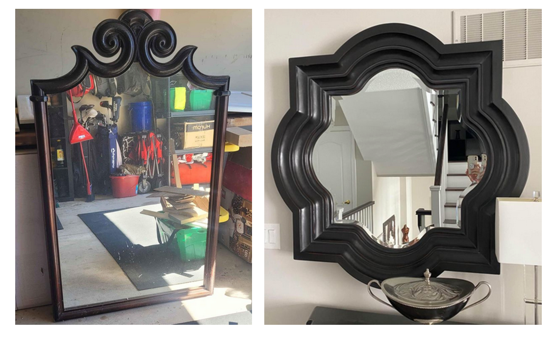
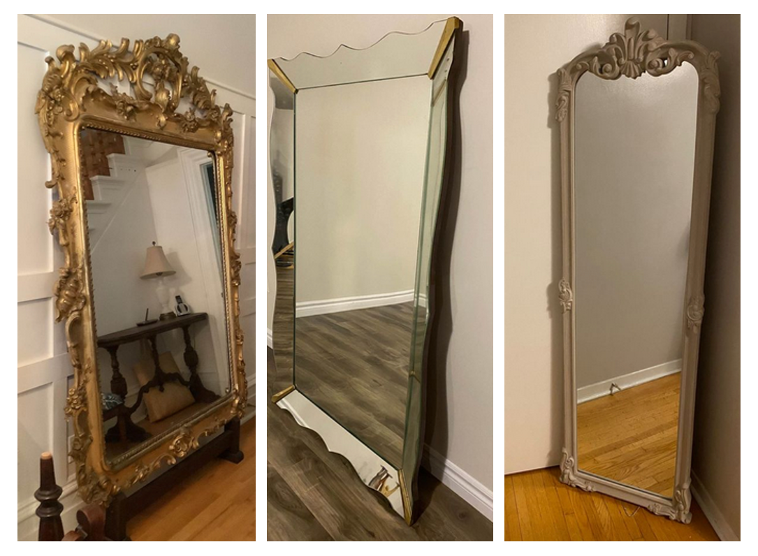
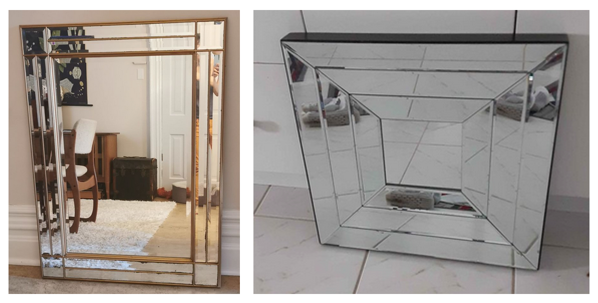
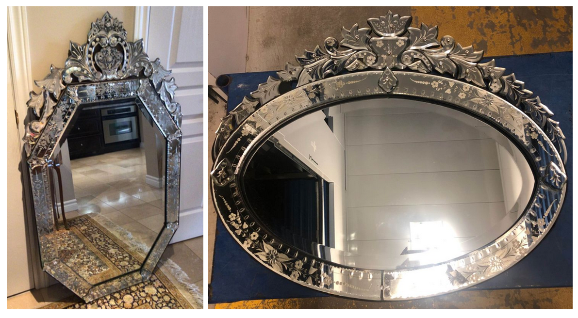
So it seems that I’m on Facebook Marketplace and Kijiji every day. You, too? Please tell me I’m not the only one who browses these sites so frequently. One of the items that I’m the lookout for is a mirror…or more than one, in fact. I have some idea of where one (or several) may end up, but I’ll know more as soon as I see one that I love. Over the last few months, I have bought three mirrors at a fraction of what they might cost at a store and, more interesting for me, they’re all antique (and unique!).
Here are some mirrors that I’ve come across lately (in Ontario) on Facebook Marketplace.
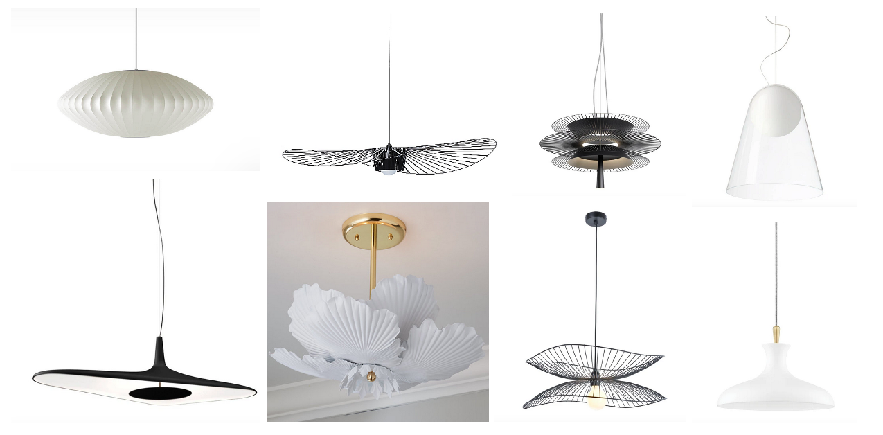
I’m starting to gather lighting inspiration. There are so many lights in our new house, and while everything if functioning well, not every fixture suits our style or this home. That said, I am finding that choosing light fixtures is an overwhelming design task. On top of this, I’m impatient, so I have to remind myself that it’ll take some time to get all the fixtures set.
For now, here are some fixtures that are getting my attention.
Having a bigger house means having more rooms to furnish. It’s completely fun, but it’s also overwhelming and a slow process. We also have a lot of furniture to begin with, so some of our furniture needs mean upgrading to pieces that suit our style and new home. It’s a tough problem to have, I know. We are lucky to have such problems! In other rooms, however, we are starting from nearly a blank slate. We have designated one room as our study/games room, and we are in need of a good set of table and chairs. As such, I’ve been on the lookout for an interesting round table at just the right size. I’d prefer a pedestal table, I think, with chairs that tuck completely in. I think this option would be best for the room and how we want it to function.
Here are some tables that have been inspiring me and the design for our study.
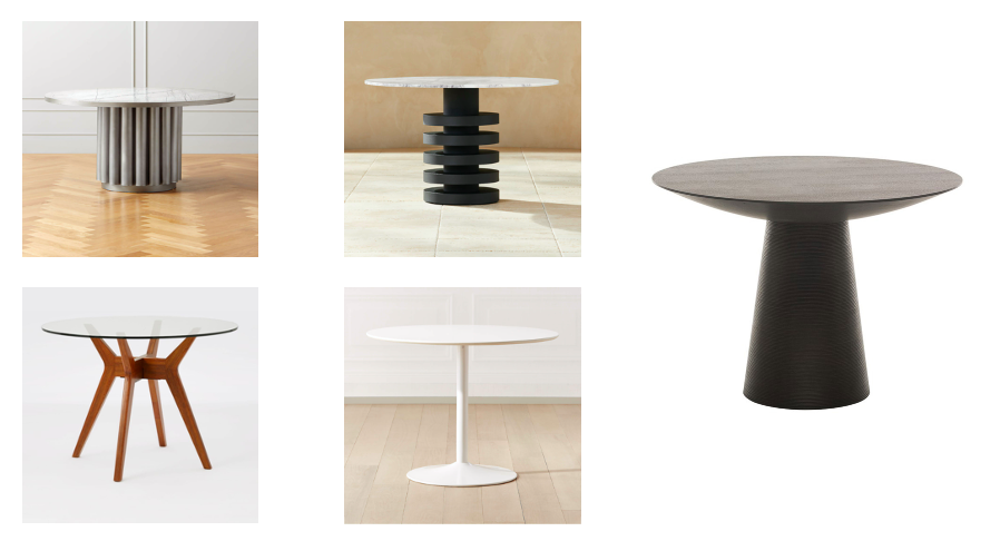
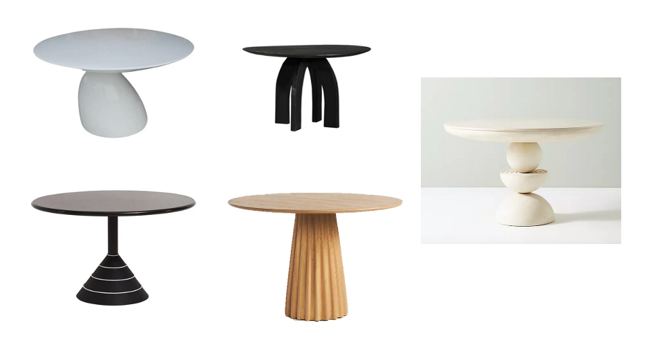
Part of me wants something quite sculptural without chairs, but I know that wouldn’t be practical. Darn!
In a recent issue of Nuvo, this picture caught my attention and enticed me to read the adjacent article.
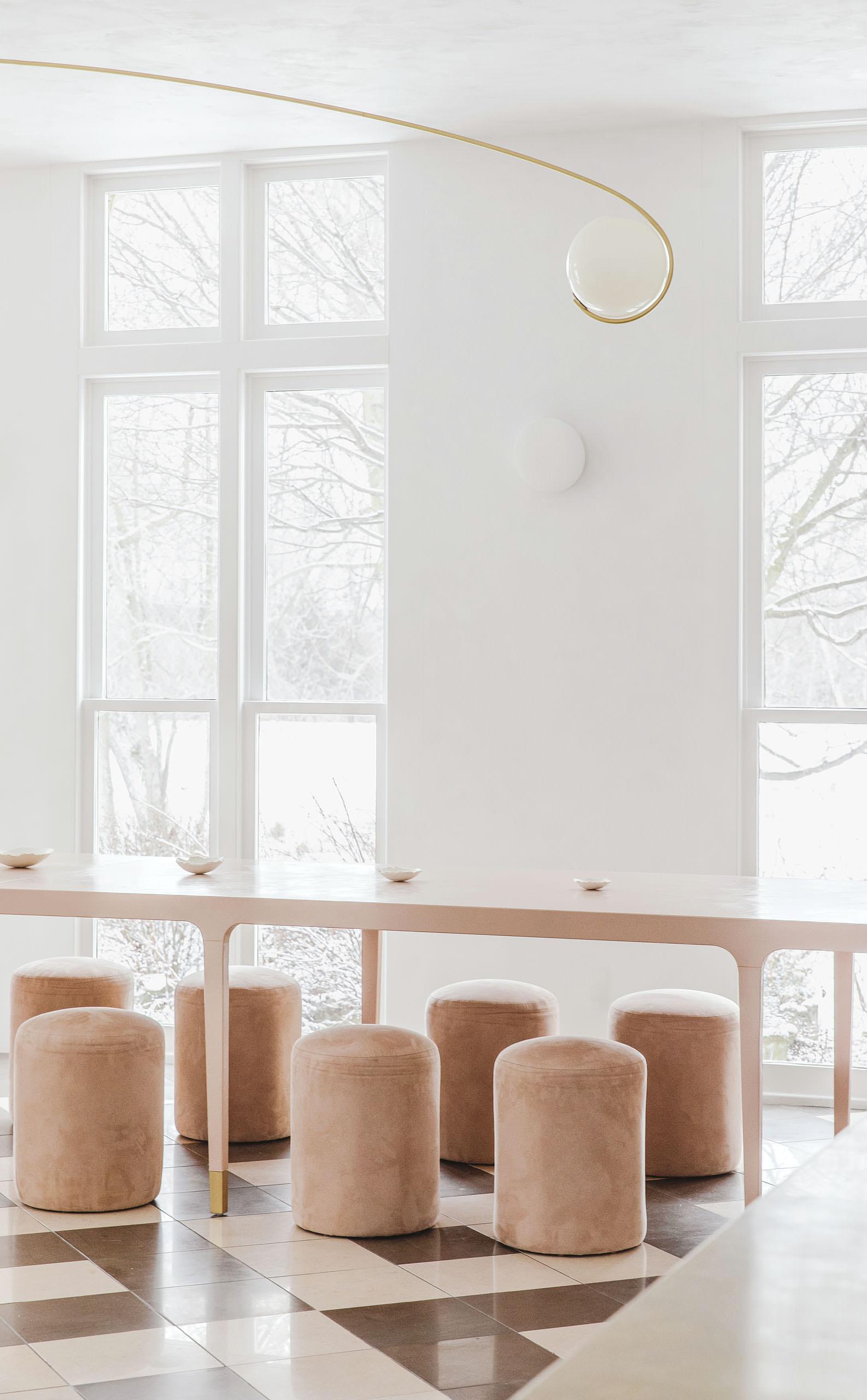
I like the table’s length and slim lines and the curve of the unusual light fixture. After reading the article, I learned that this place – Lune 1860 – is in Goderich, which is relatively close to the Waterloo region, and is a place I’ve been to several times in the last couple of years.
Lune 1860 is an event space in a 160-year old country house. It was founded by Lisa Mok, a Toronto-based creative director and graphic designer.
photos by Niamh Barry for Lune 1860
I came across the work of the architecture and design firm Bao on Desire to Inspire recently. Bao has designed so many beautiful white spaces. Here’s one example called Housing Zurbano.
Over the holidays, I received a press package from American Standard. I thought it was timely, clever, and well-designed. Essentially, American Standard’s message is to flush 2020.

Beyond the press information I received, I had a browse on the American Standard website to learn more about its bath collection. Here are some of the interesting things I learned.
The Spalet Bidet Toilet is a new release, and I know I’d love it. I became appreciative of these types of toilets after my 2019 trip to Japan.
The price tag is high, yes, but American Standard some bidet seat options at about half the price of the toilet.
Here are some other items that caught my attention because of their functionality and design.
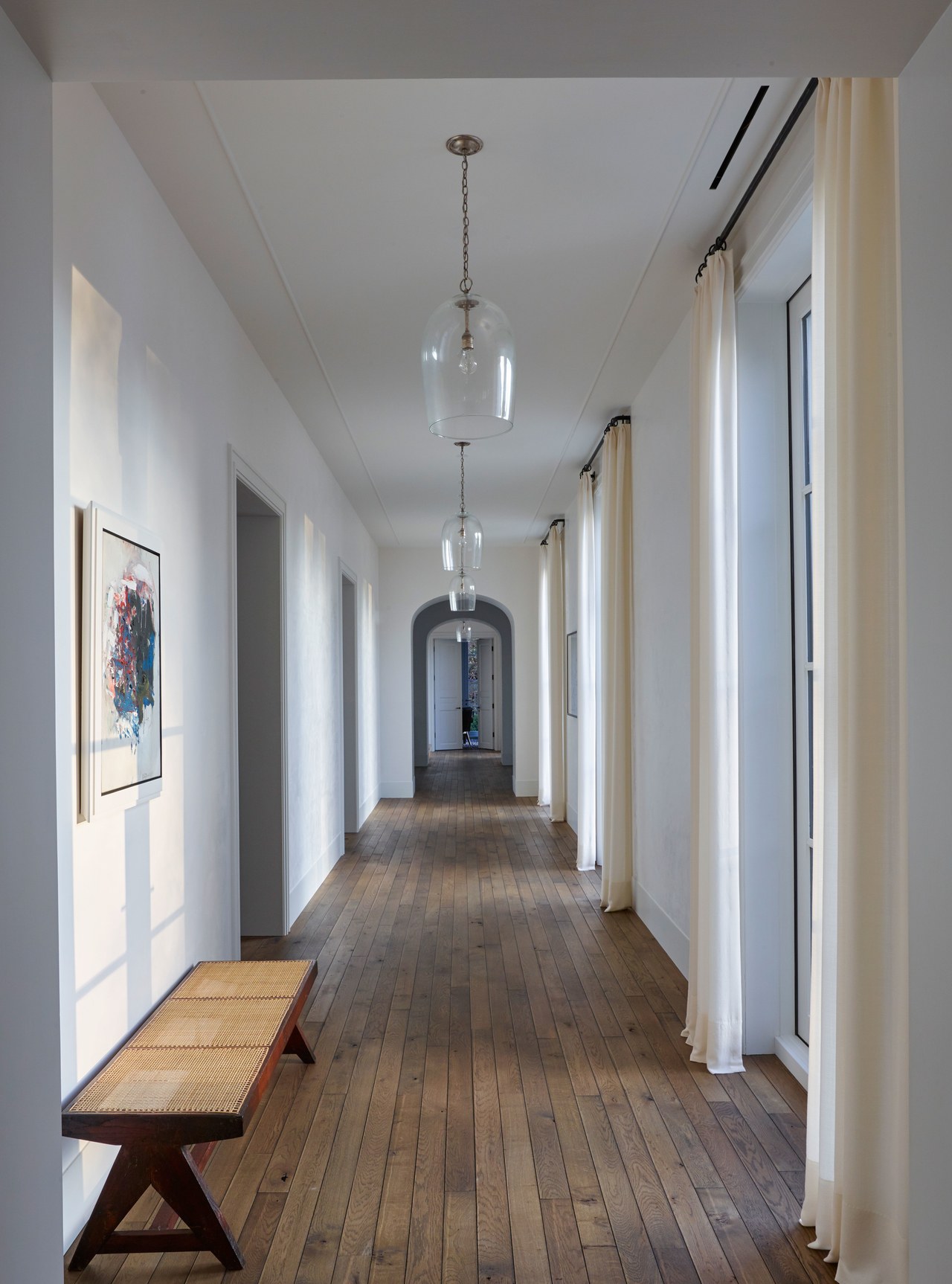
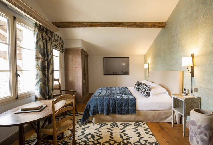
I have been following Daniel Kanter (Manhattan Nest) for years. Seven years ago, he bought a dilapidated old home (with so much potential) in Kingston, New York, and he has been renovating it ever since. Recently, he has taken his readers down memory lane, and it has been wonderful to see the results of his effort to make his home beautiful. I appreciate his design aesthetic and how he has maintained the charm of historic home while injecting it with some modernity.
Photos by Daniel Kanter (living room, hallway).
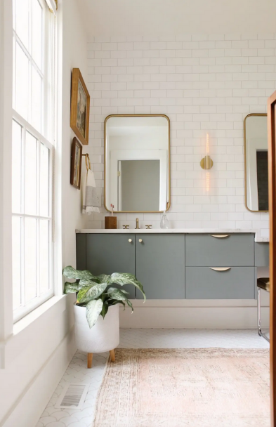
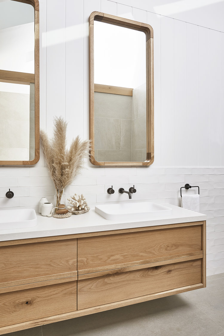
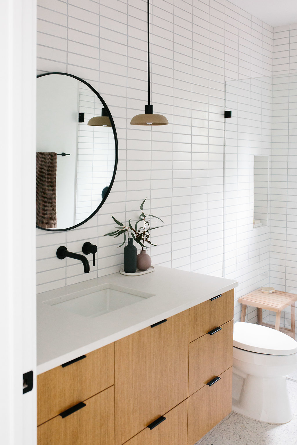
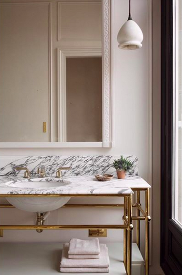
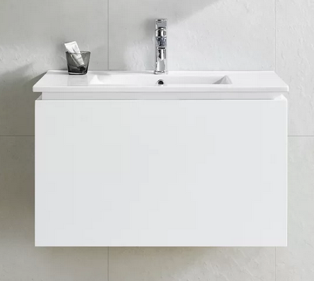
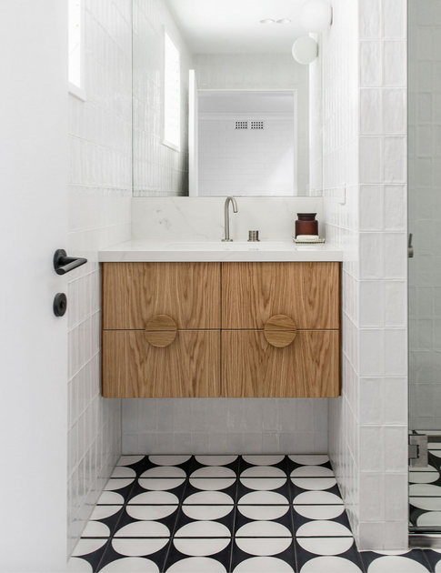
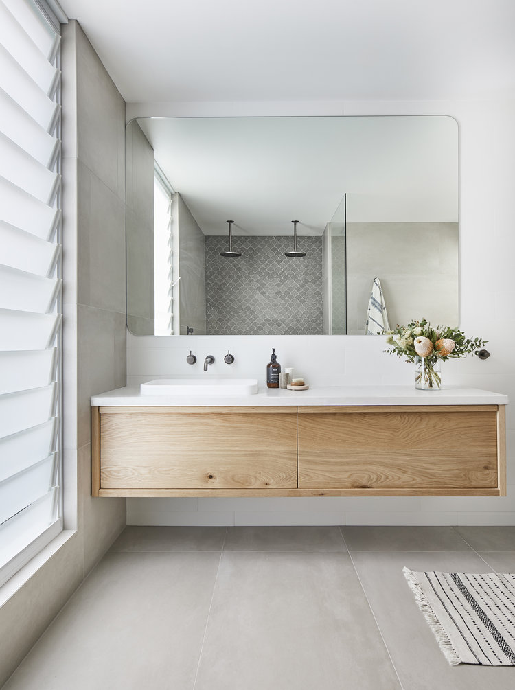
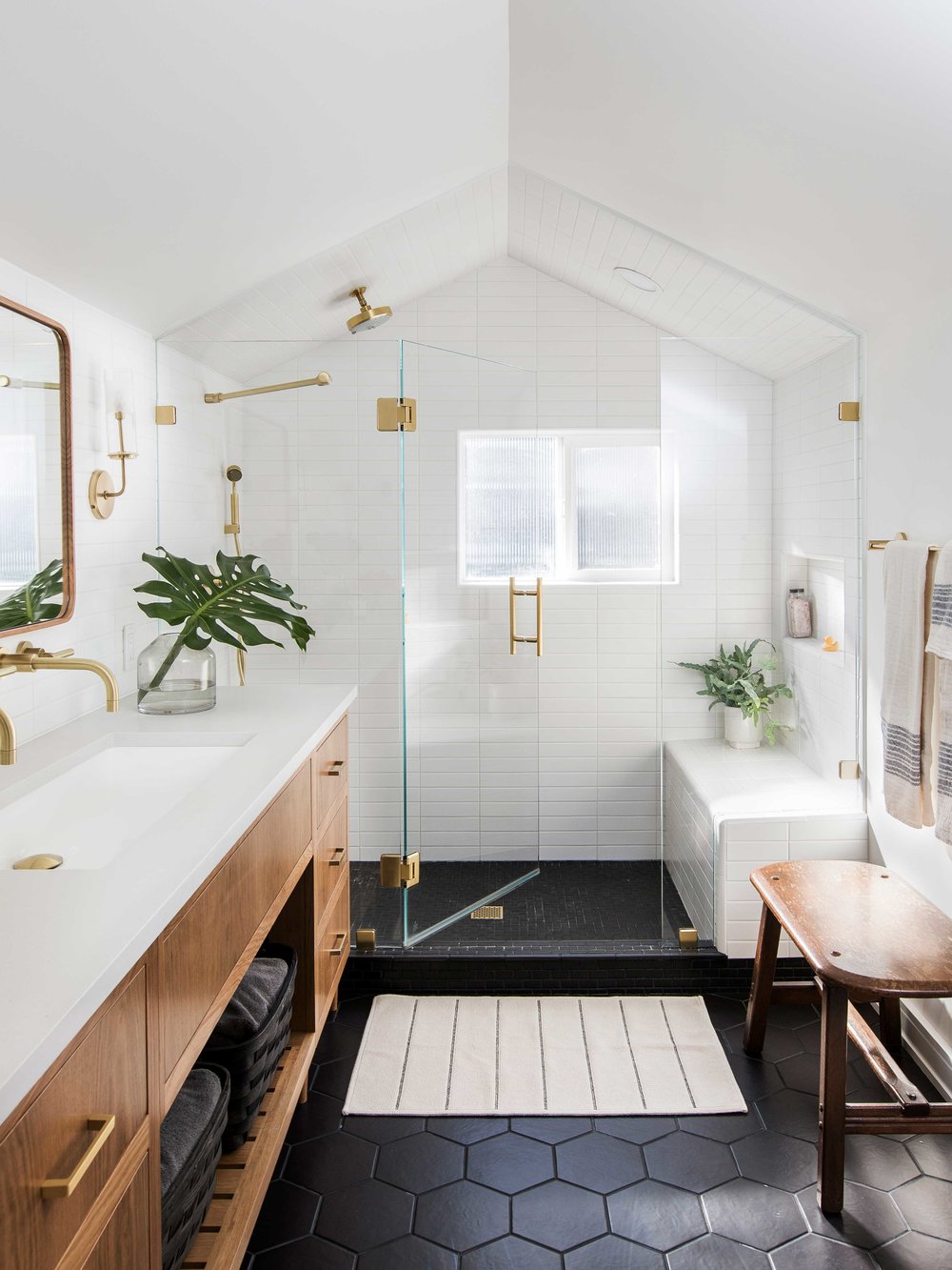
What do you all think about floating bathroom vanities? Normally, I don’t like them because they don’t maximize storage. However, I’ve recently had a change of heart after seeing this gorgeous vanity (see first image below). Although the vanity is not white, I love it. I also think it’s paired beautifully with the full wall of subway tile, the delicate gold-framed mirror, and simple sconce.
This image made me think about the feeling of lightness of the floating vanity. I think this would be a great option for a small space. A floating vanity would mean there would be more space for floor tile, which would give the illusion of a bigger space. What do you think? Agree? Disagree?
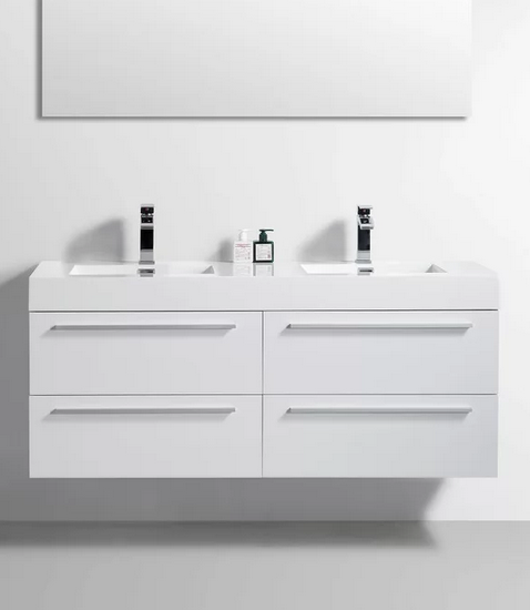
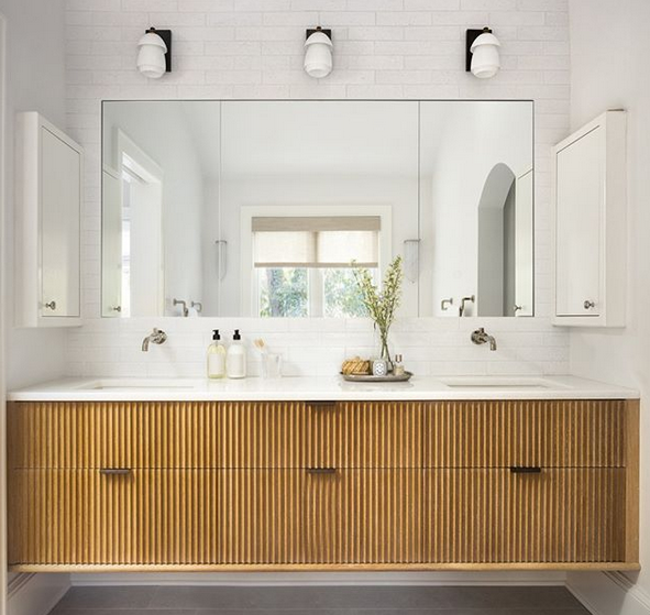
Beyond simple white vanity options in the marketplace, there’s a plethora of wood styles. These bathrooms are lovely.
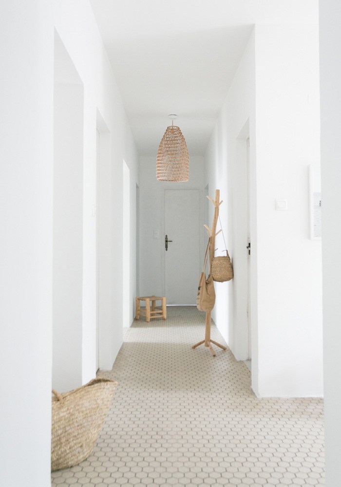
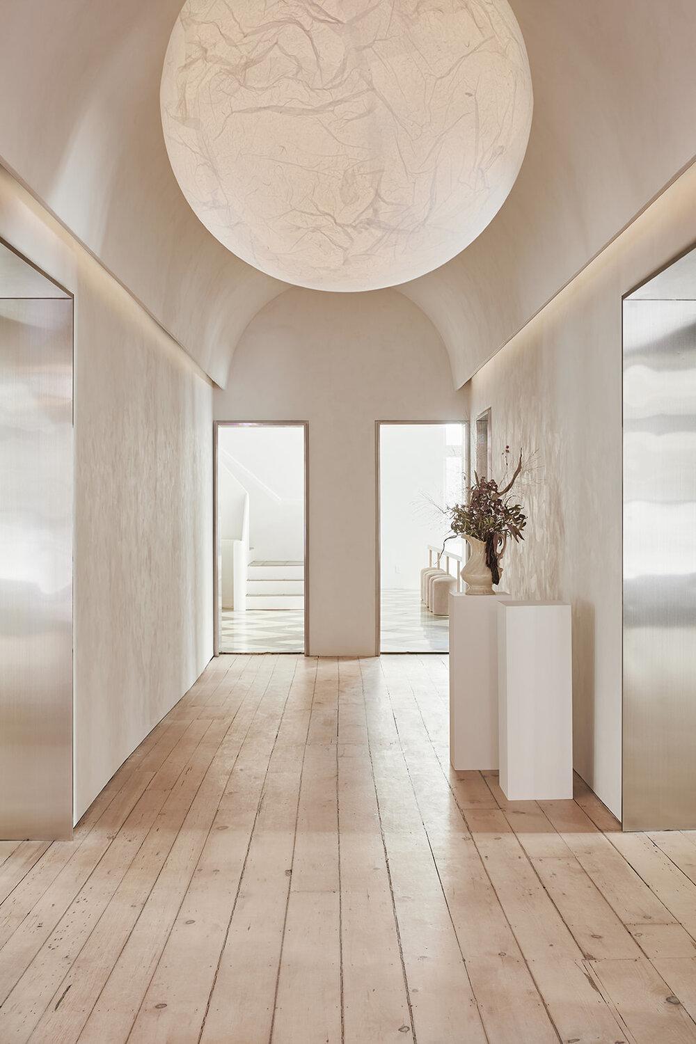
I crave calm after busy days full of work and social time (in both pandemic and non-pandemic times). This is one of the reasons why I live in a white home. The white walls, art, decor, and furniture make me feel happy and calm. Yes, I do have colour around my home, but for the most part, I live in quite a white space.
The owners and designers of these two homes – one in the country and one in the city – seem to feel the same what that I do about the beauty and peacefulness of white spaces.
Beach House Muskoka
Montreal Apartment
Azamit‘s Montreal apartment featured on House & Home; photos by Andrew Hadley
I know my posts have been sporadic these last few months, but I think my creative juices are slowly coming back, and I feel like writing more regularly again.
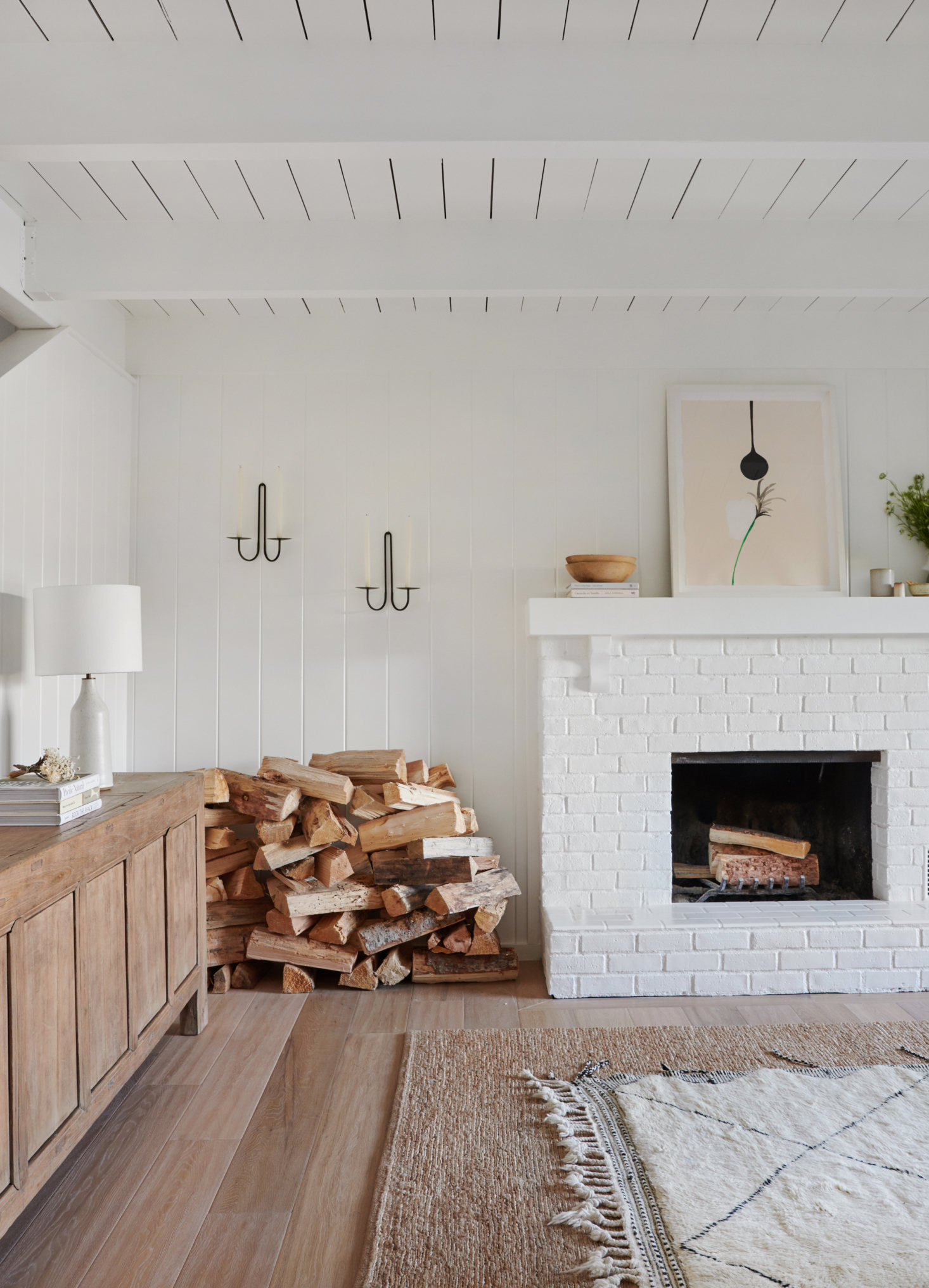
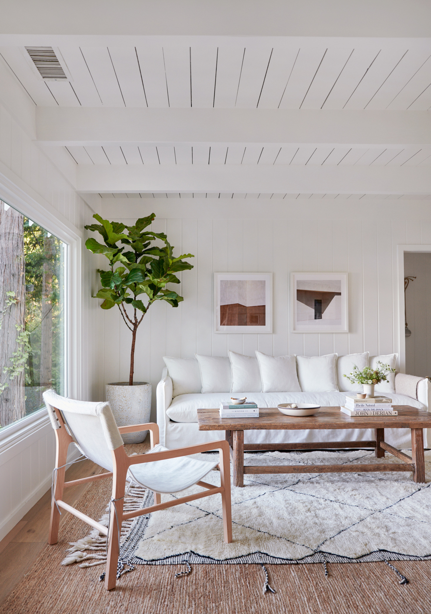
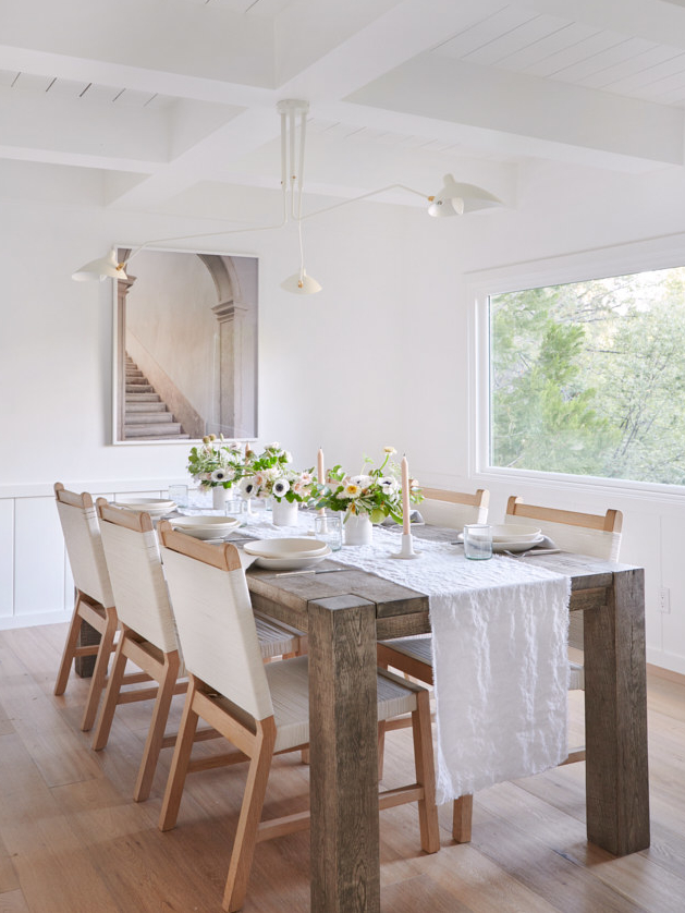
I’ve had this California home saved for a while to share, so here it is. The view from the large living room window is spectacular, and I could imagine so many lovely meals at the dining room table. Wouldn’t it be ideal if the table was always set as it is in the photo?
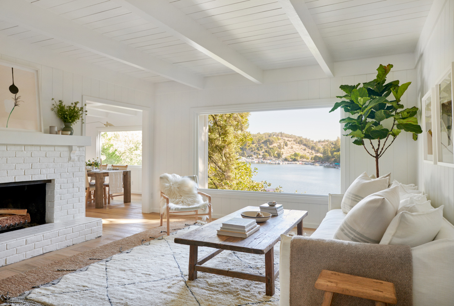
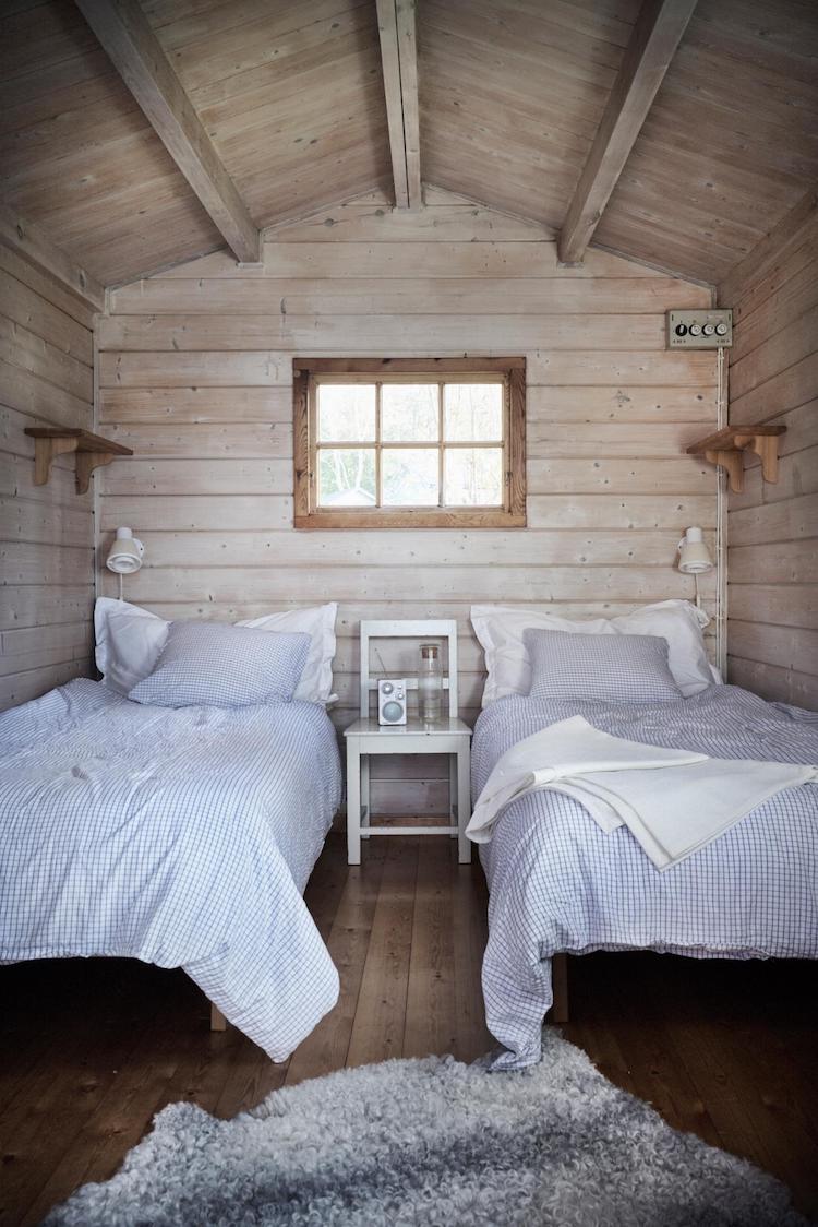
The low-rise bed in the main bedroom is waiting for someone to jump on it, I think. And the the twin room is sweet and cozy.
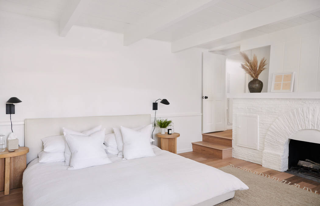
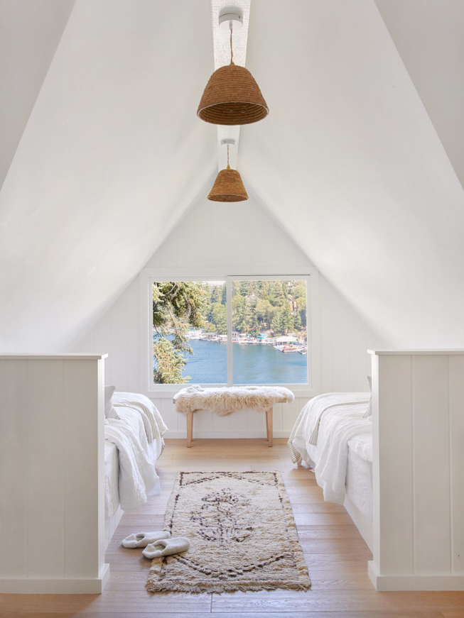
All photos via Remodelista. Photography by Tessa Neustadt. Design by Jenni Kayne.
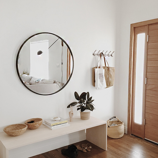
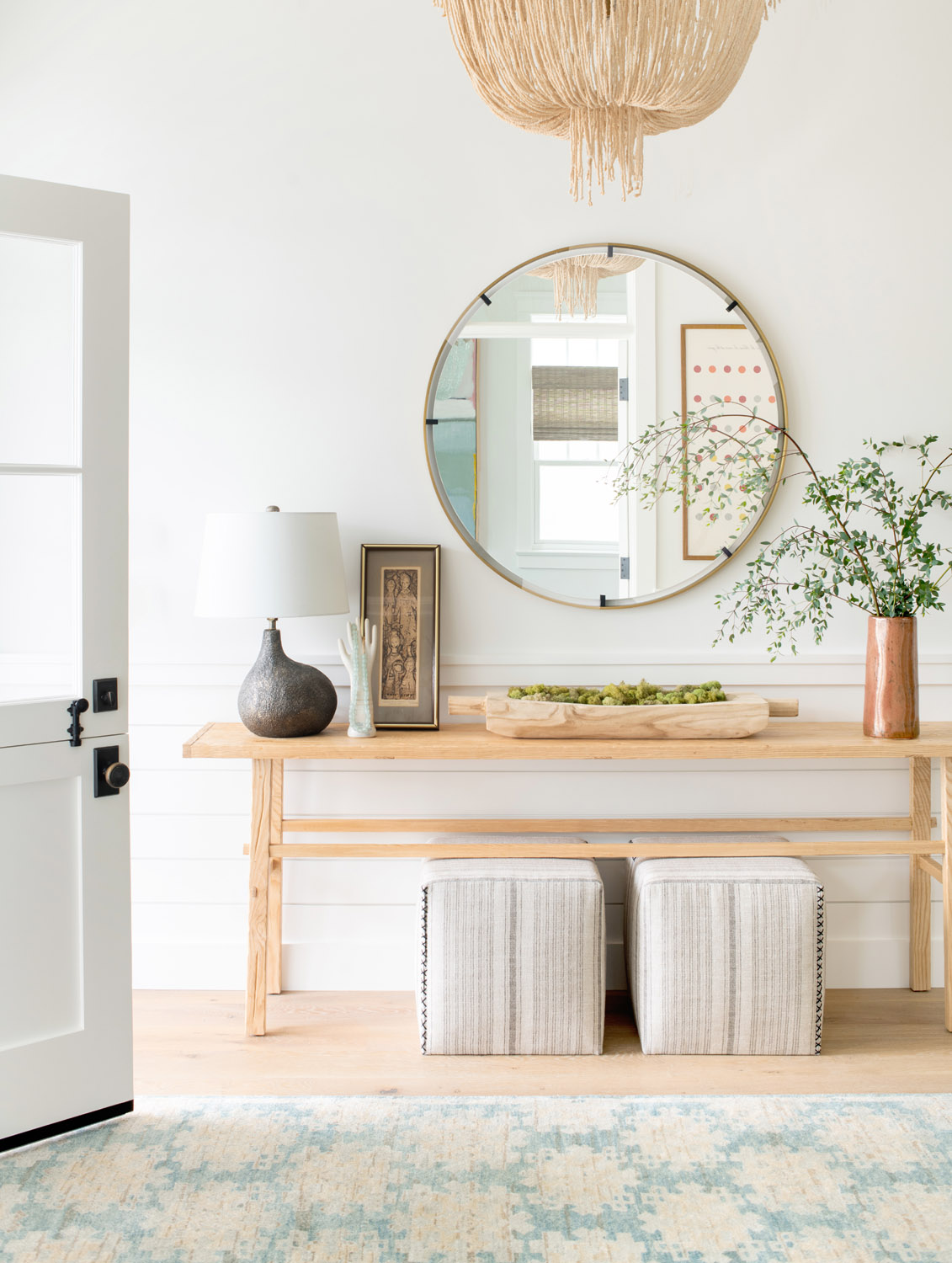
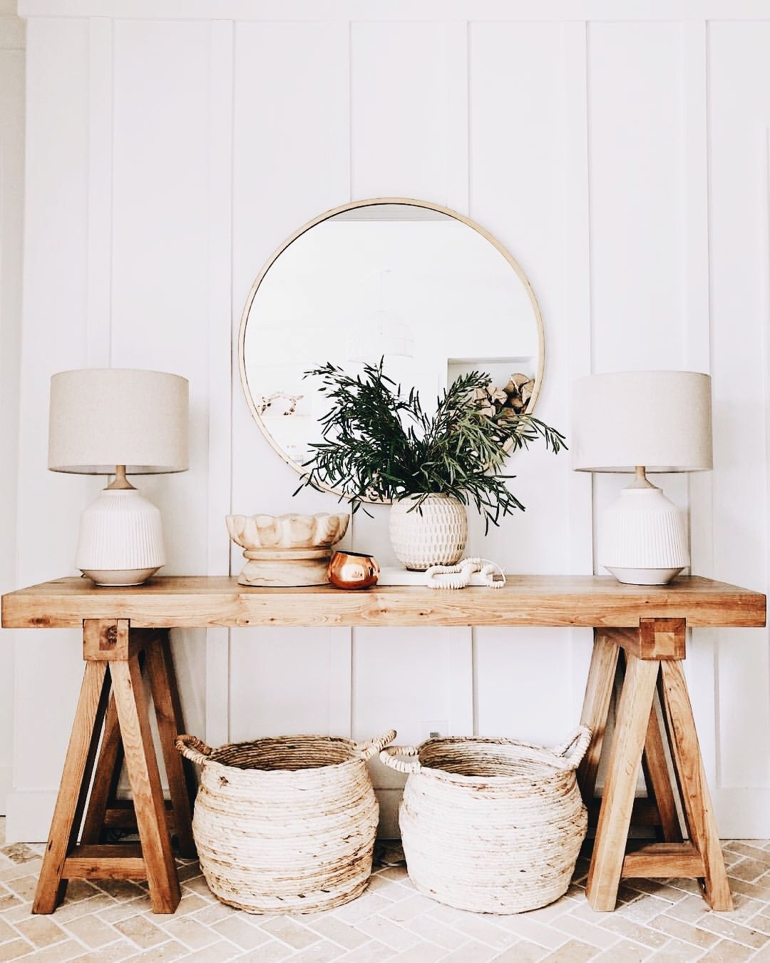
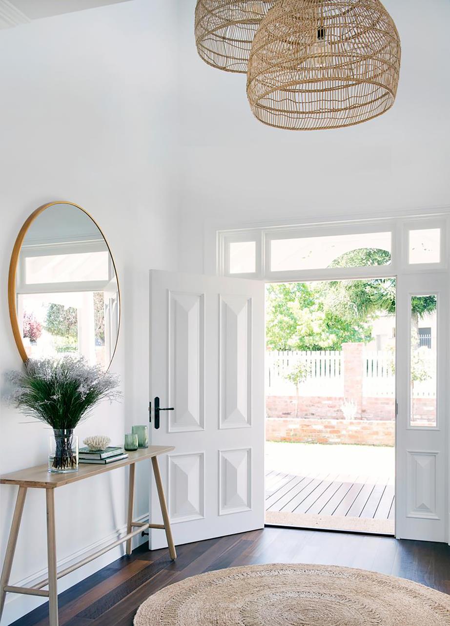
A classic, inviting, and functional foyer design generally includes a bench or console with a mirror on the wall. These foyers share common elements: a wood bench/console and a large round mirror. It’s a great combo!
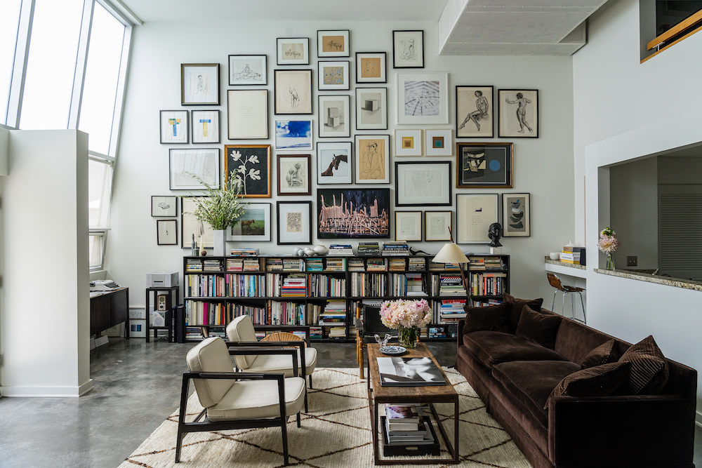
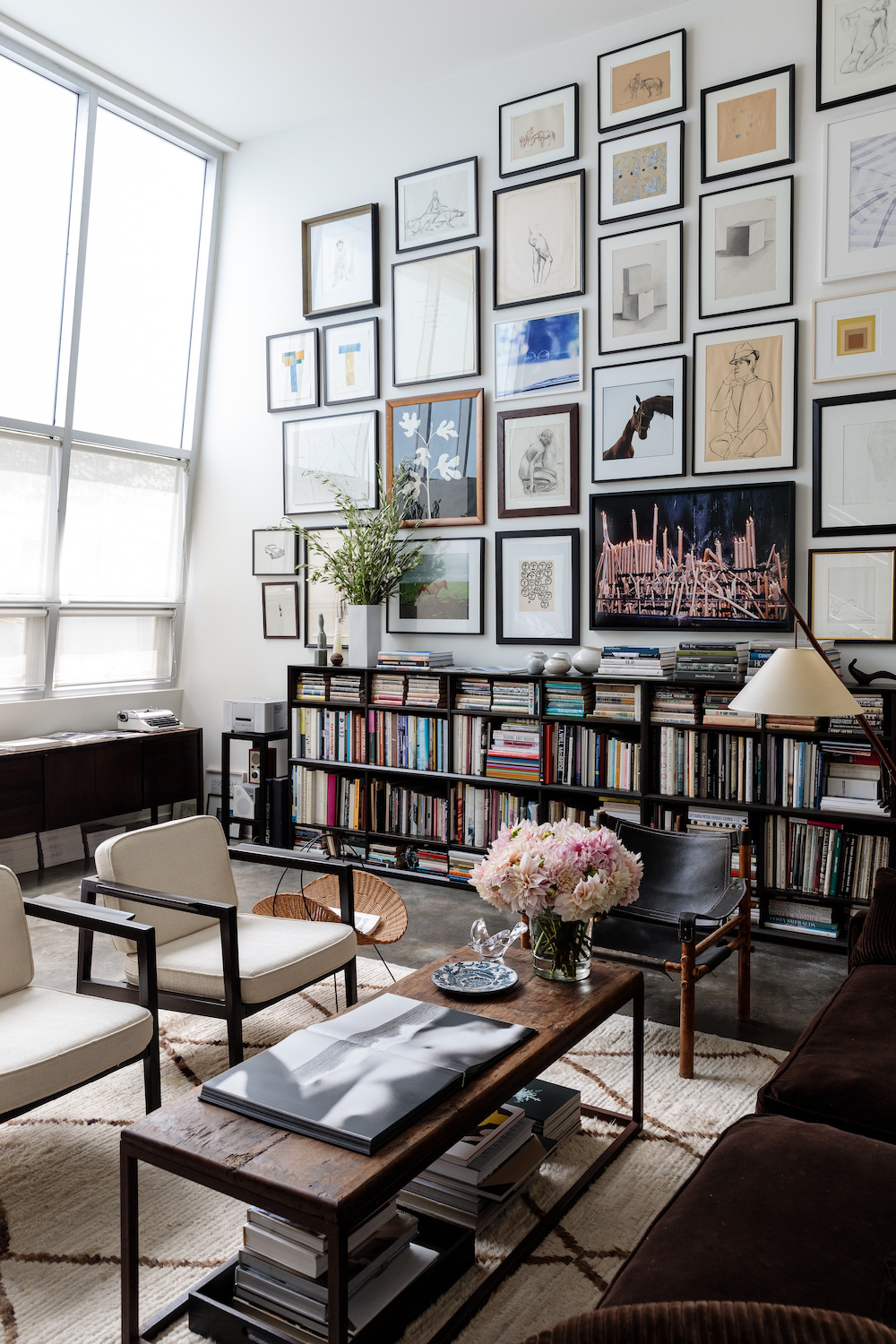
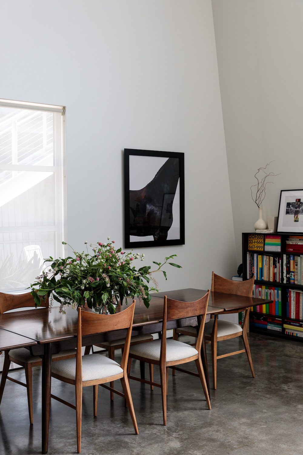
I adore Julia Leach‘s home in Los Angeles (as seen on Cup of Jo). I love homes like this one which is overflowing with books and art.
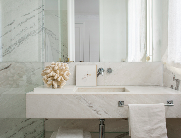
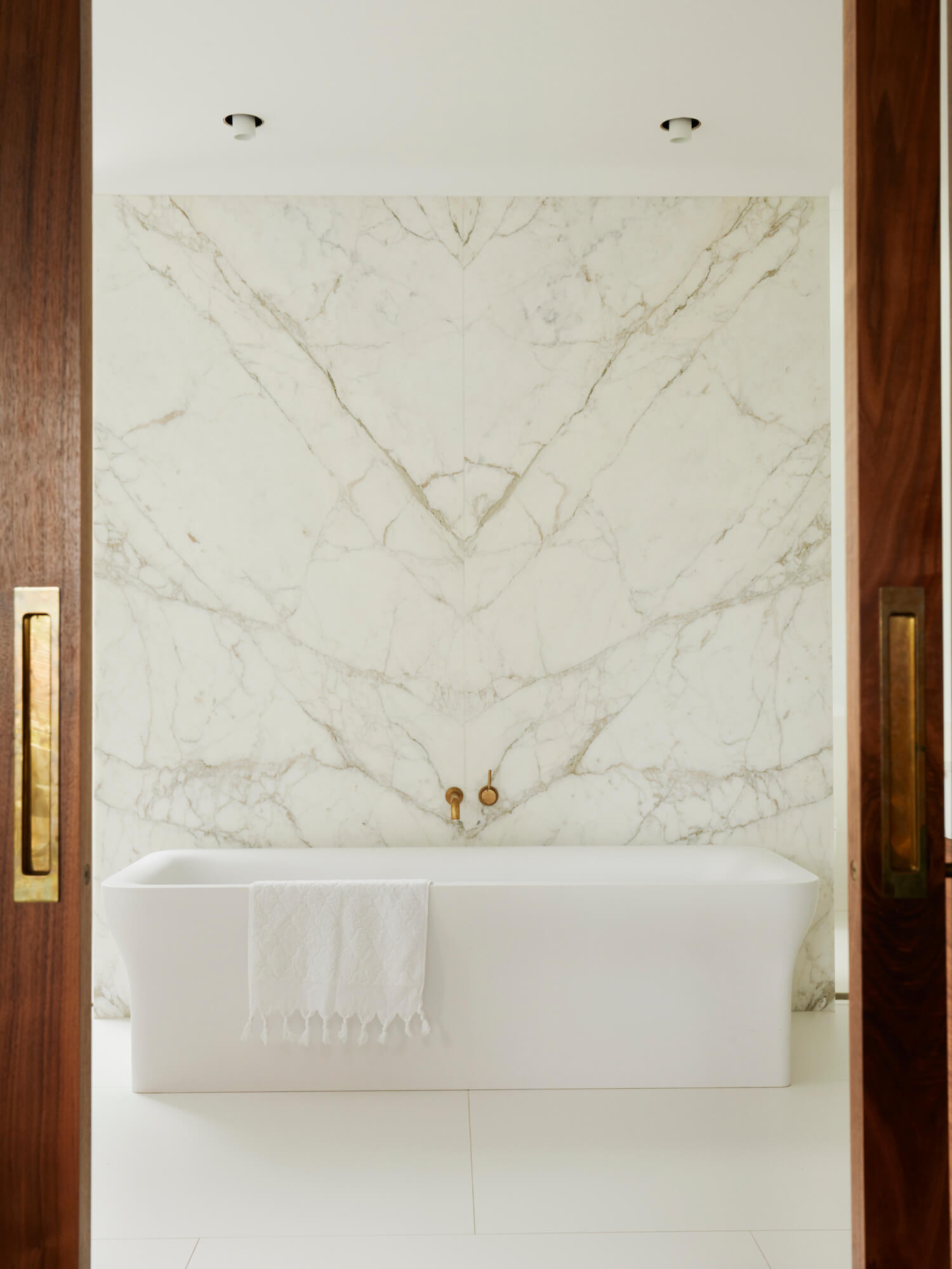
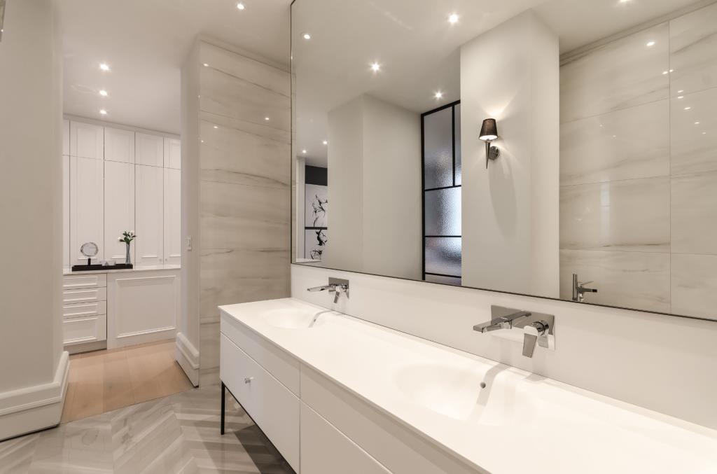
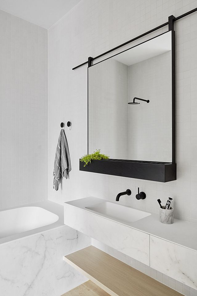
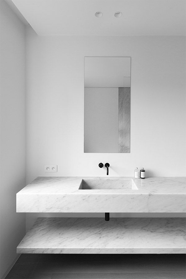
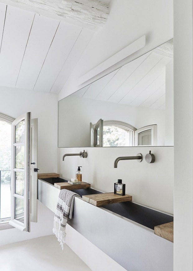
I have yet to tire of white bathrooms with lots of marble in them. If you look through my blog archives, you’ll see that I have been featuring white, marble bathrooms since I began writing about design over 10 years ago.
Large slabs of marble mean there are few grout lines and a lot of continuity. Alternatively, classic rectangular marble tiles can be laid down in a herringbone pattern (see final image below) to add more interest to a space. In my home, I have marble herringbone in my foyer and marble counters in my kitchen.
When I was in university (the first time), I spent my third year abroad in Bordeaux, France. I loved every minute of my experience there. My French improved drastically, I learned so much about the French way of living, and I met incredible people along the way. Bordeaux is a beautiful city and region. If you like wine, this is an incredible destination. The city is manageable in size, and the people are friendly (or friendlier than Paris, definitely).
I’ve only been a couple of time post-university, and each time, I have enjoyed my stay. If I get to the Bordeaux region again one day, I think I’ll have to stay at Les Sources de Caudalie. It is on a beautiful property surrounded by vineyards; it also has an exceptional restaurant and spa. And the rooms? They are unique and a pretty mix of traditional and modern.
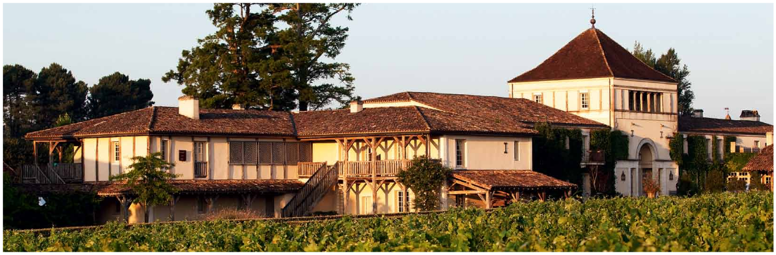
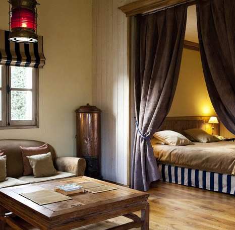
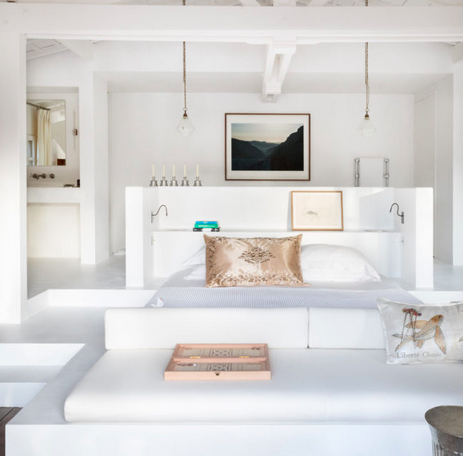
All photos from Les Sources de Caudalie. I learned about this amazing property from Daphné of Mode and the City.
I have written about terrazzo before here on White Cabana (see this post from 2018), but since it recently came up in a real life conversation, I thought it was time I bring it back up here, too.
Have a great weekend, everyone!
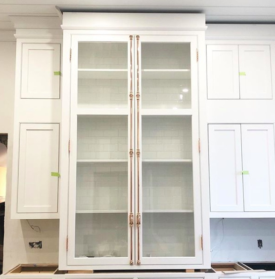
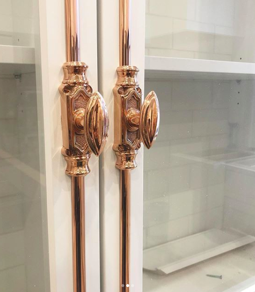
My jaw dropped when I saw these progress photos from Waterloo-based designer Kendra Bester. I think I need French door hardware in my future! (Note: This hardware is called cremone.)
Here’s another look at cremone hardware in Ellen’s kitchen.
We got hit with an awful freezing rain and snow storm yesterday, which meant that it was the perfect day to decorate my home for Christmas, drink multiple cups of tea, and take a nap by the fireplace. It was a good day.
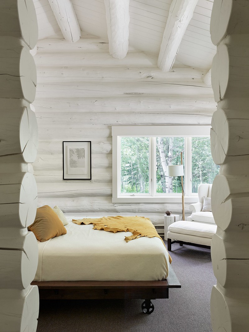
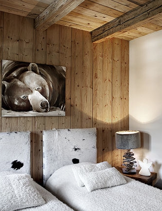
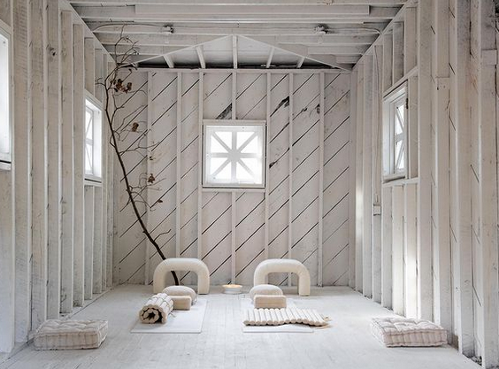
The dreary day also had me down an internet rabbit hole of cozy, white cabins. I’m a cottage person more than a cabin person, but you wouldn’t have to twist my arm to stay under soft blankets and reading all day if I had a gorgeous mountain cabin of my own!
There are several elements that these spaces share: warm white tones, textured fabrics, wood accents, and fireplaces.
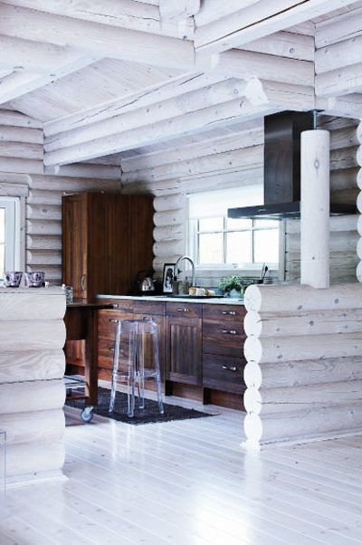
What would be your must-haves in a cabin of your own?
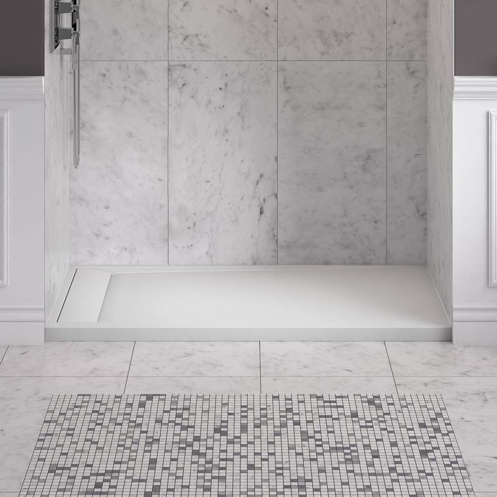
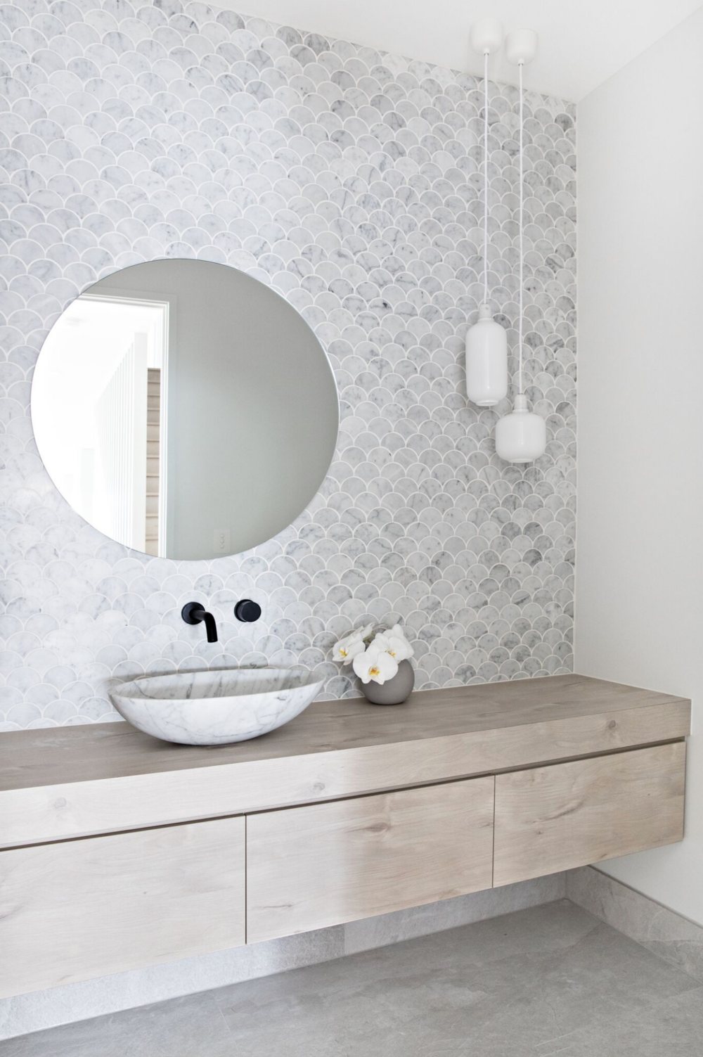
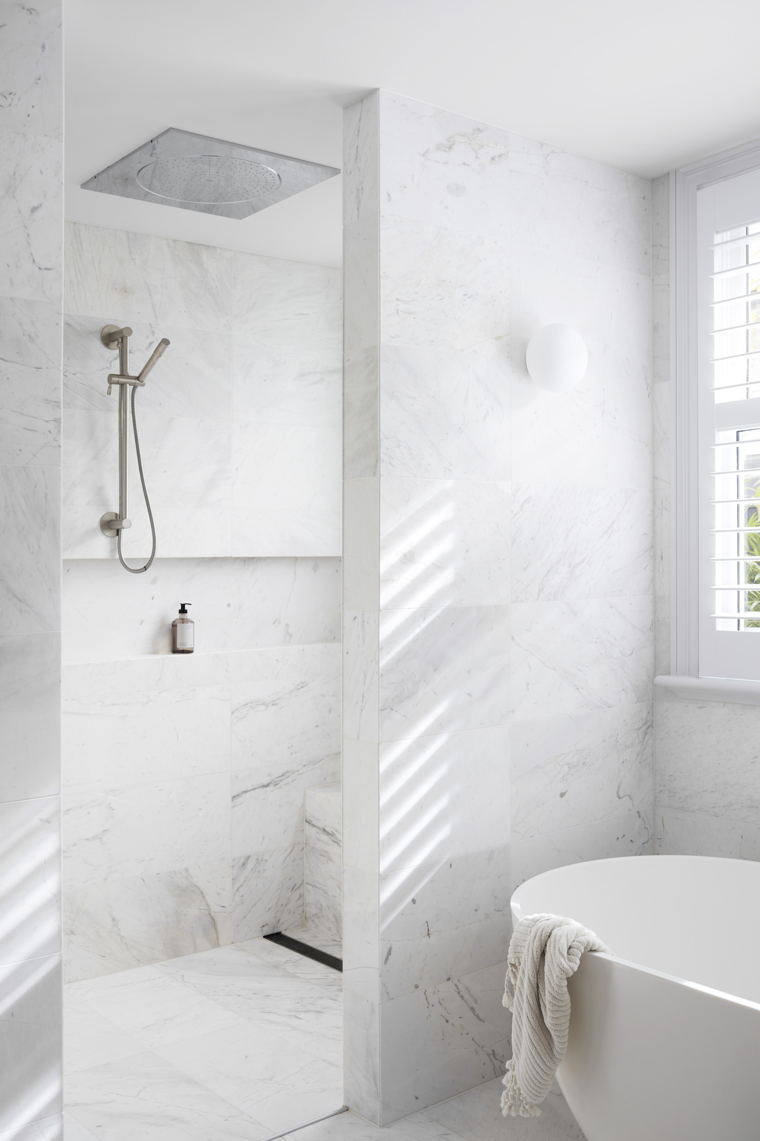
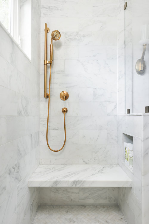
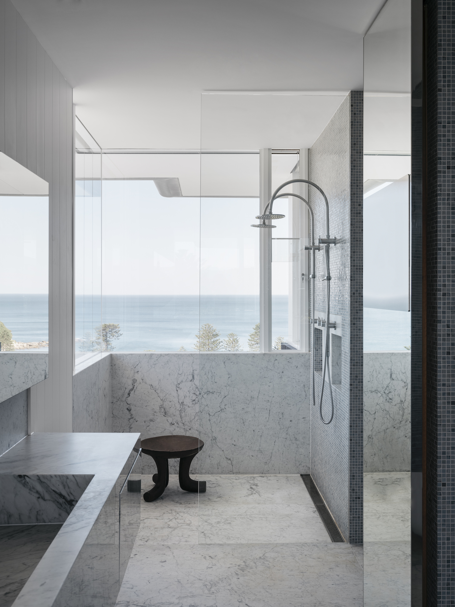
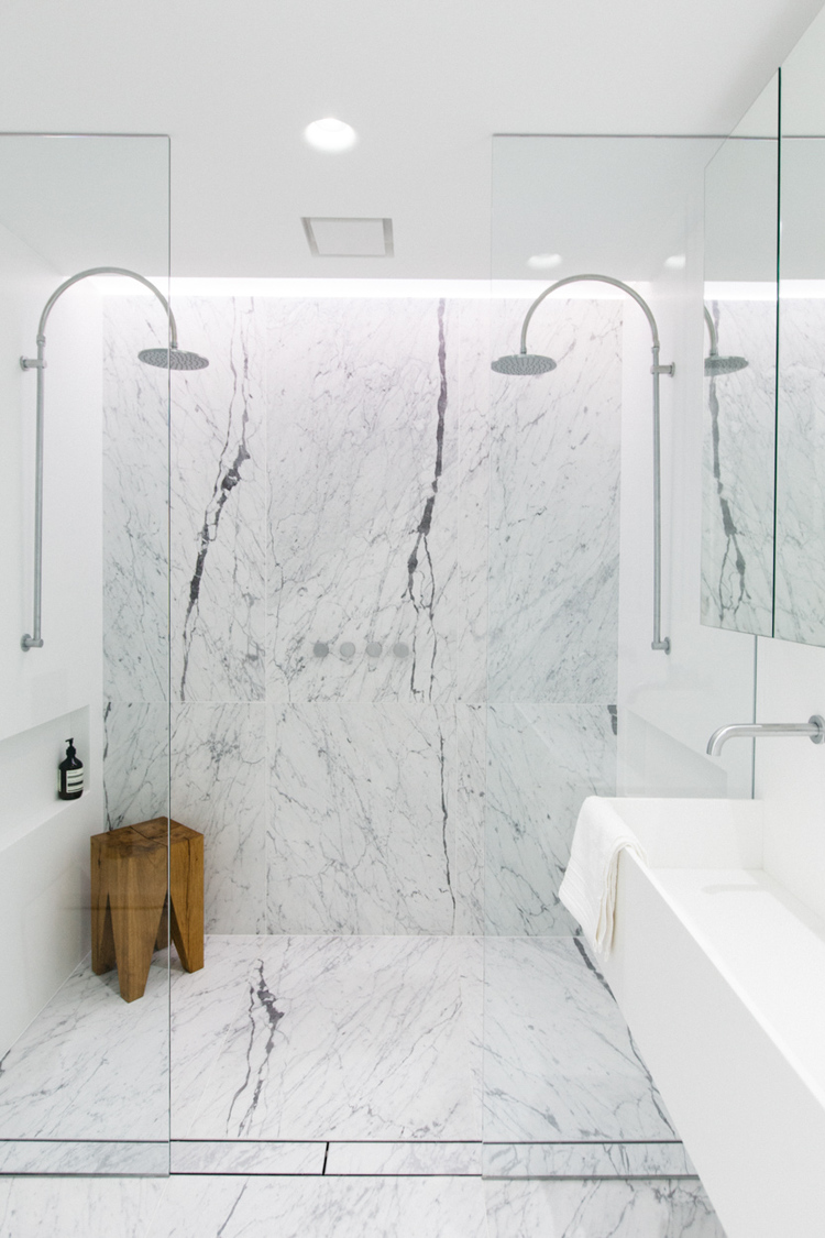
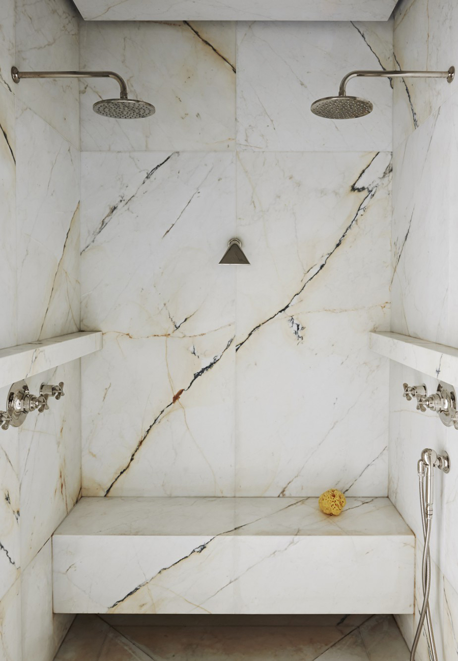
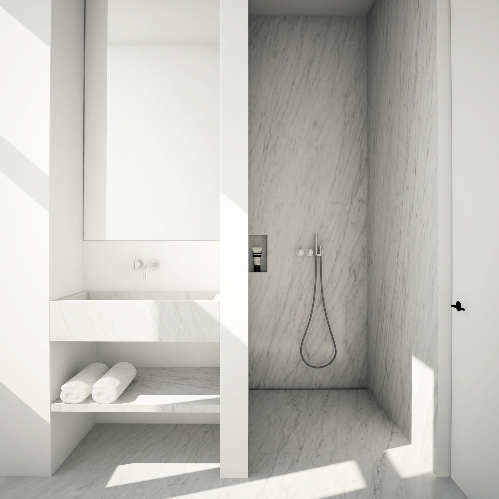
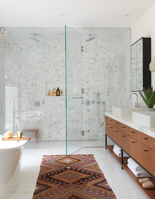
What do you get when you mix a little marble with a little shine? A gorgeous shower!
Who else has turned on the heat in their home? I tried to hold off for as long as possible, but it has been cool these last couple of weeks!
Given the change of seasons, here is today’s hot pair.
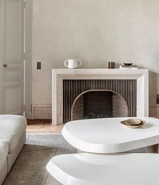
I love all the shapes in this first room. The room is balanced. The hard edges of the fireplace surround, rug, and door are balanced with the soft edges of the tables, sofa, and the accessories. The fireplace’s curved opening is balanced by the hard-edged vertical slats that frame it. It’s beautiful.
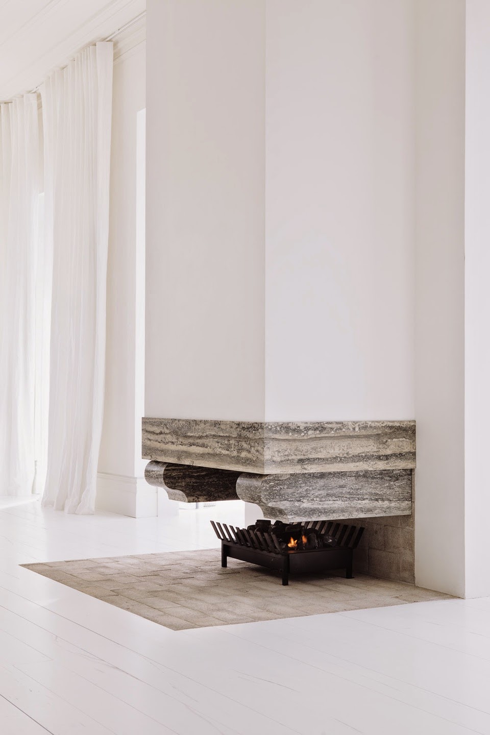
This second design is beautiful in its simplicity. The floating stone seems like an optical illusion. How does it stay up? This fireplace would heat up a room in no time since it’s open, so the design showcases a great pairing of function and form.
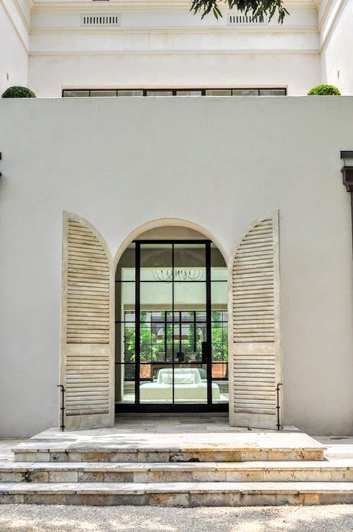
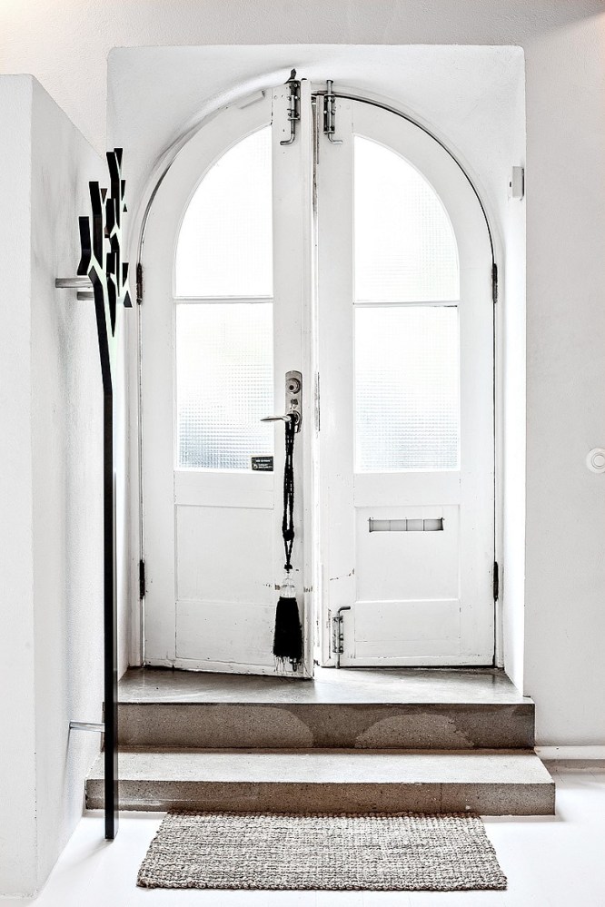
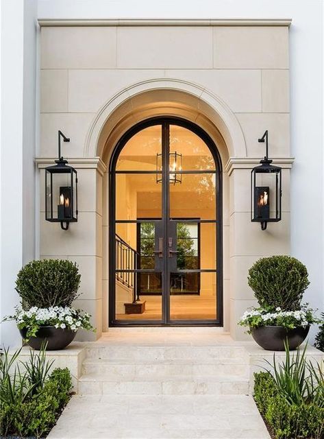
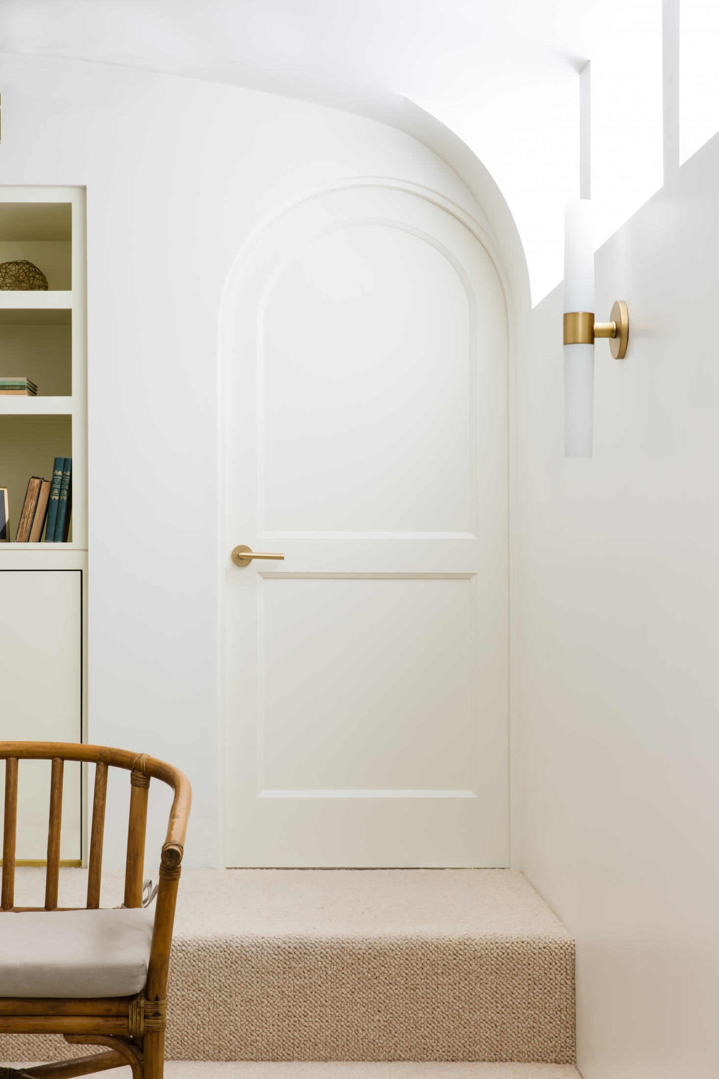
When I move to Italy or France in the future, I hope to have a place with at least one curved door/doorway. The same goes for my future potential cottage. A curved doorway would put a smile on my face.
The September issue of Style at Home magazine arrived this week, and one of my favourite features in this magazine is the high-low article. In this issue, the Style at Home team designed two versions of an office – high/low, of course!
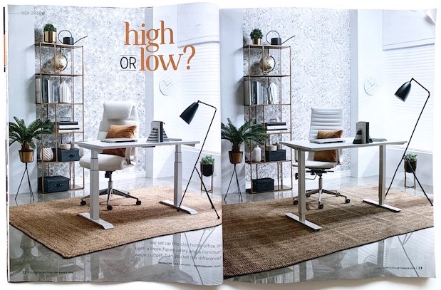
Before you scroll down, make your guess!
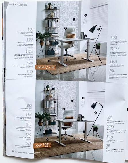
Did you guess correctly? What gave it away? The rooms are so similar, so it’s definitely hard to decipher between the two! I usually look at the lighting to help me determine which room is high and which one is low.
In this feature, the magazine writes, “We set up this chic home office on both a three-figure salary and a minimum wage budget.” You know I love Style at Home, but I have an issue with this statement. First, what’s a three-figure salary? Should it be a six-figure salary? Also, if you earn minimum wage ($14/hr in Ontario) and work 40 hours a week, your weekly earnings (before tax) is $560. Would you really then spend nearly $1000 for a home office?
So I wondered if it was possible to design a similar room at an even lower cost. When I spotted an $80 vase in the low version (compared to a $60 version in the high?), I thought I could do better. So I took on the project, and here’s what I came up with.
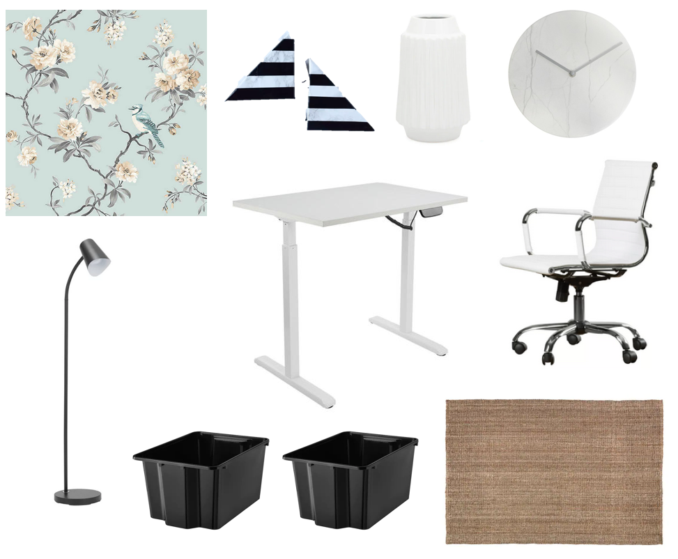
The total cost for this “extra low” version is $674 CAD. I know I could create an even lower cost version if I was shopping in actual stores (including second hand) rather than doing my shopping in online shops only. In this design, it was especially challenging to find a more affordable rug, so I opted for a slightly smaller size than the ones featured in the magazine.
I’ve been thinking about cottages for years now. I want one. I want to design one. Want. Want. Want. Yes, it’s true. I am back to dreaming about a cottage. These dreams are especially strong after spending the last two weekends at two friends’ cottages in two opposite ends of Ontario. My friends’ cottages are charming and have that cottage smell that I would love, too (not the musty cottage smell…the “come in, relax, take a load off” smell).
With the dreams, naturally, comes the design! Of course! Here’s what’s currently on my cottage design wish list.
The cottage would be small and cozy. It would have rocking chairs on the porch. I’d rock there with a cup of coffee in the morning. I could be lazy since I’d be on cottage time.
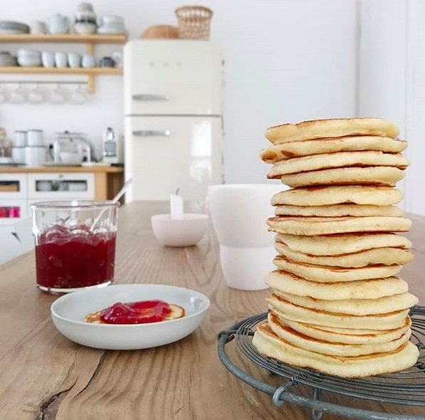
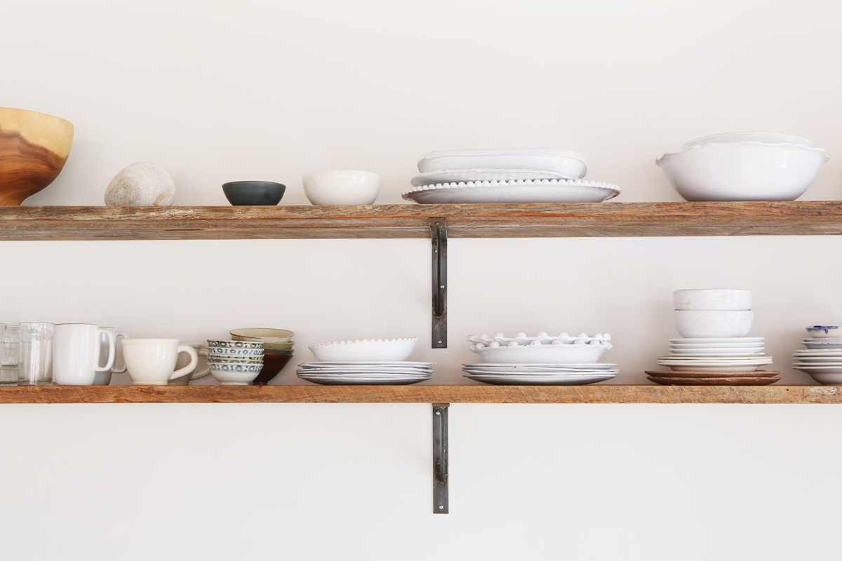
The kitchen would have some open shelving for dishes, serving pieces, and art. I’m not normally a fan of open shelving, but I think it’s a good option for a cottage kitchen (or at least part of it).
I would make stacks of pancakes for guests because a stack of pancakes looks so pretty.
The bedroom(s) would be sparse. A bed, a nightstand, and that’s about all.
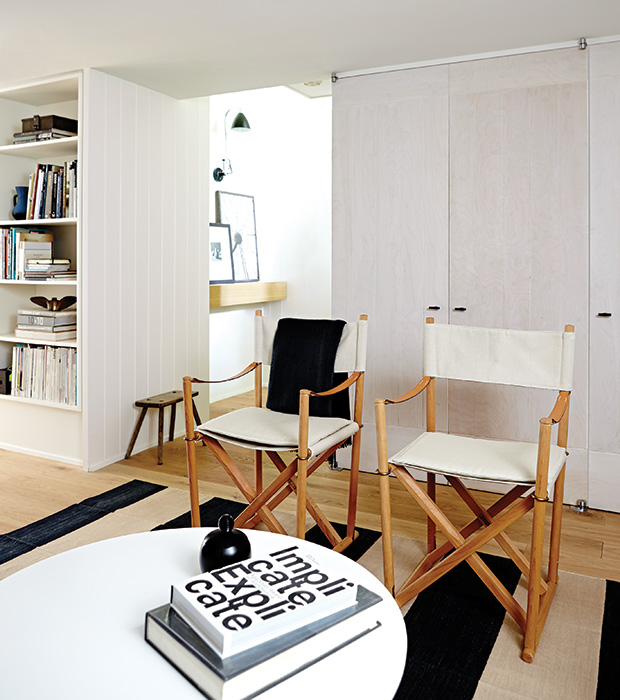
The bedroom(s) would have vintage director chairs. There would be extra director chairs in the cottage that would fold neatly for storage, but could come out for extra seating.
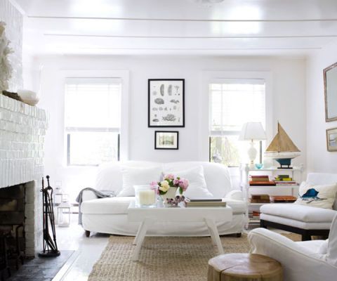
The living room would have couches you could sink in to with slipcovers for easy care.
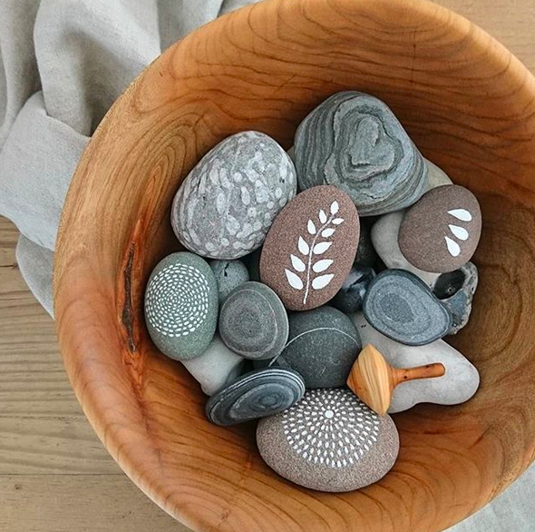
I don’t think I’d use blue as an accent colour. I’d use shades of white. Maybe grey. Even a touch of black. I’d have rocks in every shade in bowls around the cottage with white and grey paint available for guests to get creative.
Blankets would be in abundance for year-round cottage going.
And there would be a fireplace, too, for winter living.
The bathroom would be minimalist and white, white, white.
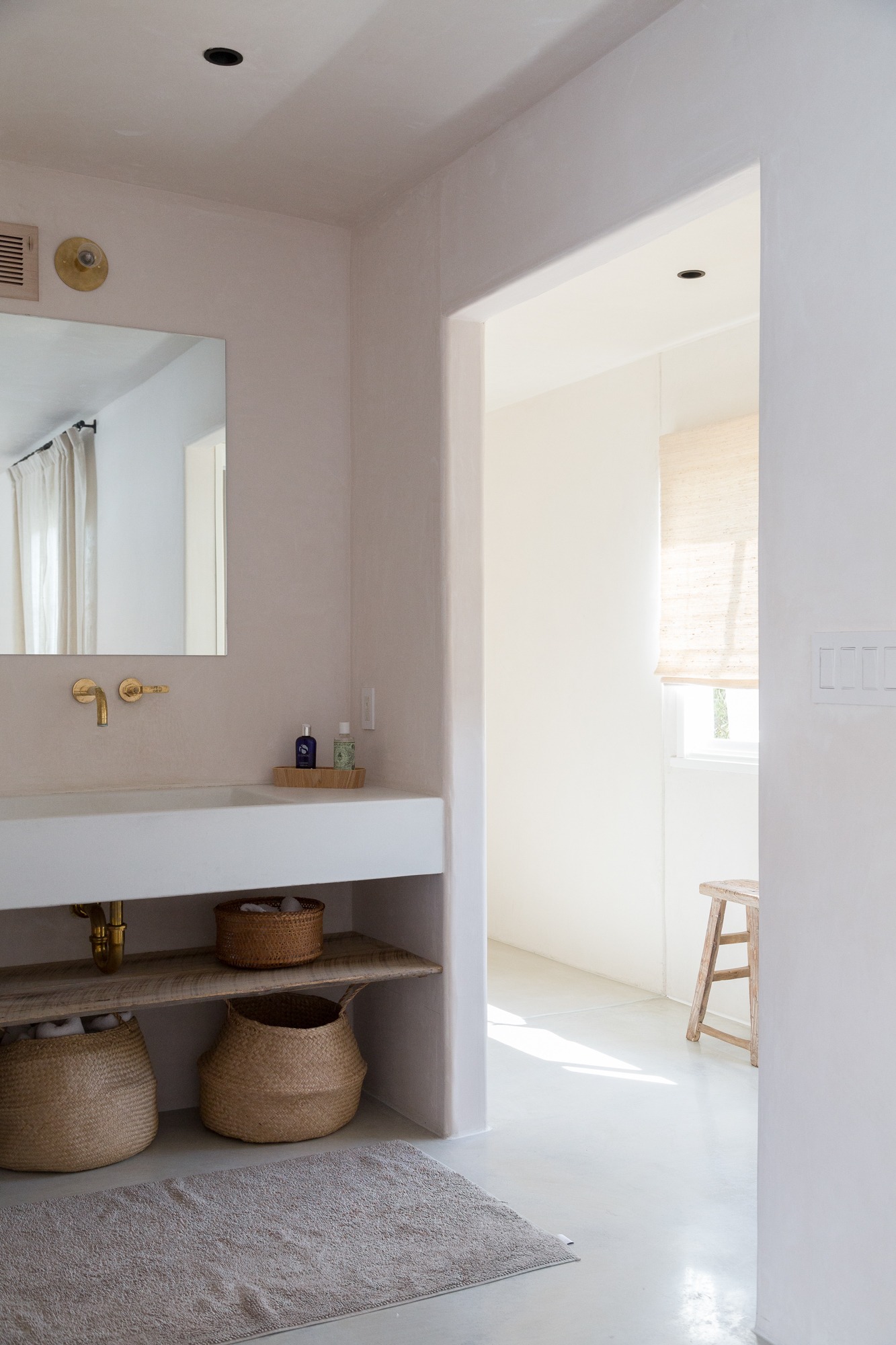
There would be wicker baskets placed strategically so I could easily grab them to load them up with market purchases or beach necessities.
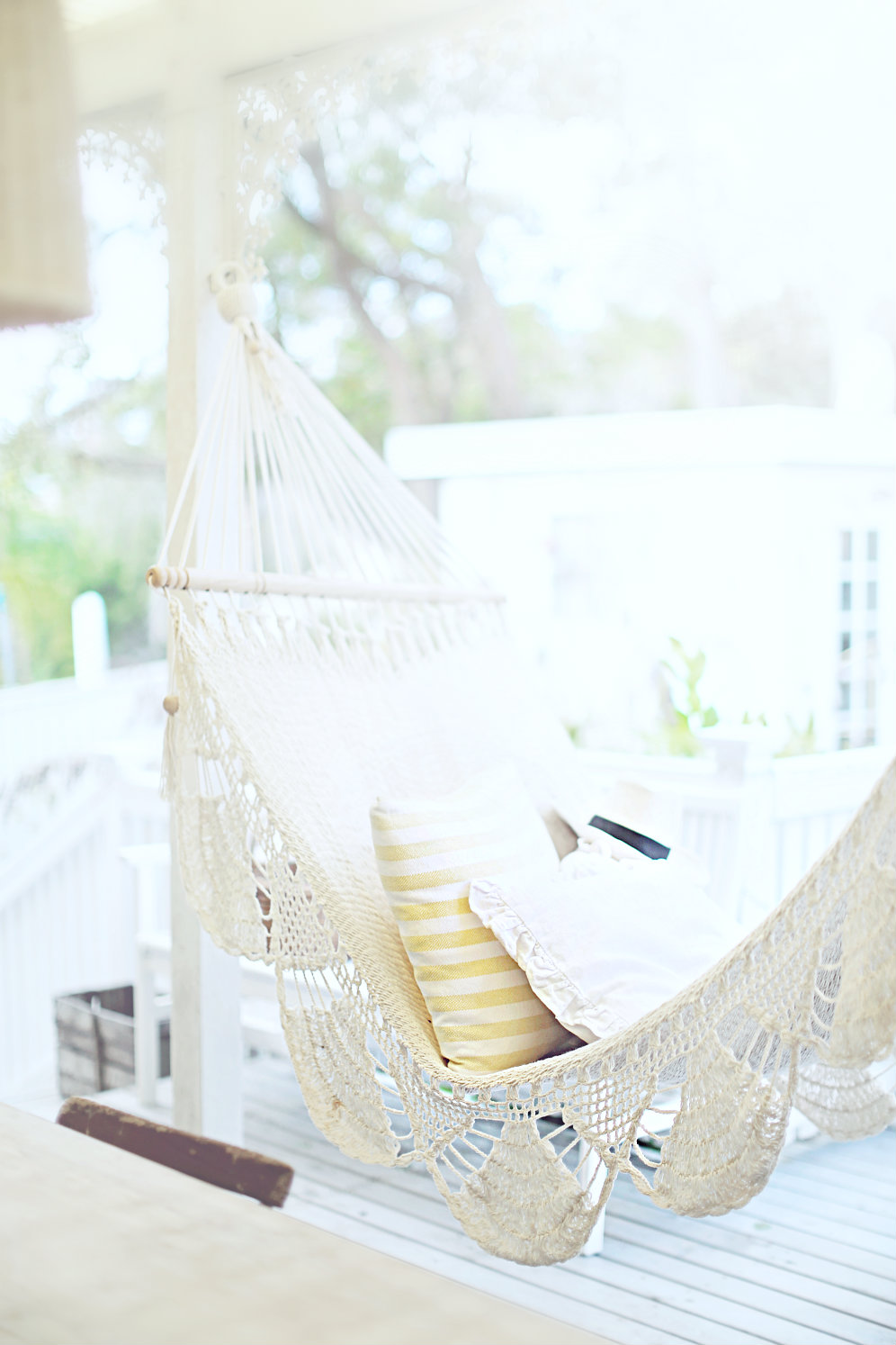
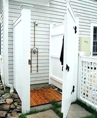
I would have an outdoor shower because it seems like the best place to wash off sandy feet.
I’d also have an outdoor hammock for afternoon naps.
Books and magazines would be piled everywhere.
And I’d end evenings with an outdoor fire.
These are just a few of the design details I’m dreaming up for my future cottage! Do you have a cottage? Do you want one?
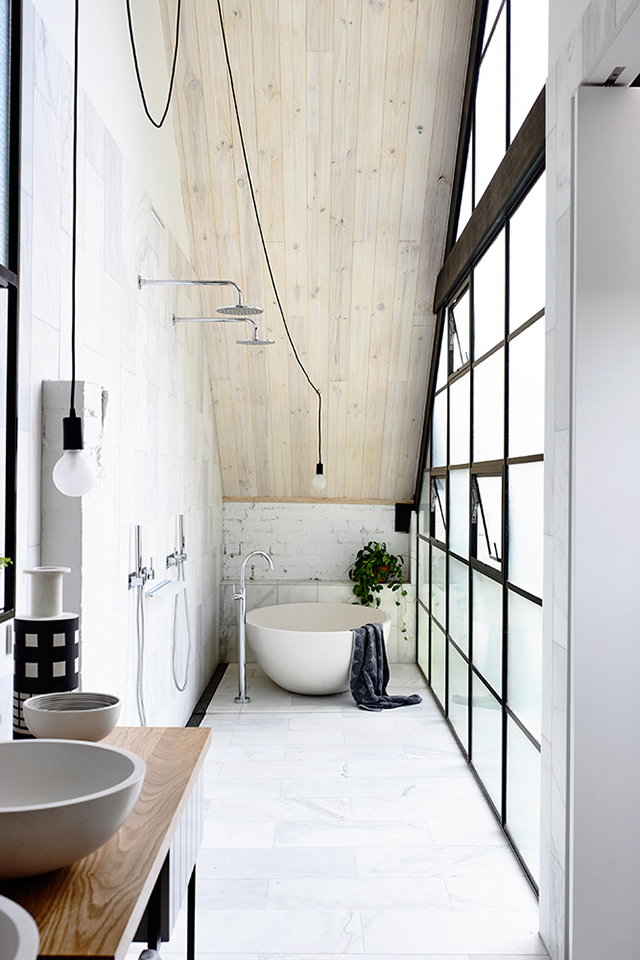
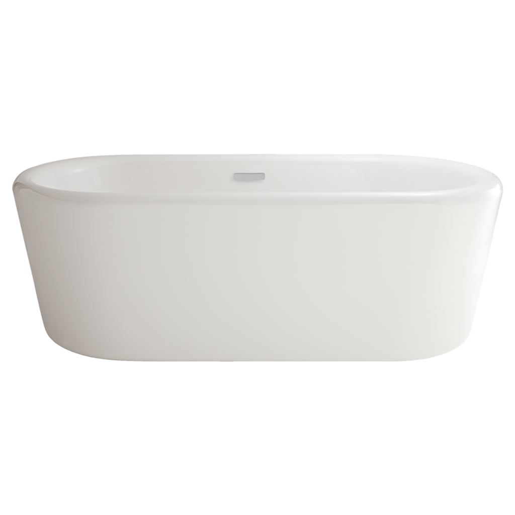
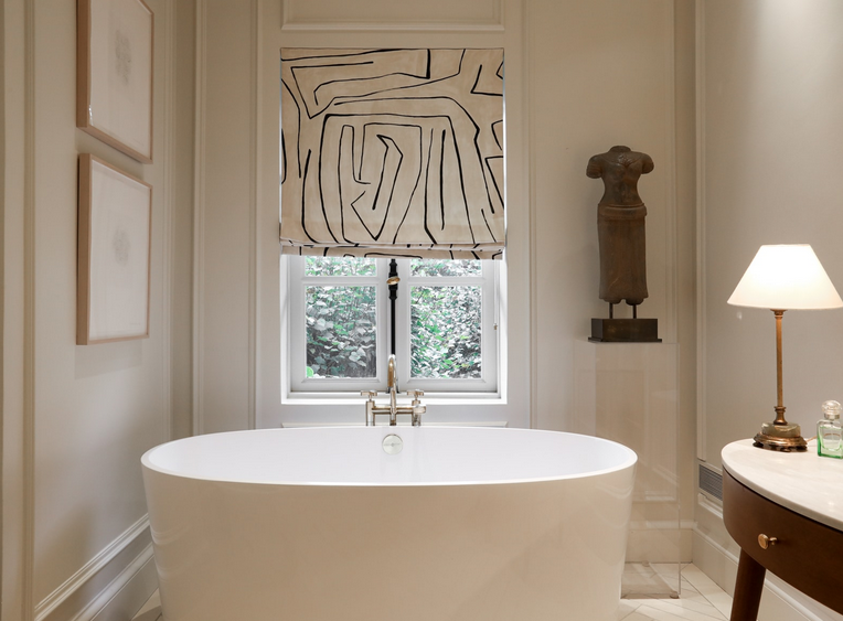
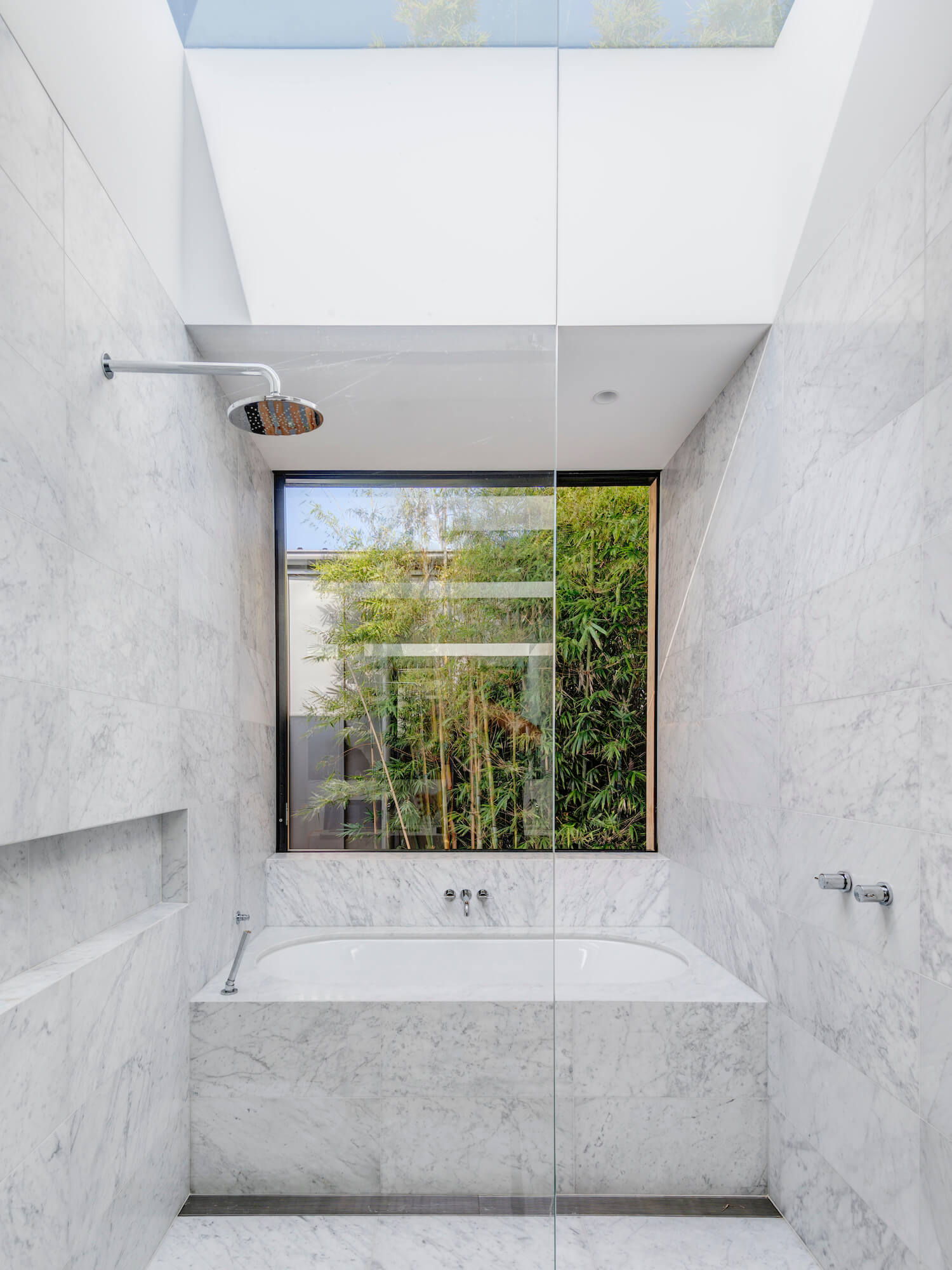
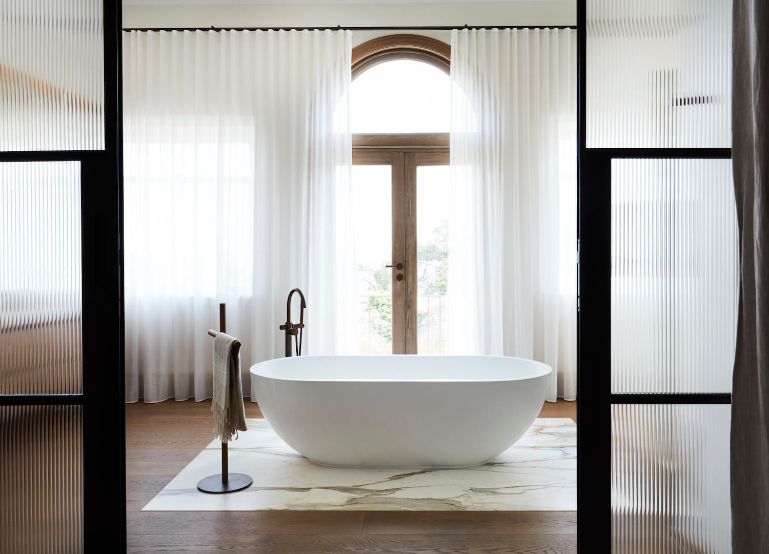
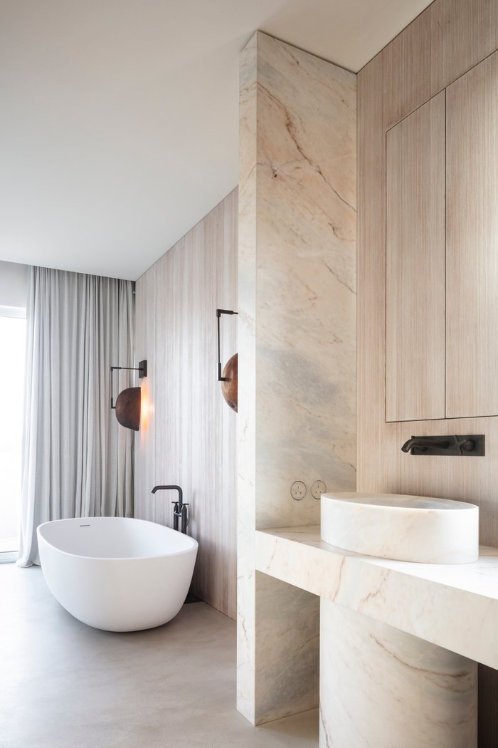
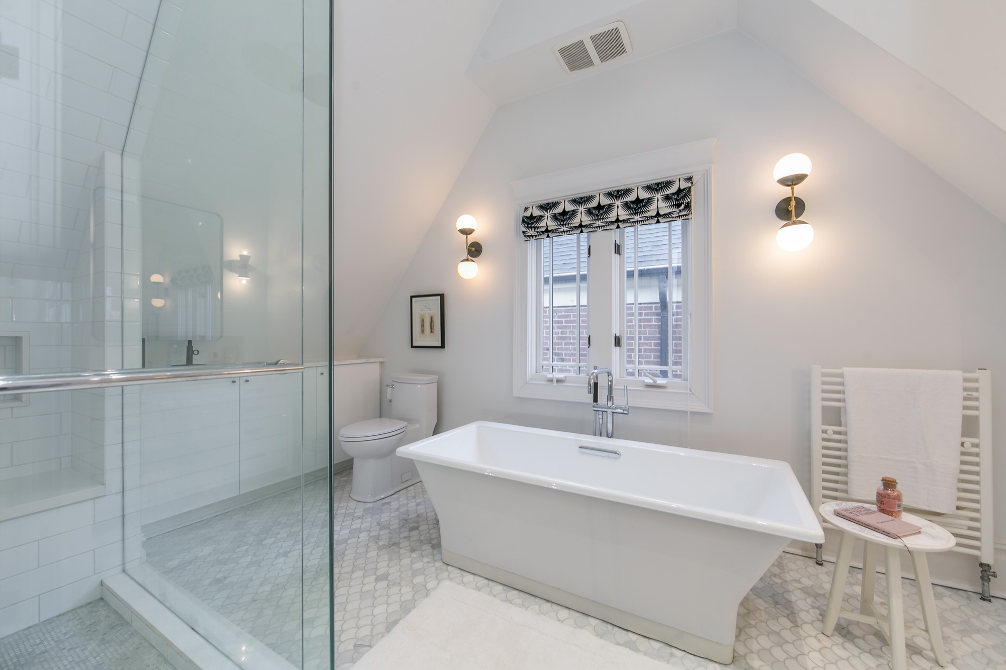
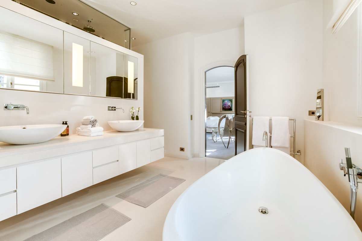
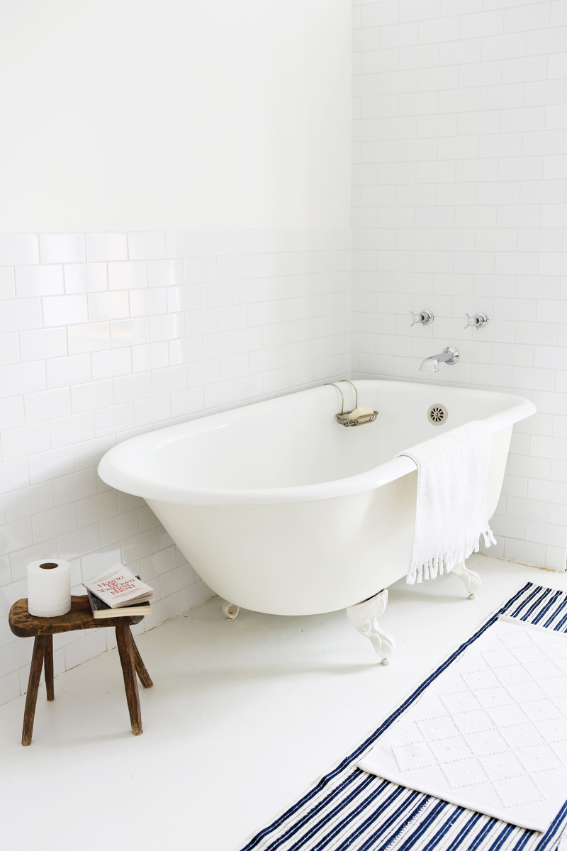
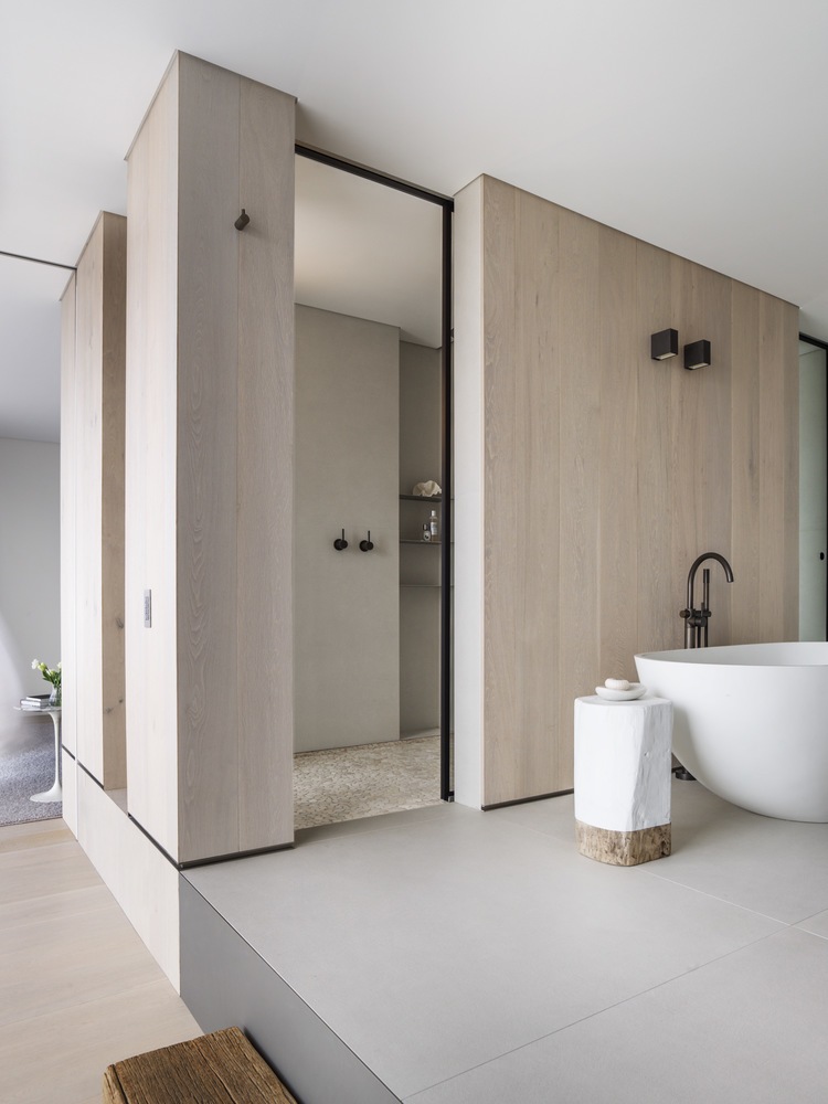
I love these bathrooms with their freestanding bathtubs.
When I find a neighbourhood that I like when I travel, I tend to look online at real estate websites. Does anyone else do this? I guess I’m curious about the real estate market and the design of homes. I think I also have the “Where could I live if I moved here?” question in my mind, too. You know how it is, right?
On my recent trip to Montreal, I became most curious about real estate in the Outremont area. Here’s one condo that has me dreaming of moving to Montreal and living the luxe life!
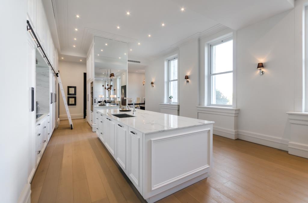
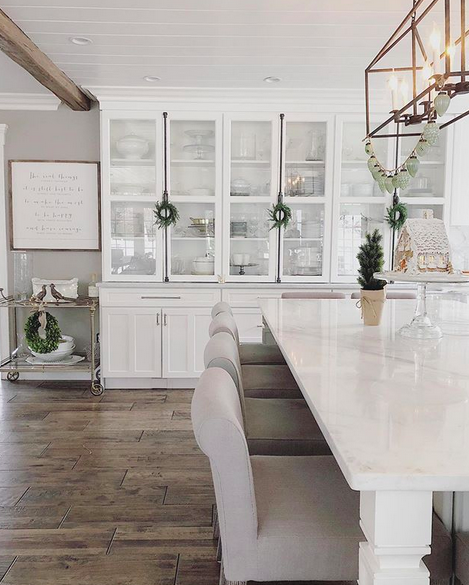
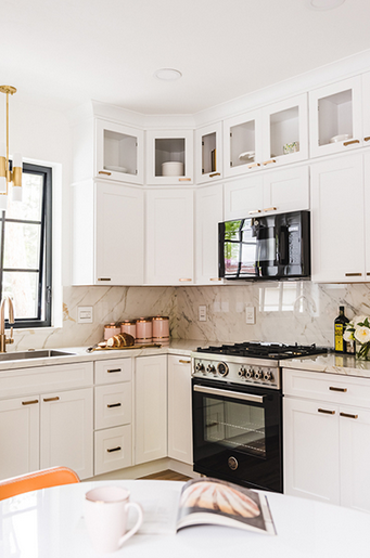
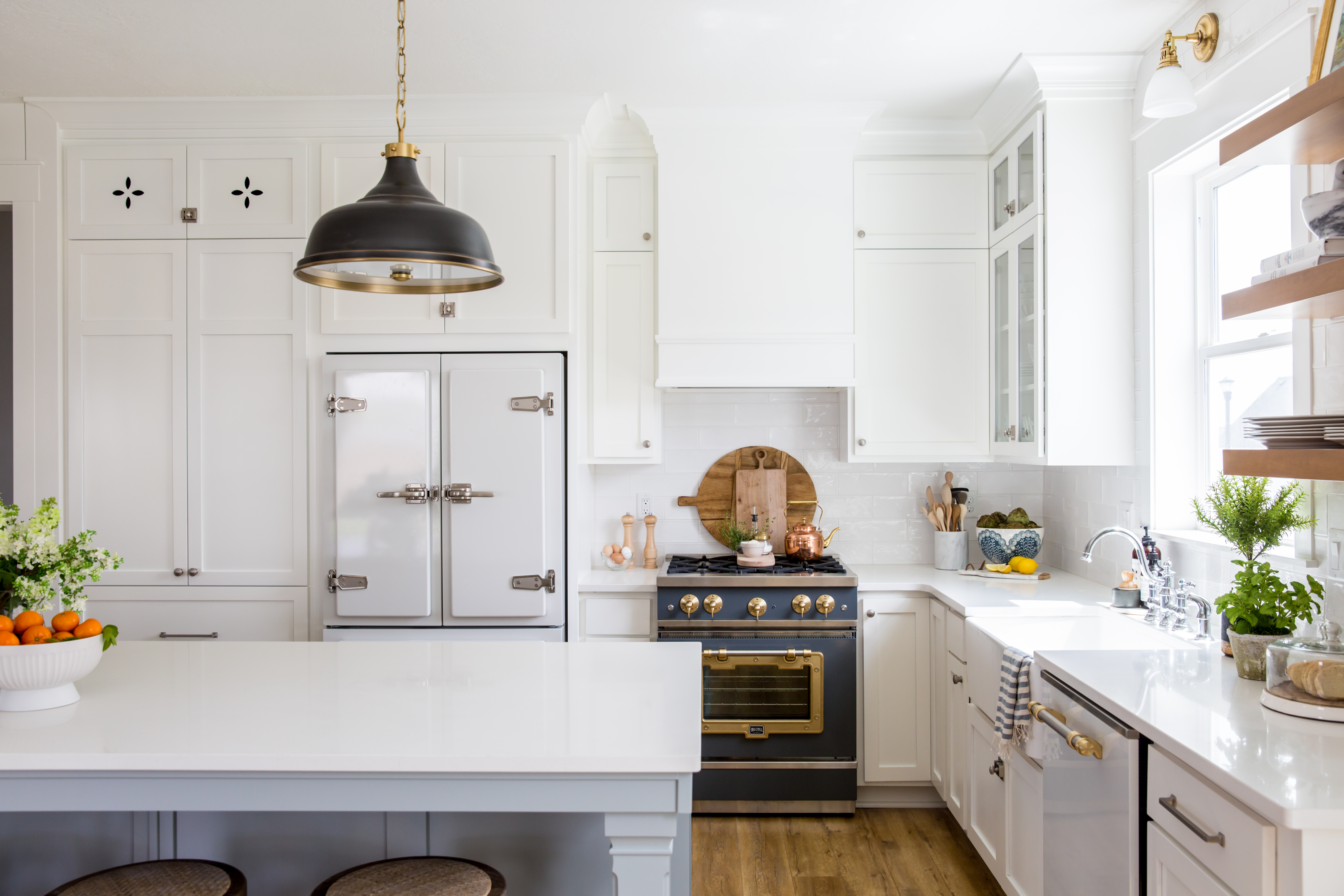
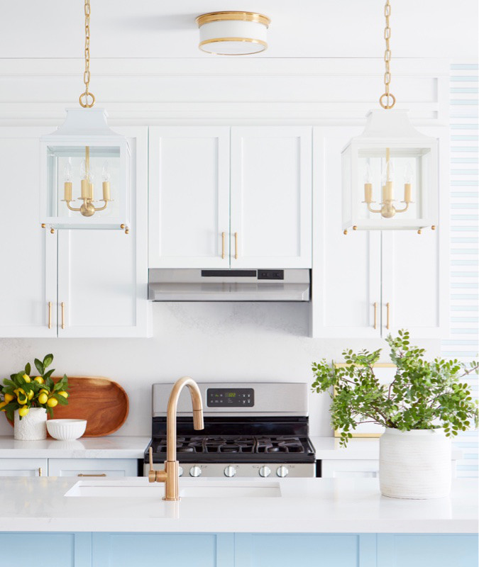
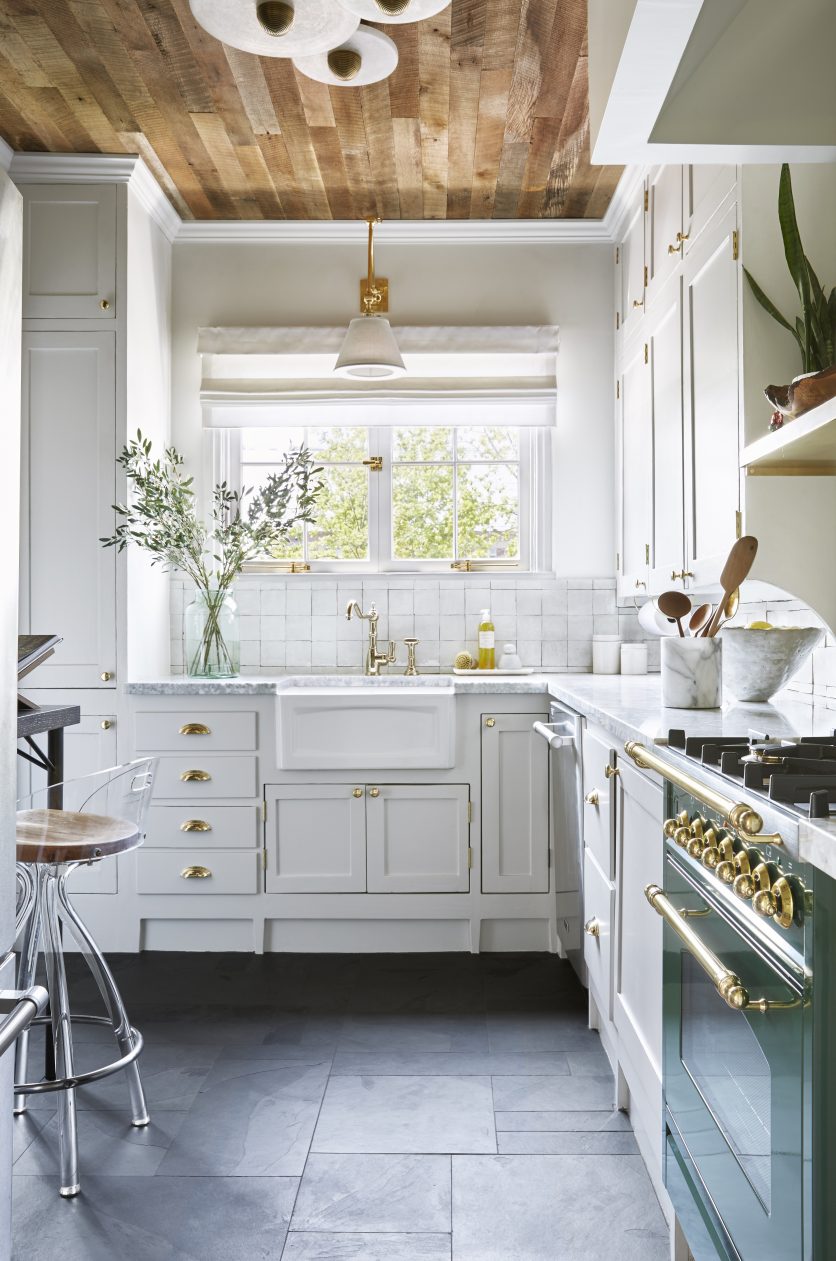
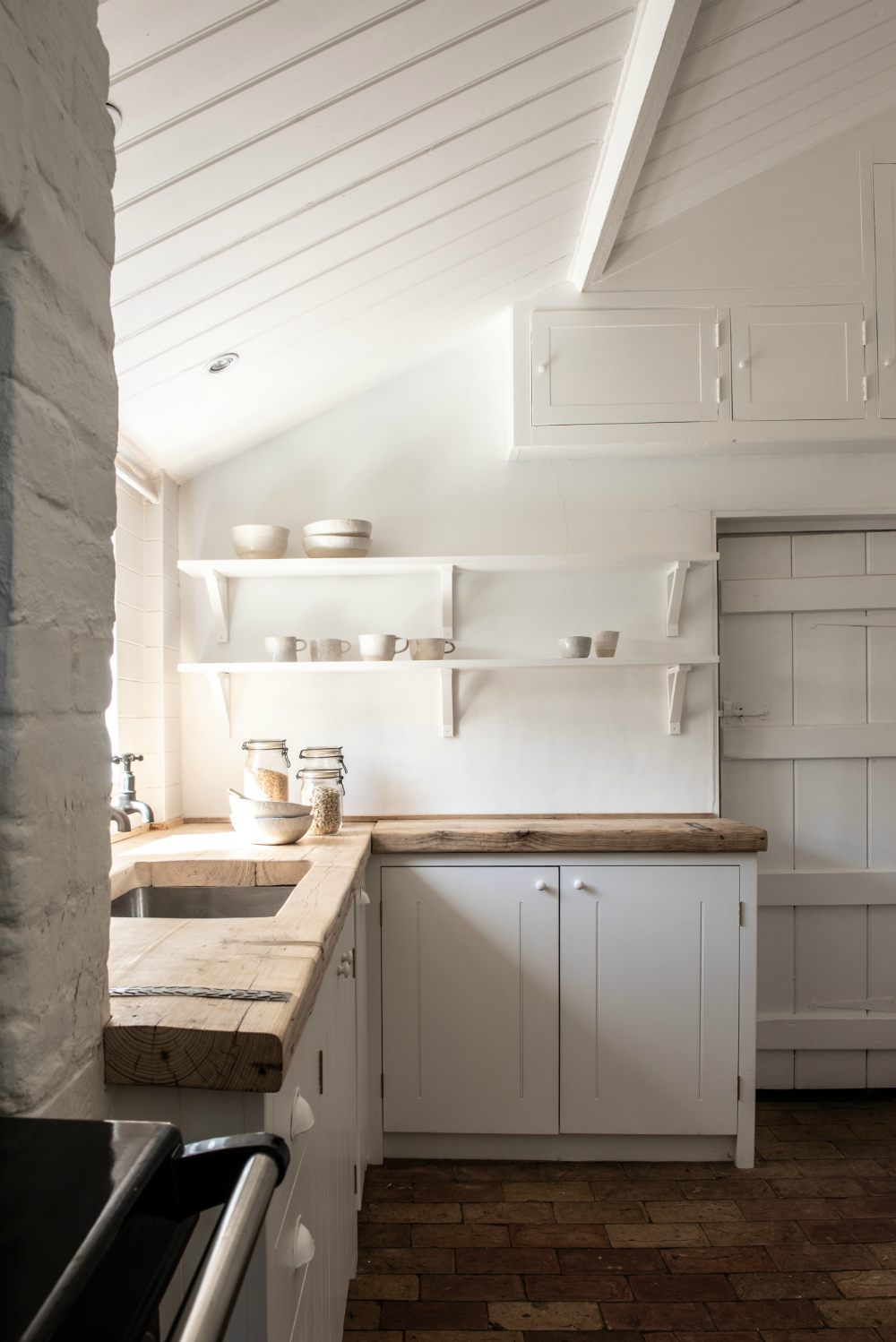
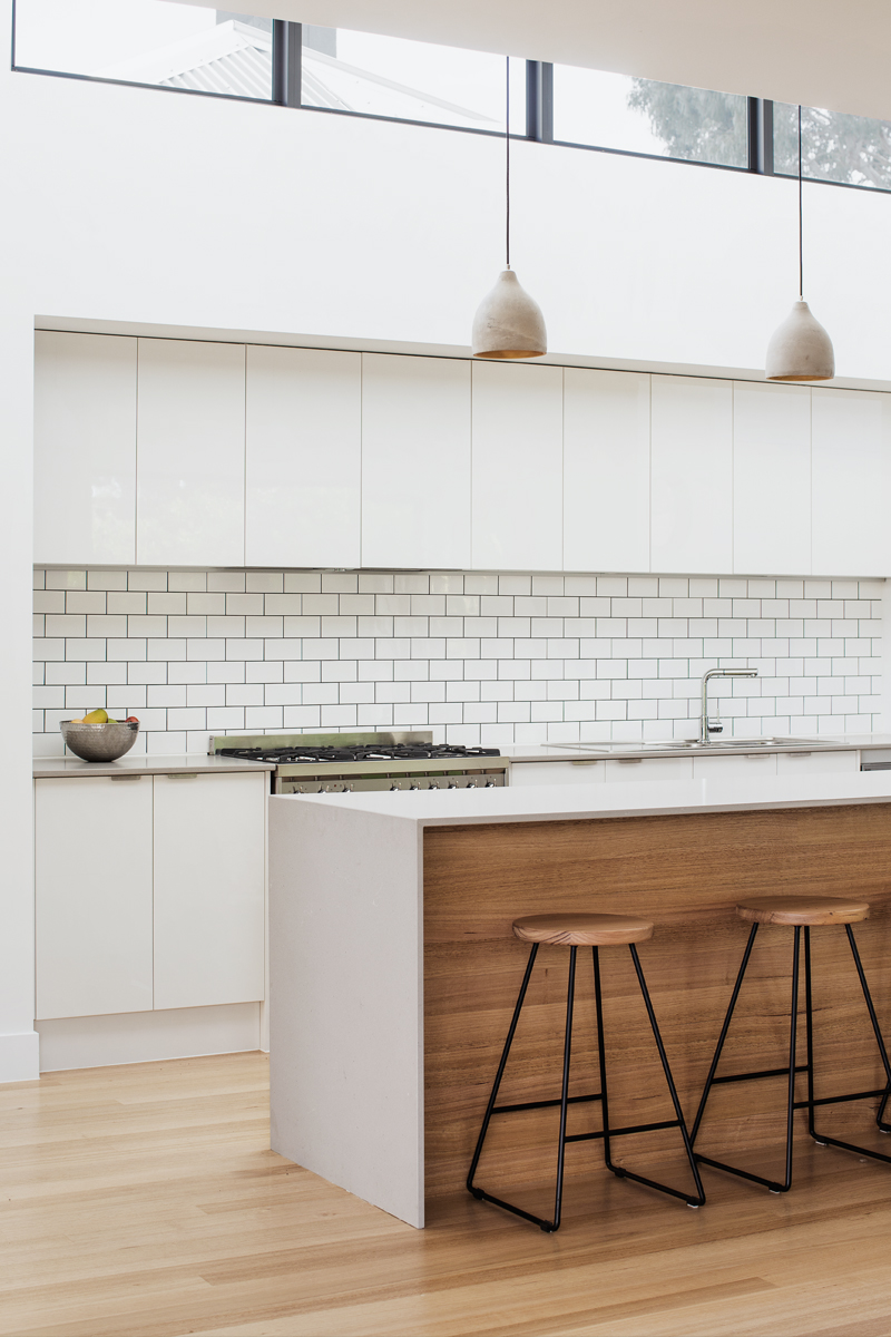
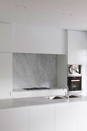
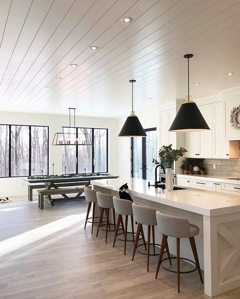
Have you seen an increase in dark kitchens floating around design sites and magazines? I’ve been seeing hunter green and black more than usual along with an increase in shades of blue on walls and cabinetry. While I do appreciate the moodier aesthetic, I think a white kitchen is the way to go (no surprise, right)? Just look at the kitchens here – they’re bright, clean, and inviting. Food looks great on white dishware…and it also looks perfect in white kitchens!
The first few kitchens below were part of the One Room Challenge Spring 2019 event, so I encourage you to click through to see the before photos of these spaces.
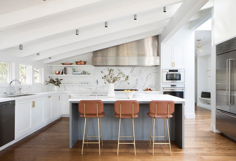
What are your thoughts about kitchen colours? Are you a fan of white, colour, or natural wood?
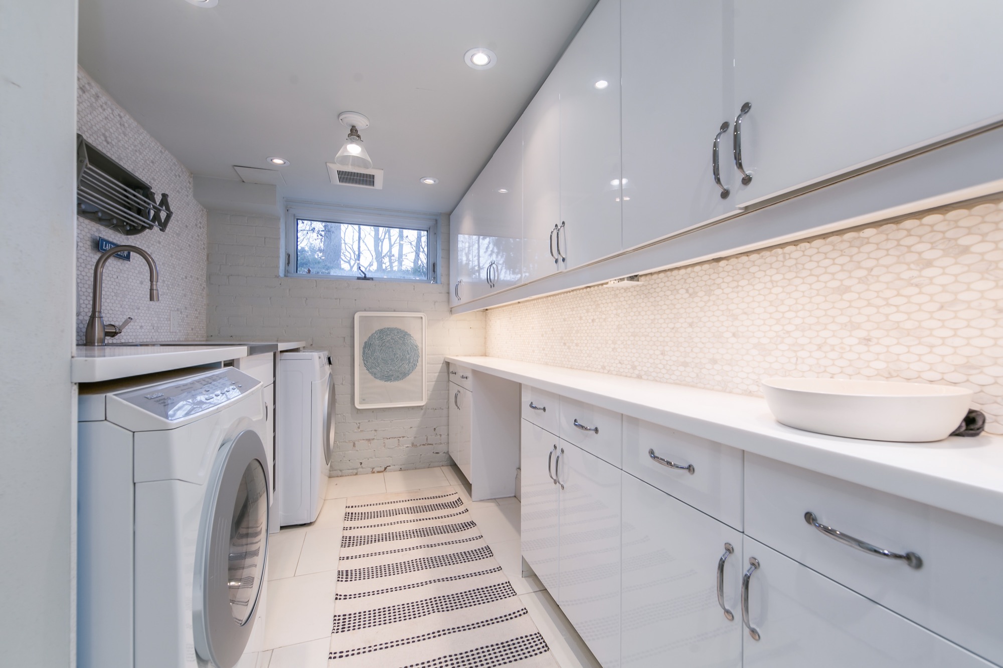
We all know I love a good hex tile. I have mini ones in my powder room and small ones in my laundry/bathroom. Love them! My final bathroom renovation is still a project for the future, but I wouldn’t hesitate to install more hex there. I’m inspired by these two spaces with their large, grey hex flooring.
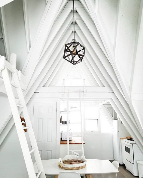
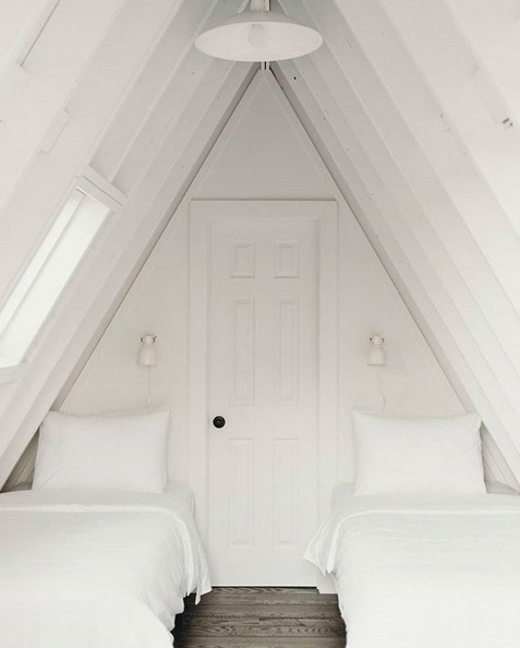
One day I will stay in an a-frame cabin. Perhaps I’ll venture over to Trott Cottage in Muskoka, Ontario to try it out. It looks so pretty. Here are two images from Trott Cottage’s Instagram that really show the character of the letter A.
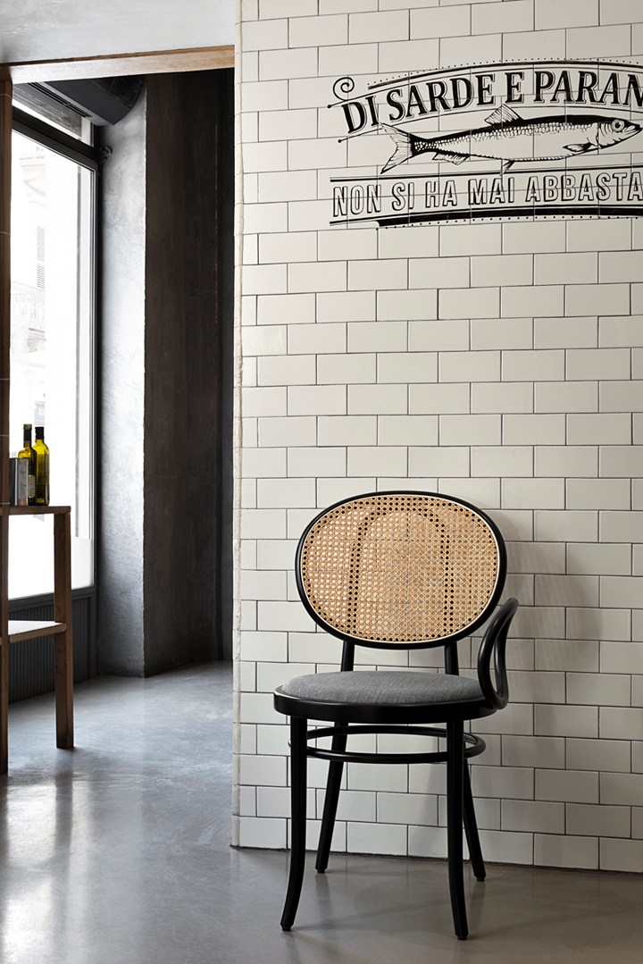
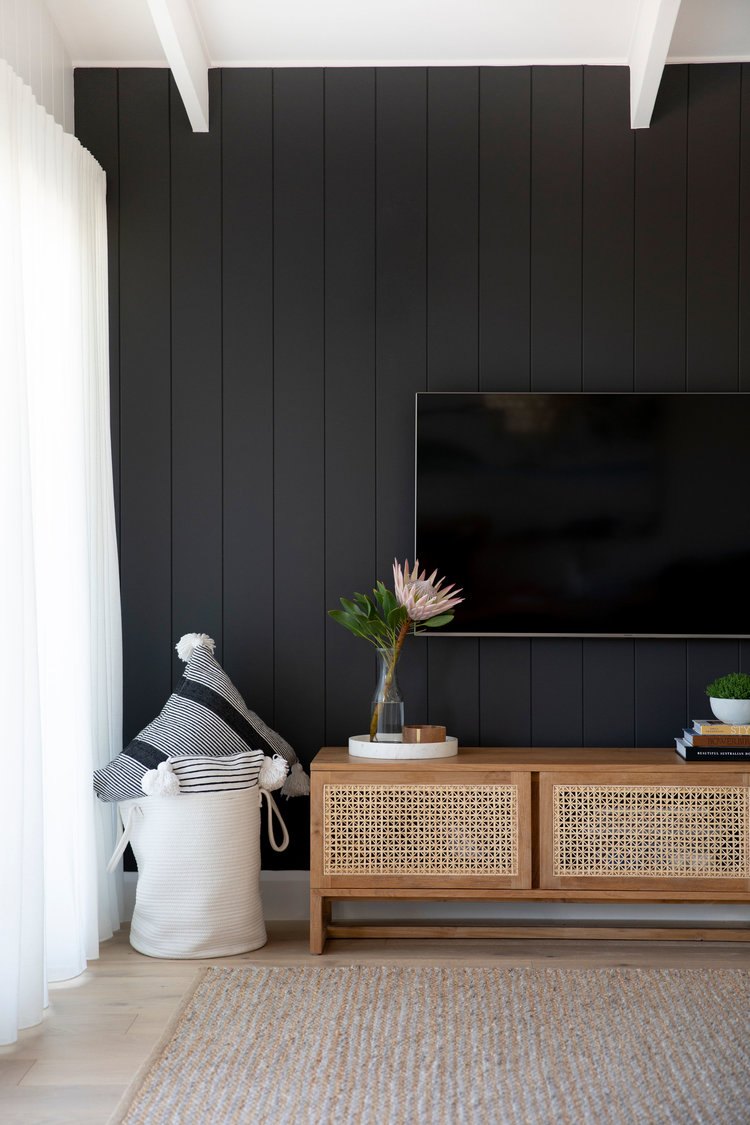
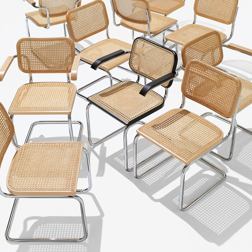
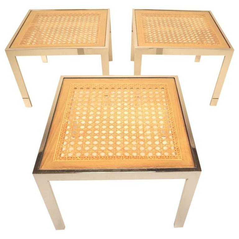
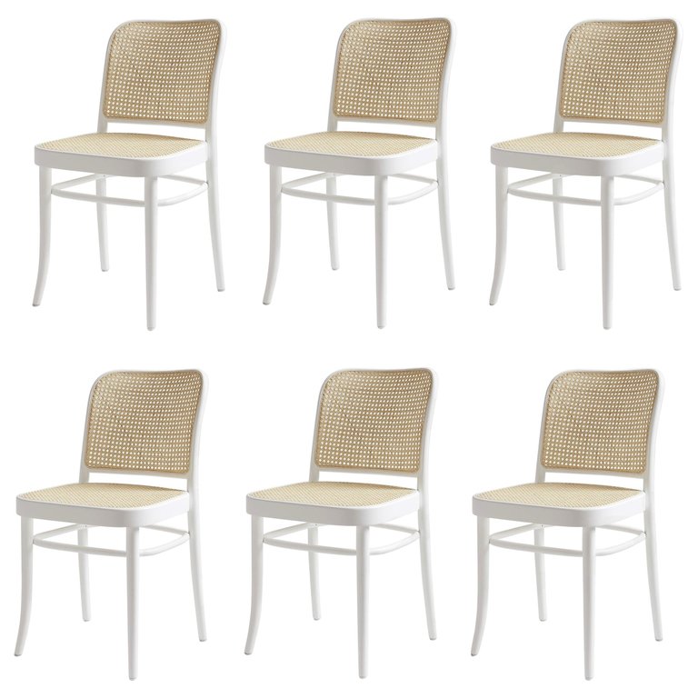
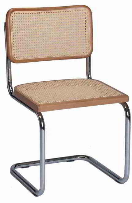
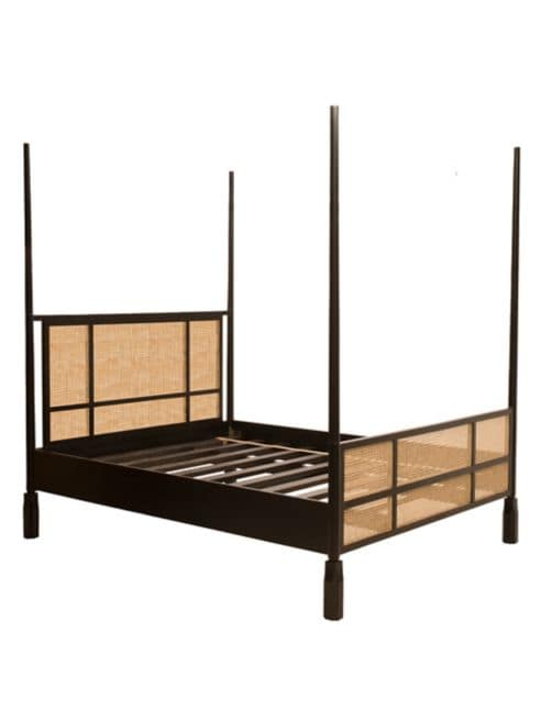
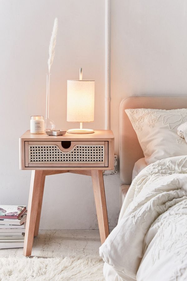
I am seeing caning everywhere these days. Online. In stores. High end. Low end. Even HomeSense had several caned chairs and tables in stock when I was there over the weekend.
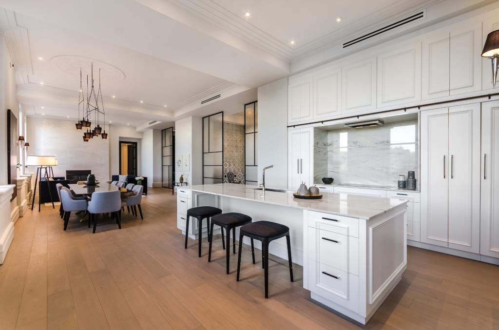
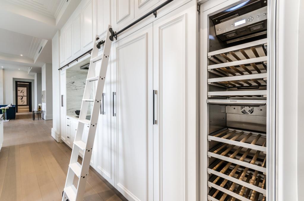
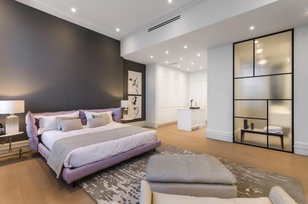
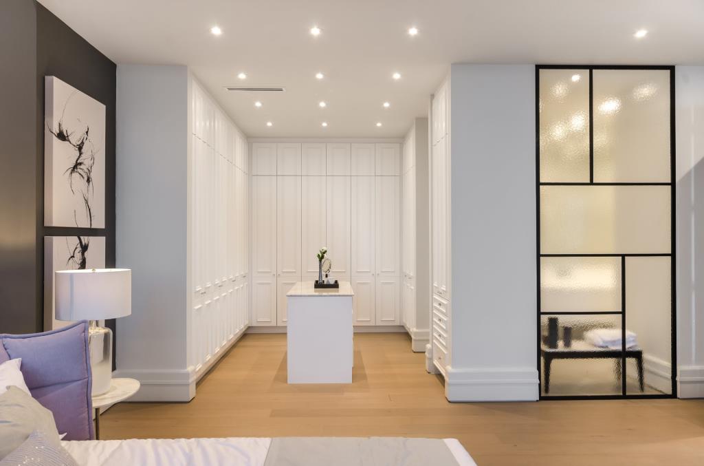
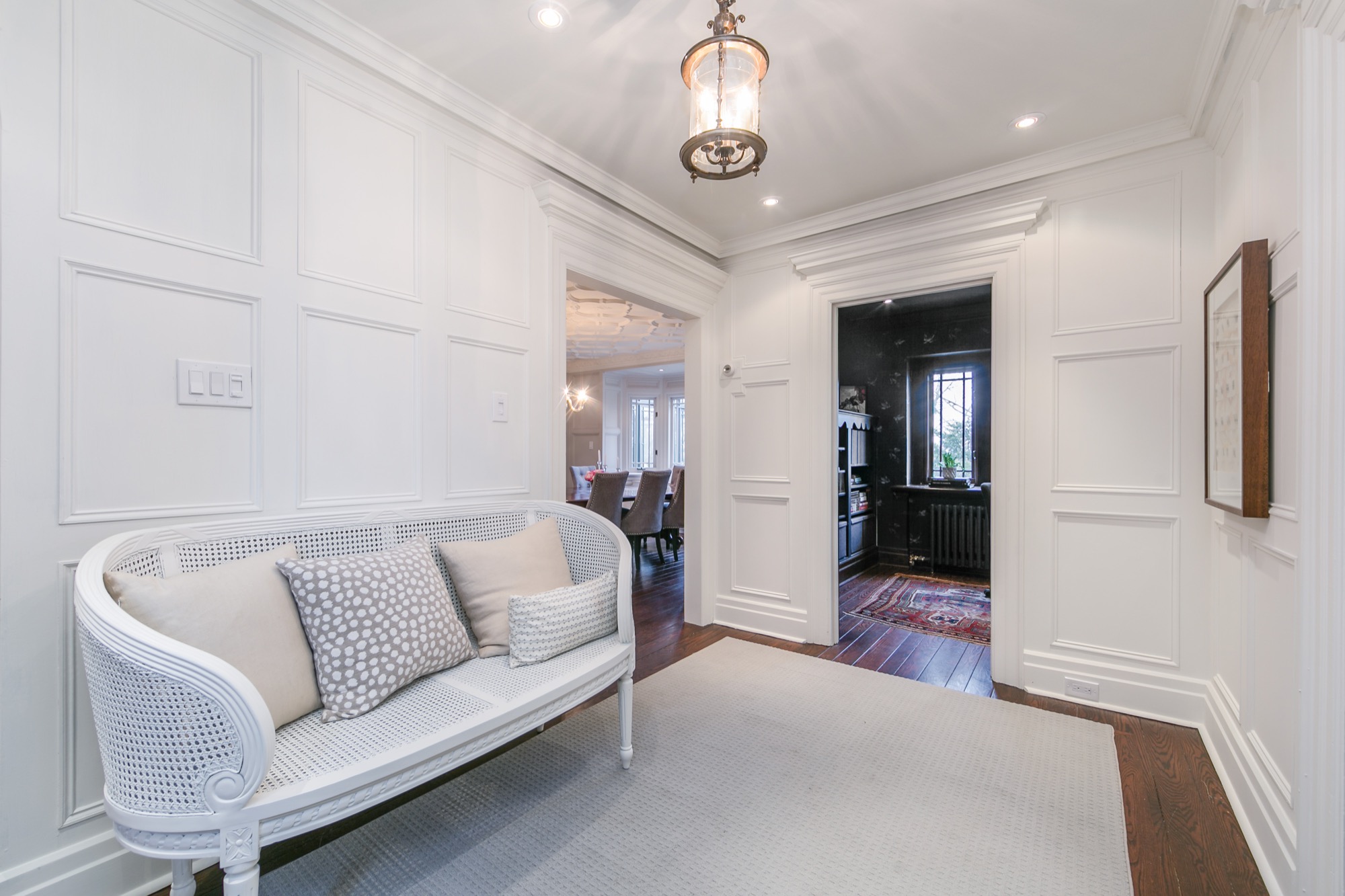
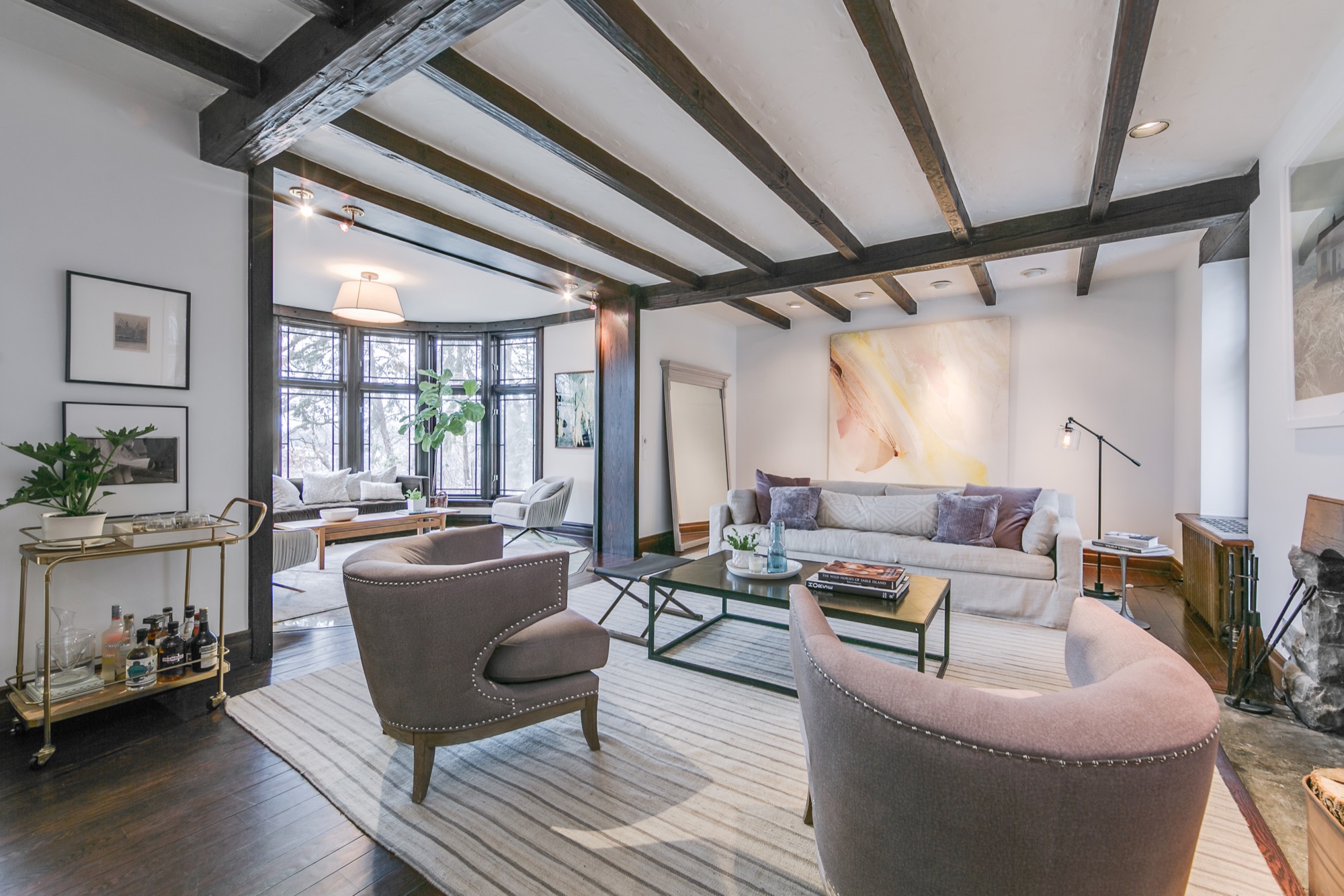
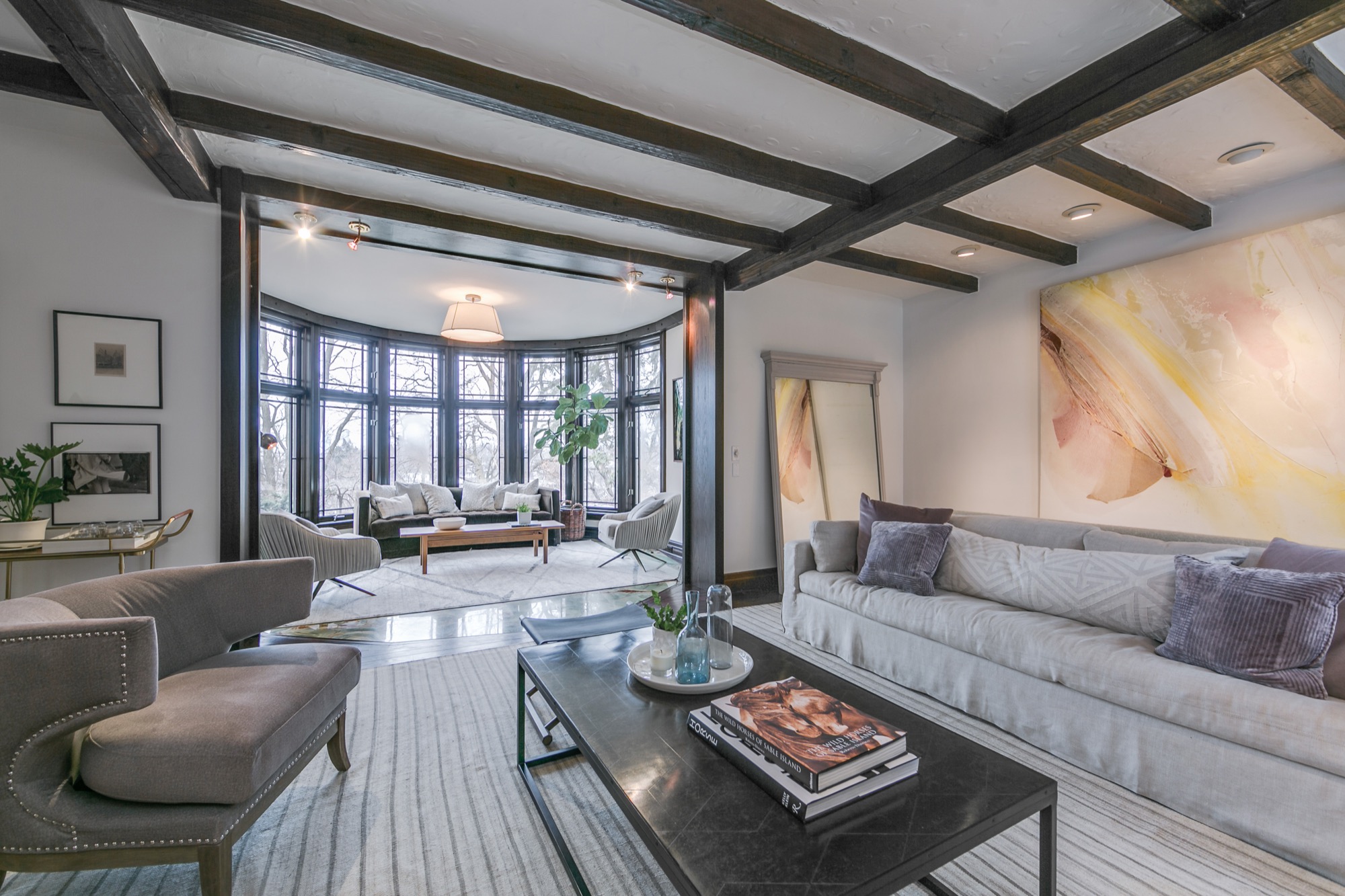
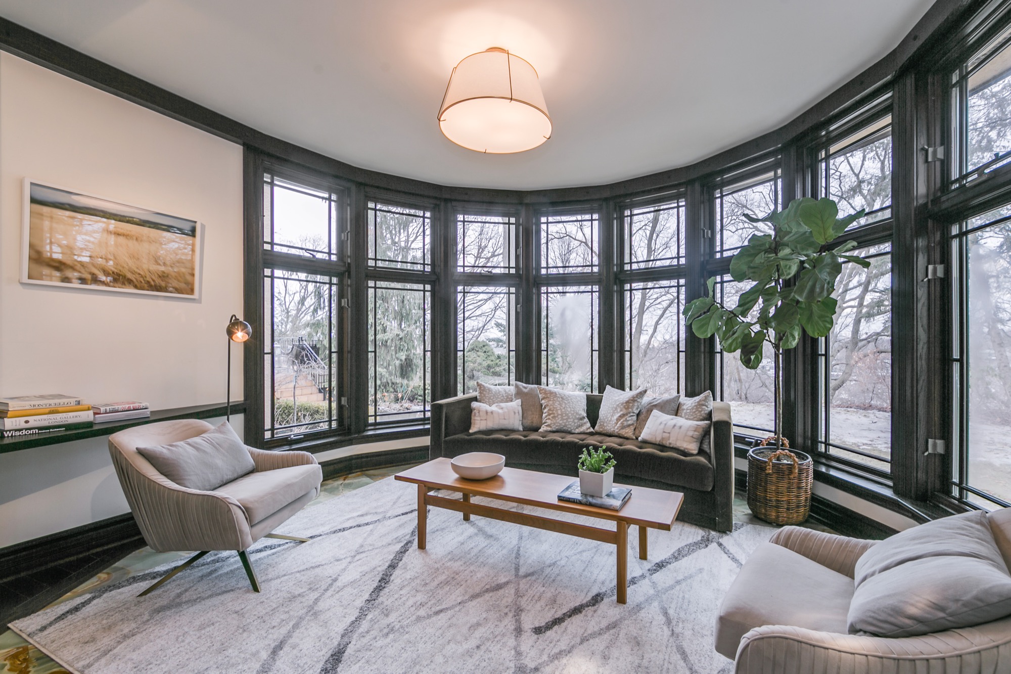
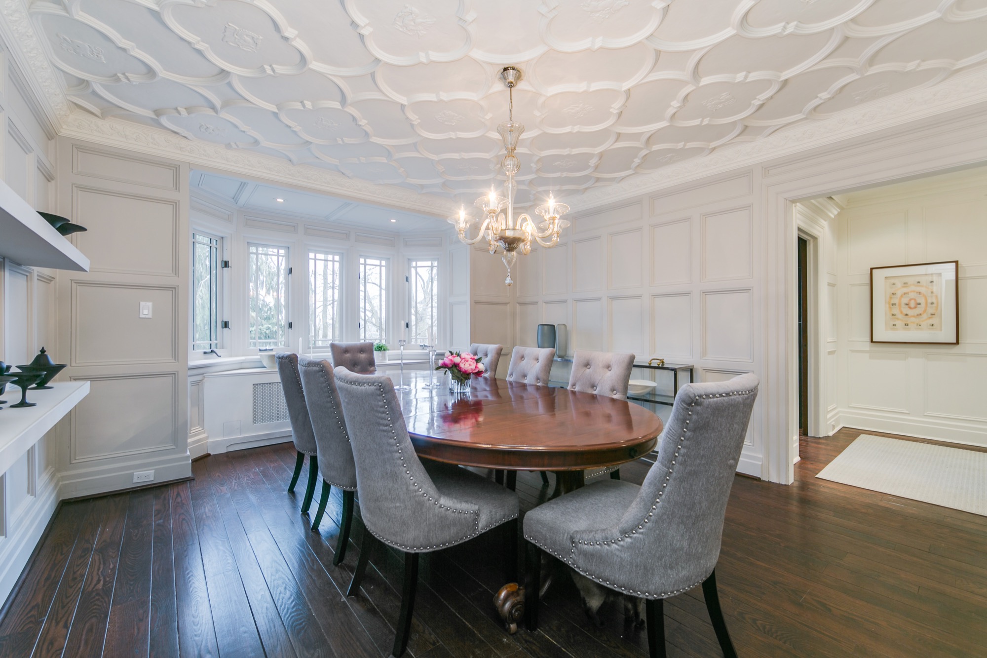
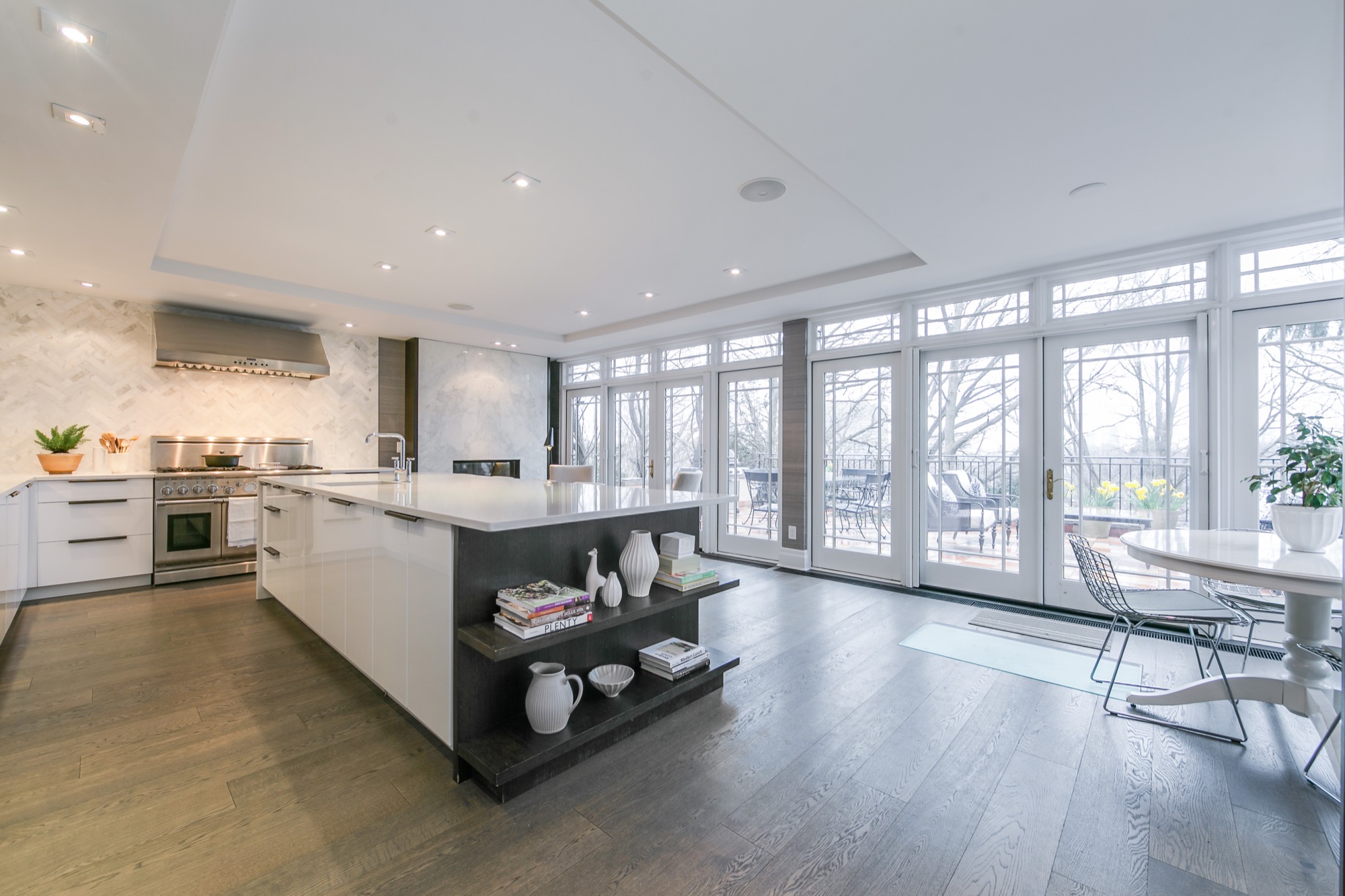
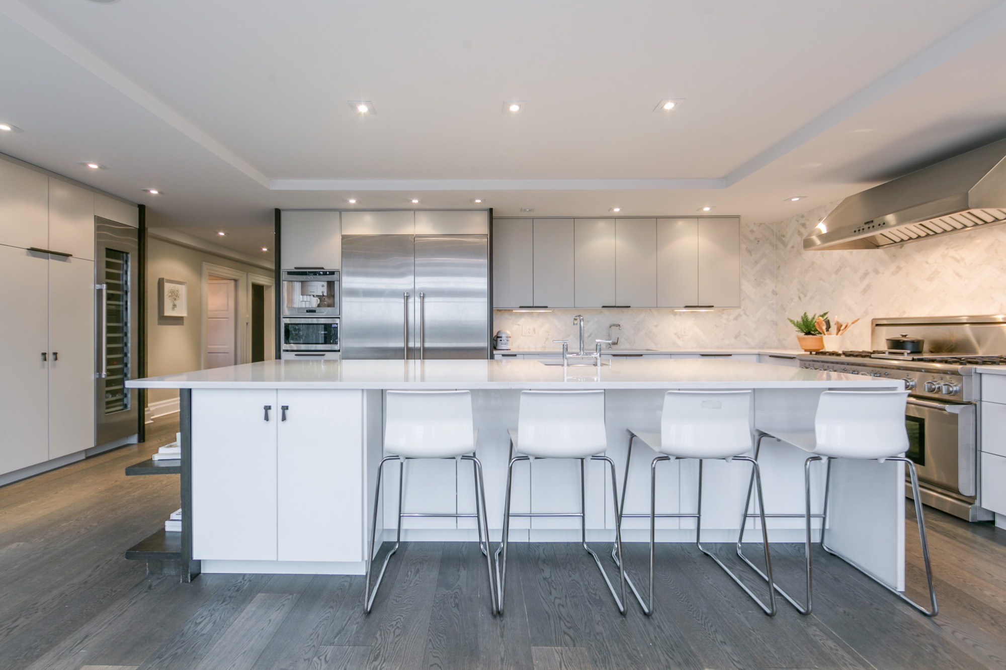
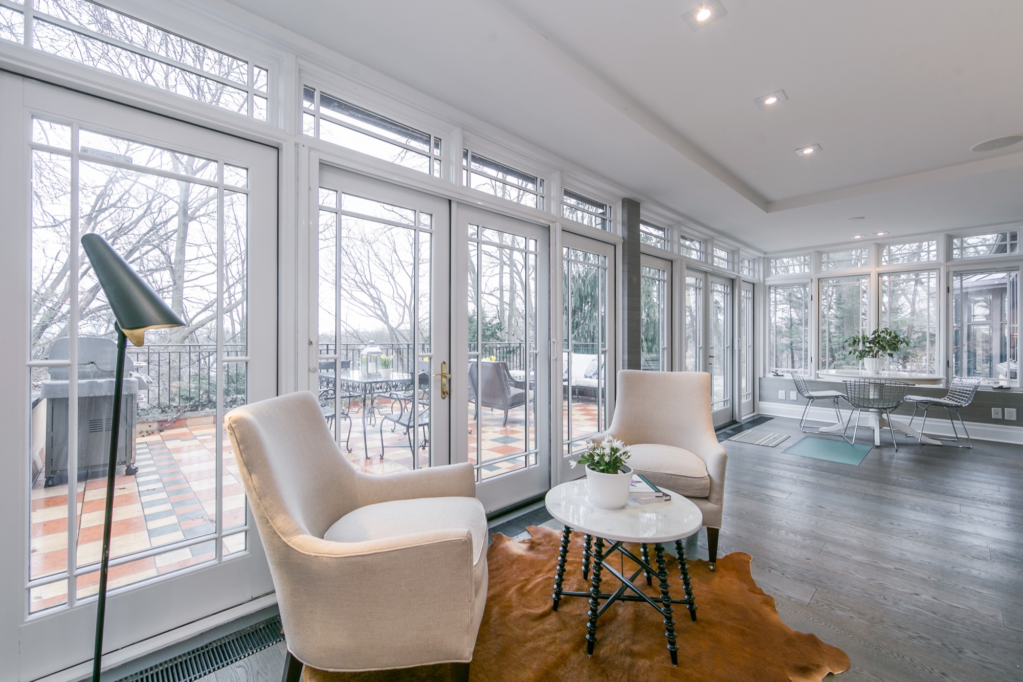
This home. Oh my goodness. I have drooled over every photo of it. My friend Shannon spotted it first on Erin McLaughlin’s (Style at Home Editor) Instagram feed. I quickly hopped on to the listing, too. It’s just so beautiful!
It’s hard for me to choose a favourite room, but if you twisted my arm and I had to choose, I think it would be the kitchen as it’s hard to resits the brightness and the wall of windows. I also love the foyer because it’s dressed beautifully in white.
Would you like a tour? Here you go! You may recognize a space or two from Erin’s home as it was previously featured in Style at Home magazine.
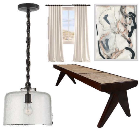
I’ve been devouring Architectural Digest online lately. Articles, images, videos…I’m enjoying all of it! There’s inspiration at every click, but it was this image that definitely had been examining things up close.
To get the look, here are four things you’ll need:
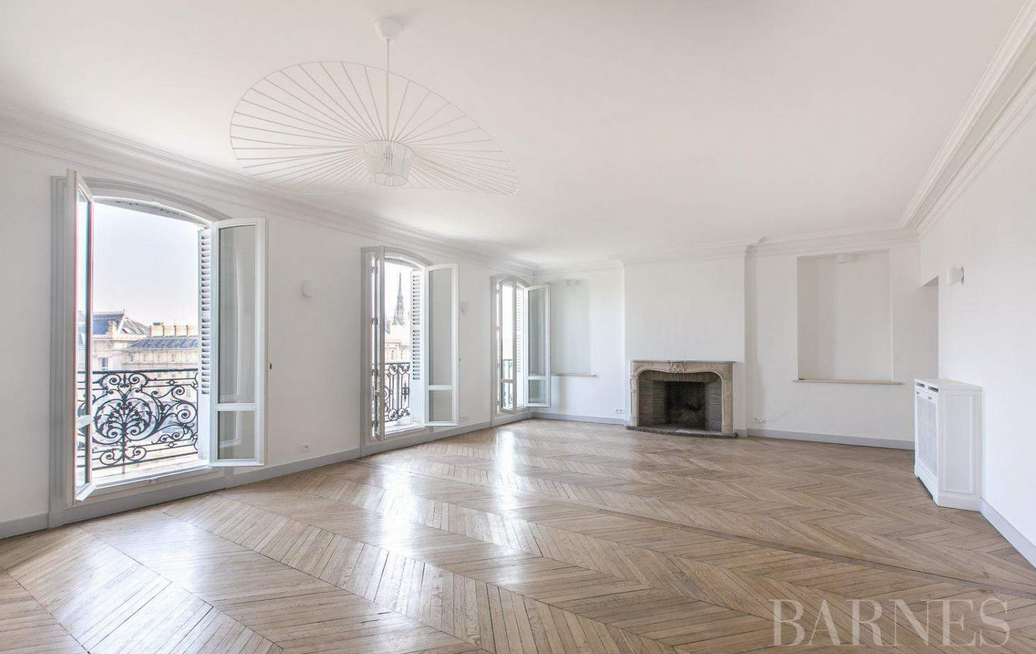
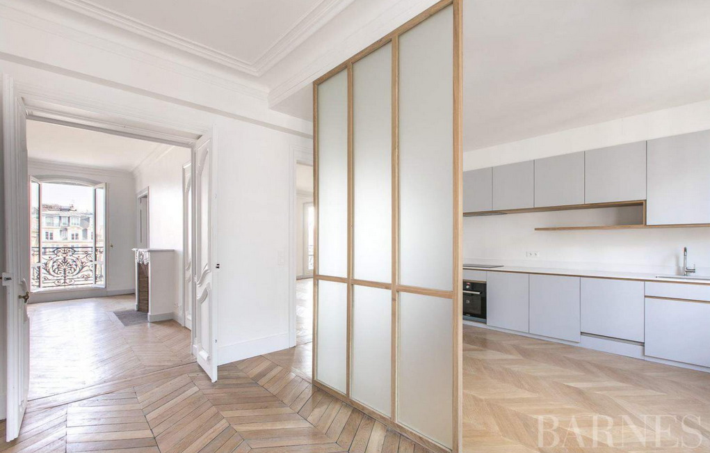
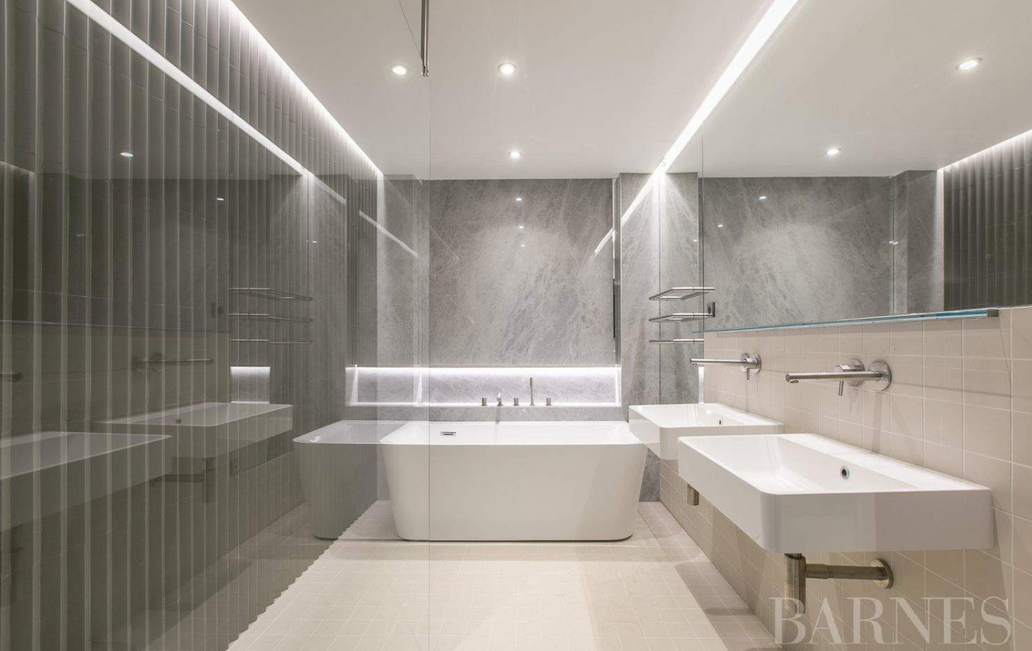
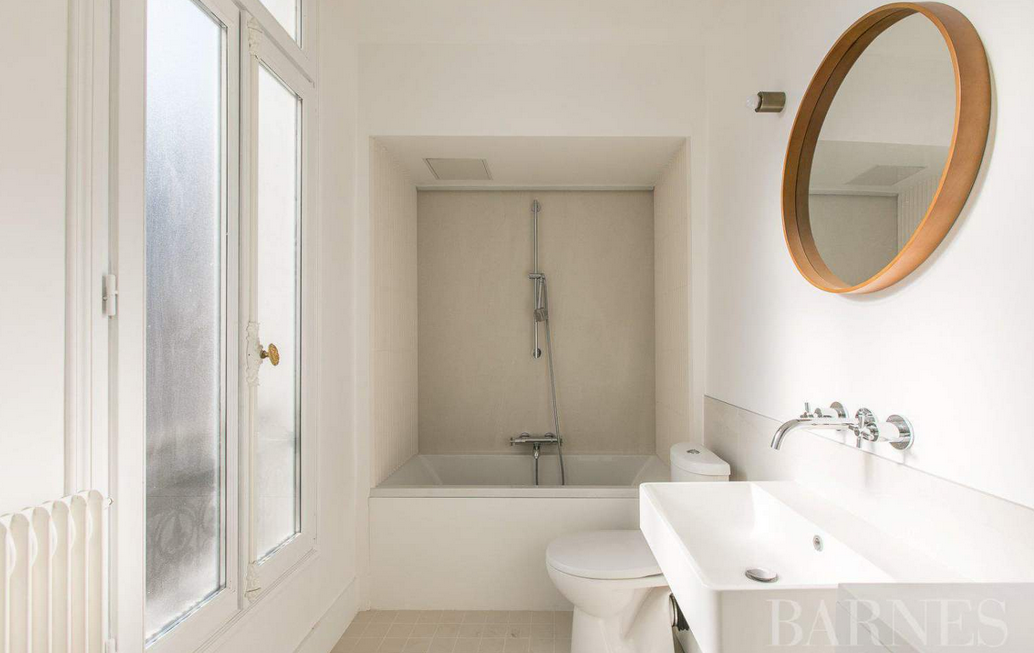
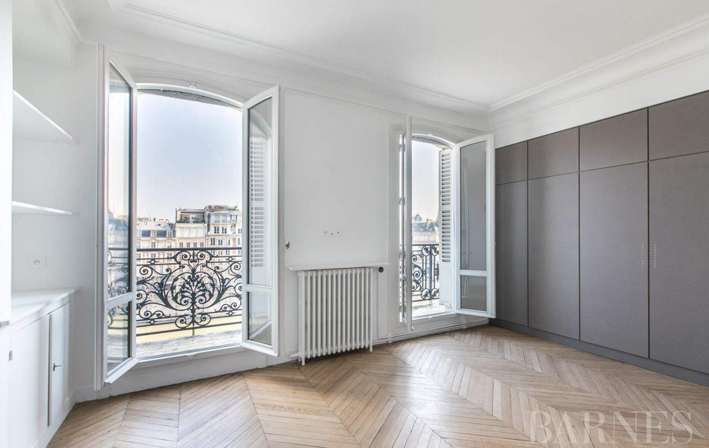
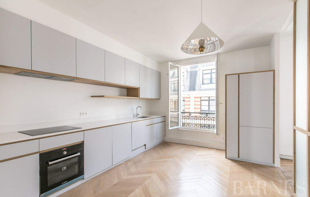
I’m drooling over all of the gorgeous apartments for sale. I’ve been on realty sites far too often these days! This stunning 4-bedroom, 2-bathroom apartment is in the 7th arrondissement.
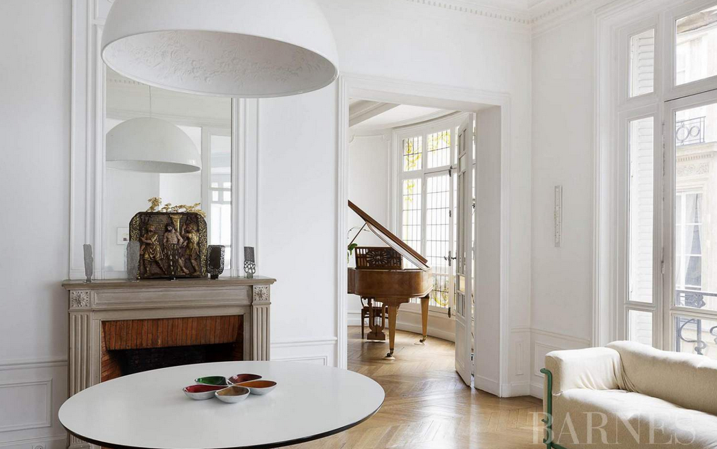
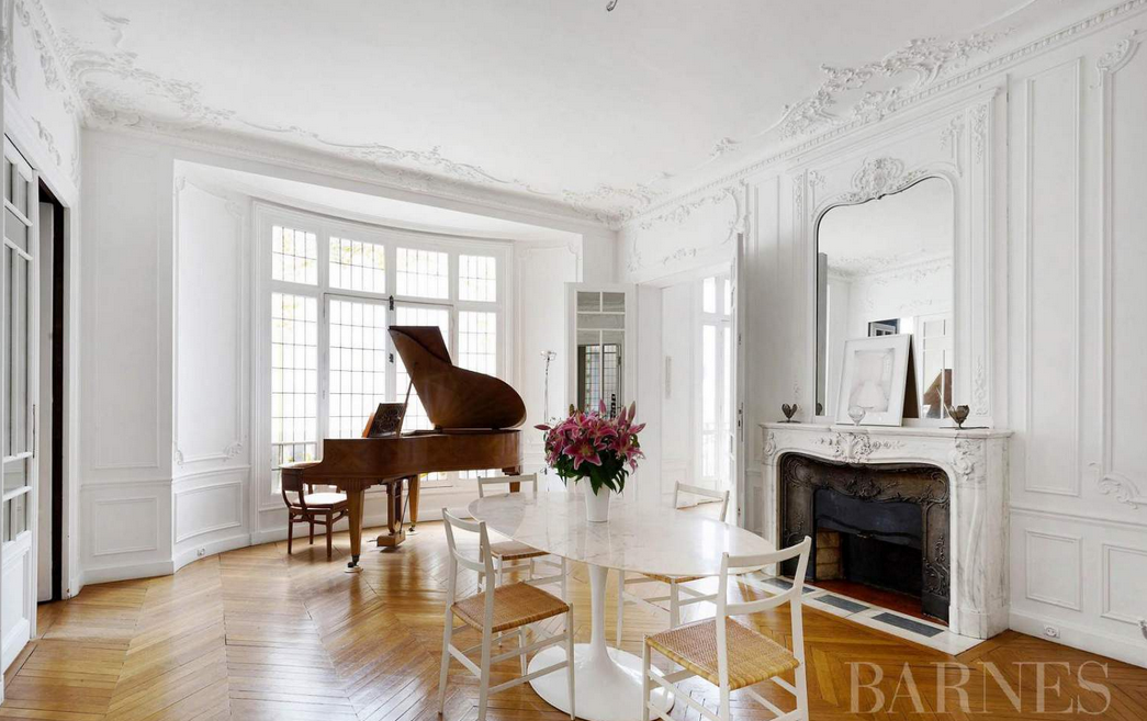
The price tag? 4.5million €.
All photos via Barnes International Realty.
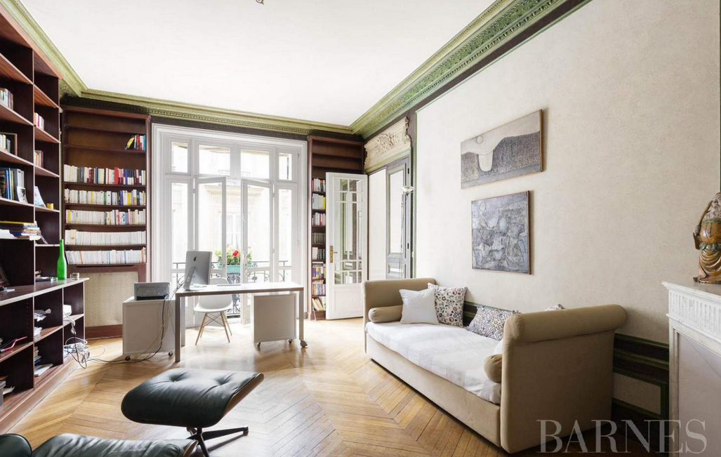
Of course I still have Paris on my mind even though I’ve been home for a few days. Did you follow along my Instagram photos? Do you want to see more? I have much to share, so stay tuned for those posts in the weeks ahead. For now, here’s a gorgeous Parisian apartment in the 6th arrondissement that could be yours for just over 5 million euros.
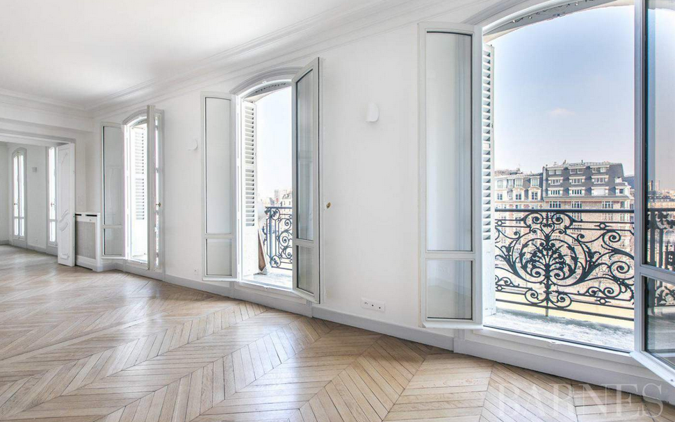
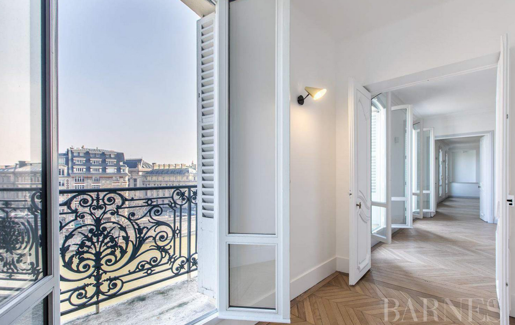
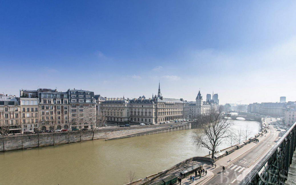
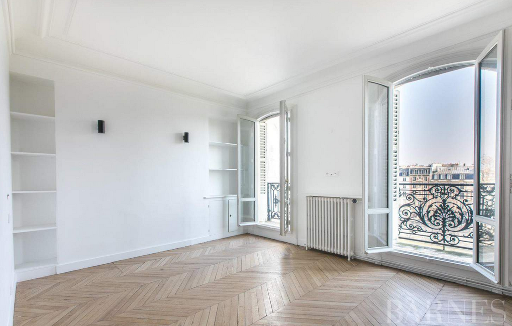
All photos from Barnes.
I love when so many lovely spaces pop up on my Instagram. Here are the latest gems that have come across my screen.
And a great reminder, too.
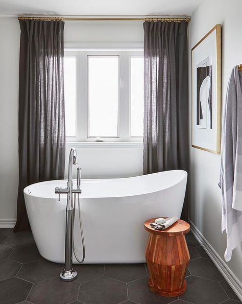
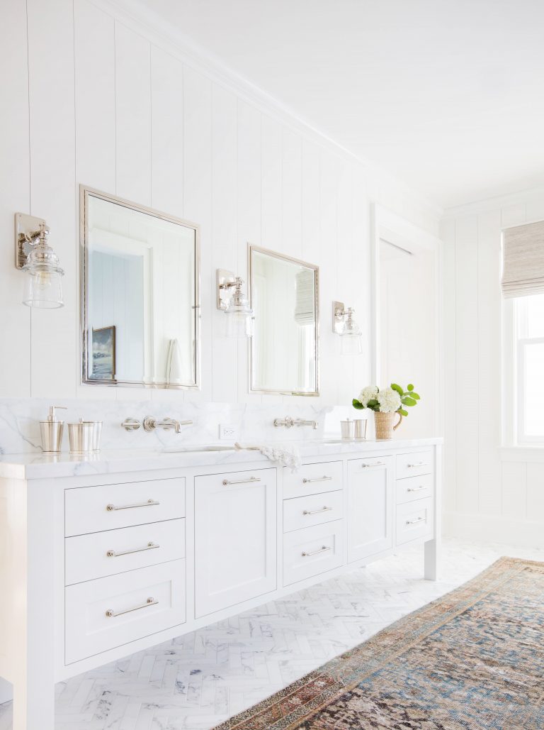
I’m ending the week with five gorgeous, white bathrooms that are bright, airy, luxurious, and inviting.
Let’s go to Manhattan, shall we? More specifically, let’s go to this minimalist 2-bedroom home in Tribeca.
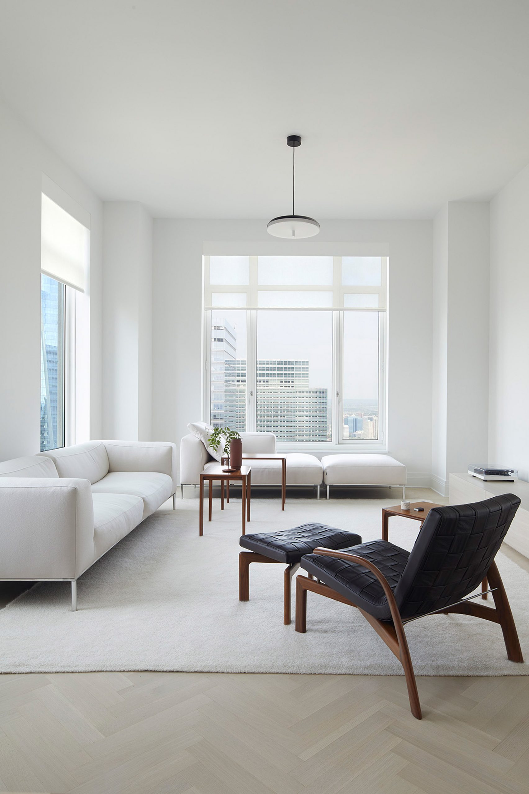
images via Dezeen
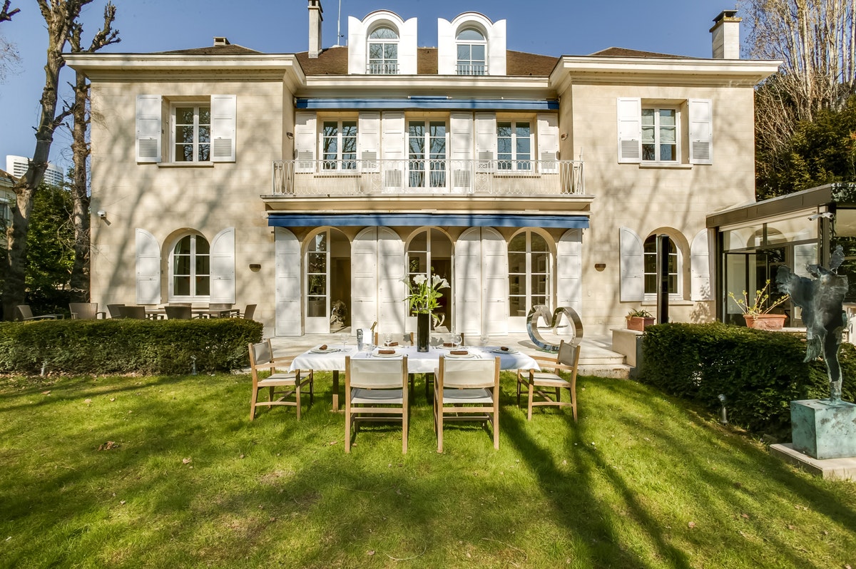
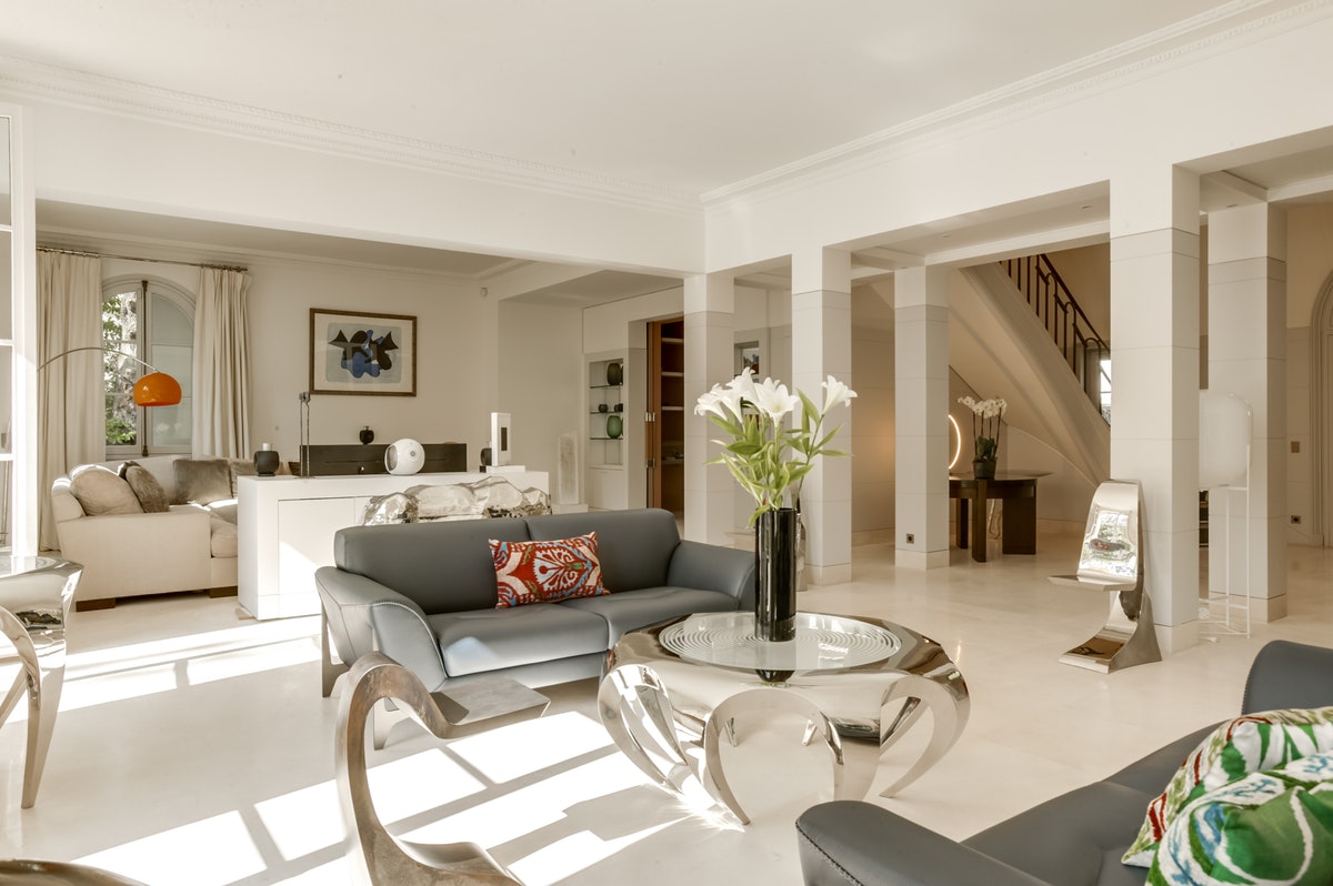
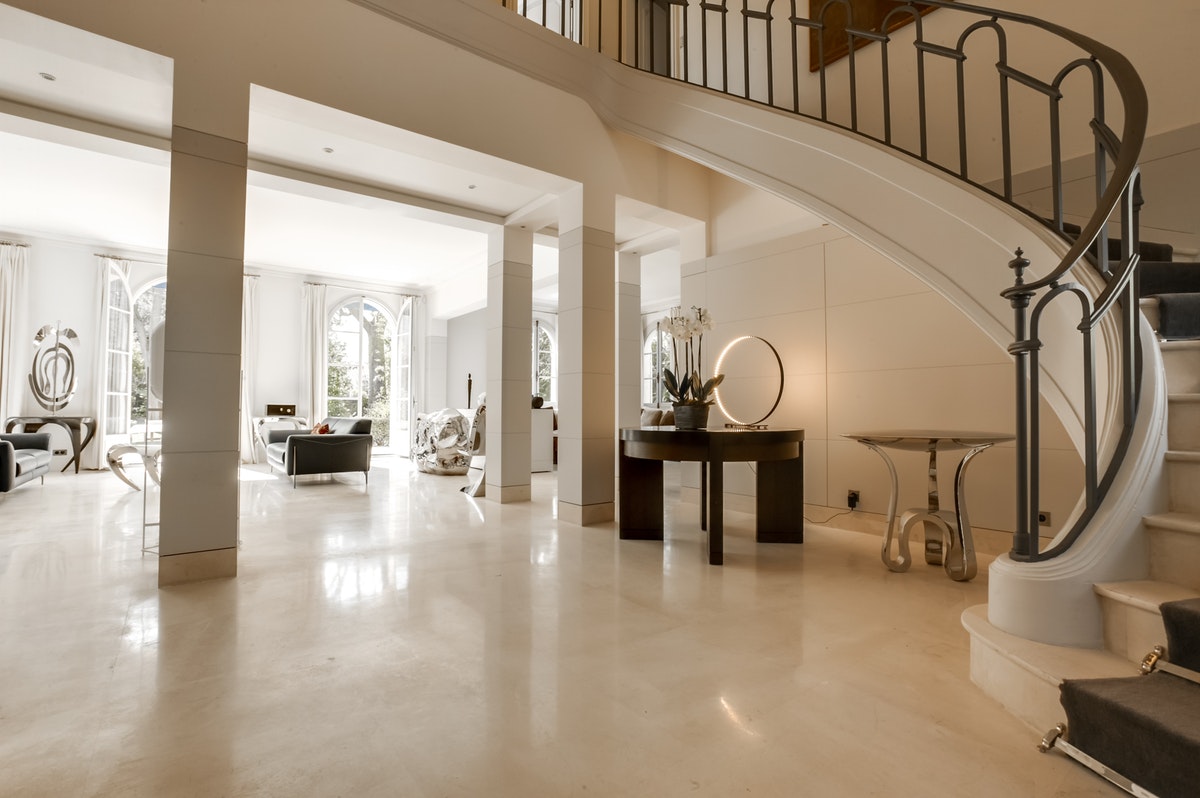
Much of my Internet travels lately has been focused on Paris. My trip is in a couple of months, yes, but it’s never too early to travel plan as far as I’m concerned. Plus, my trips around the web have brought me to some incredibly beautiful and interesting apartments and homes to rent.
Villa César – a massive Parisian home – is one of the gorgeous rental properties available on The Collectionist.
The Lower East Side home of Daphne Javitch and Pali Xisto Cornelsen is just too beautiful. From the custom couch to the wood beams to the quirky pottery, this home has plenty of charm.
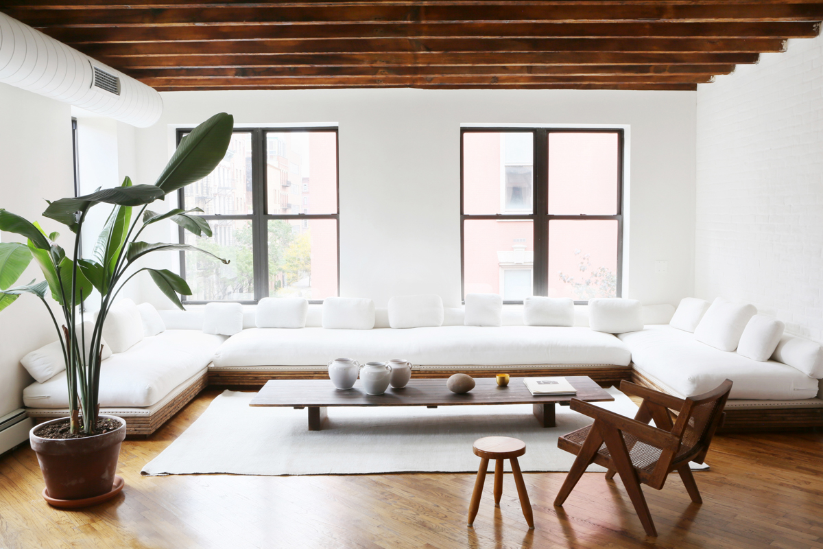
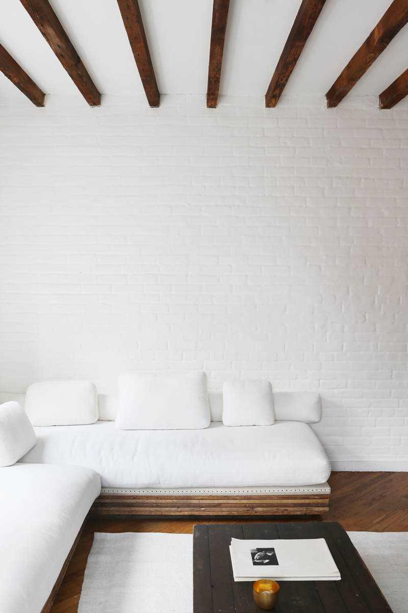
photos Sarah Elliott via Jenni Kayne
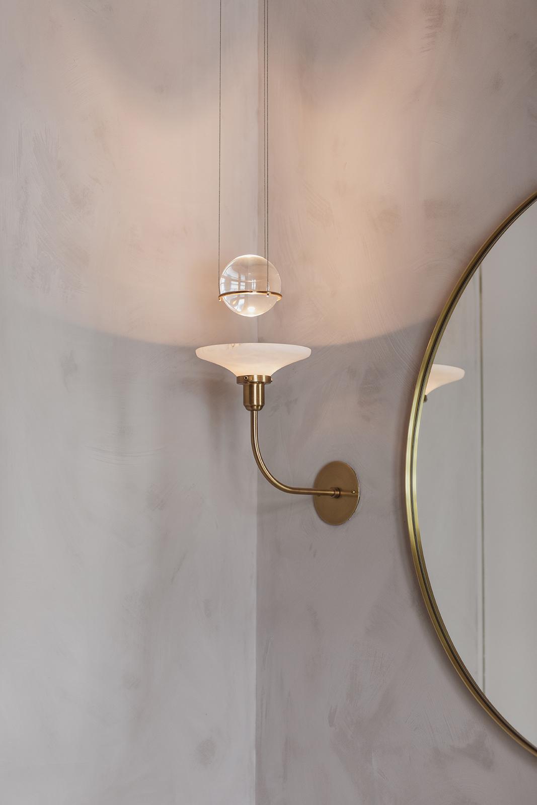
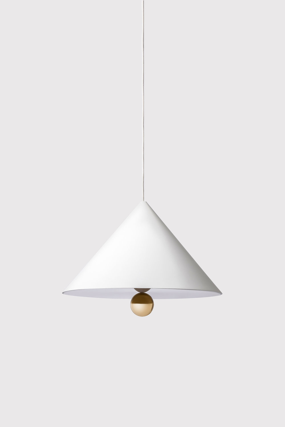
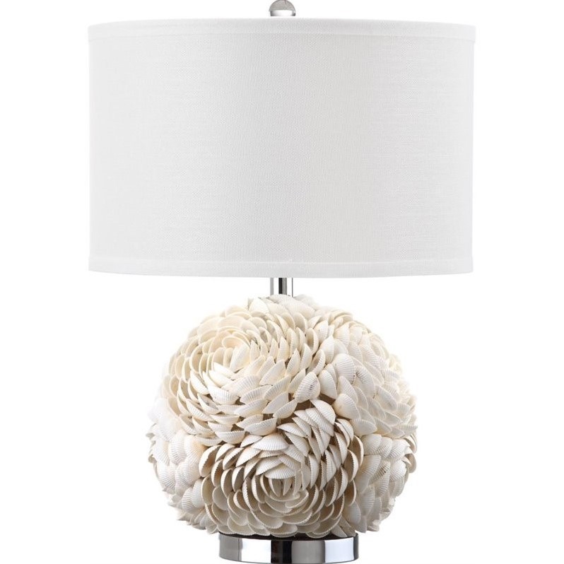
I have been collecting images of interesting light fixtures for a little while now (beyond this ribbon lamp that I have loved for years), so I thought I’d finally share a few. Here are ten fixtures at various price points – and in many styles – that have caught my attention.
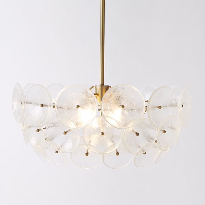
glass disc chandelier, $374USD (on sale), West Elm
Petite Friture x Daniel Emma, Cherry White Large, $402 Euros
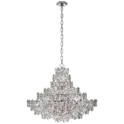
Lauzet chandelier, $6299USD, Aerin via Circa Lighting

Eleonor table lamp, $105.99 CAD (on sale), Wayfair
Safavieh Pauley table lamp, $220CAD, Walmart
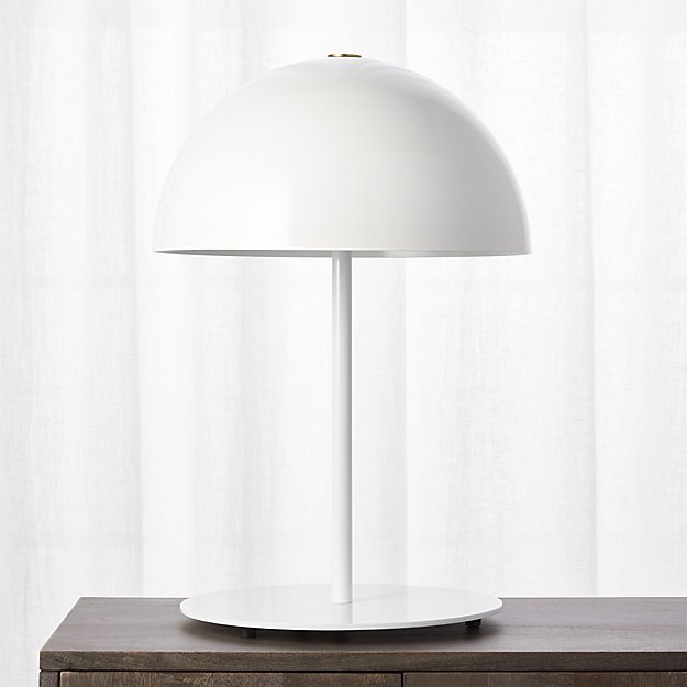
Hanna table lamp, $179USD,CB2
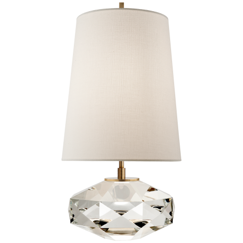
Castle Peak glass lamp, $949USD, Kate Spade via Circa Lighting
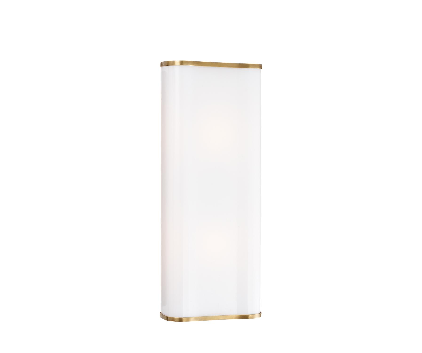
Darbon sconce, $489USD, Aerin
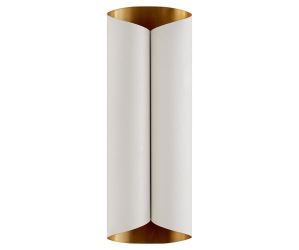
Selfoss sconce, $799USD, Aerin
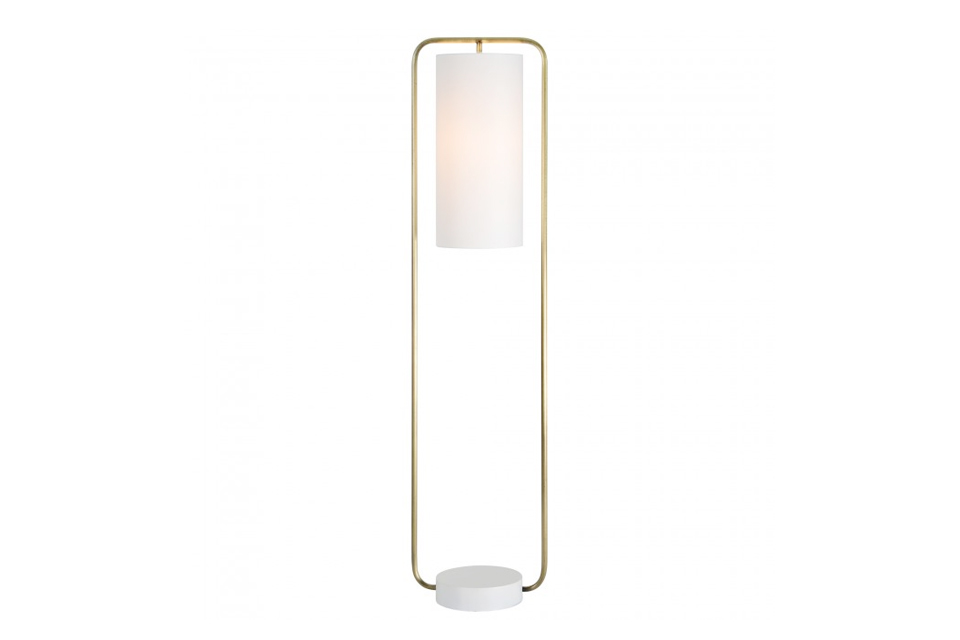
Simpson floor lamp, $439CAD, Casalife
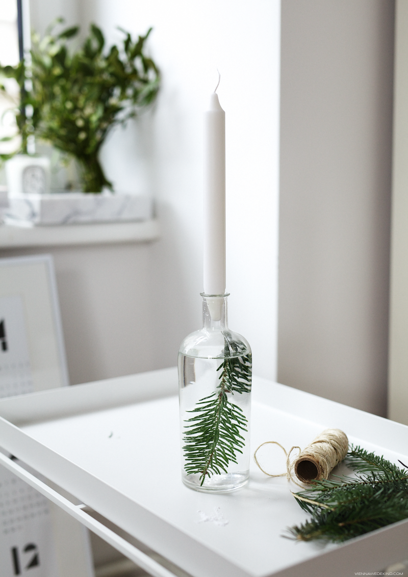
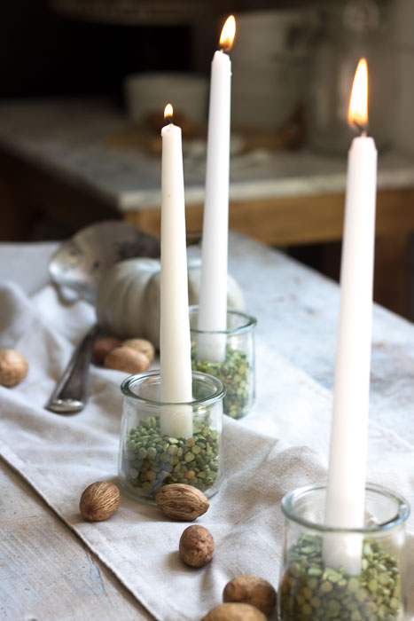
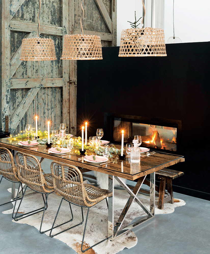
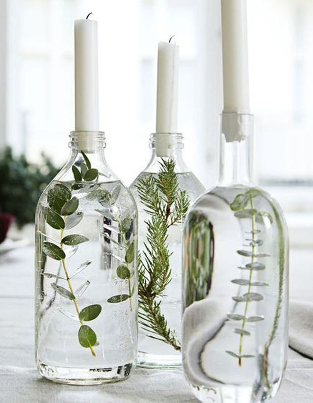
After looking at all of these photos, I want to fill my house with candles this Christmas.
Dear Readers,
I’m having an issue with WordPress, so I need a couple of days to sort some things out. I’ll be back in a jiffy!
In the meantime, have a look at this gorgeous kitchen.
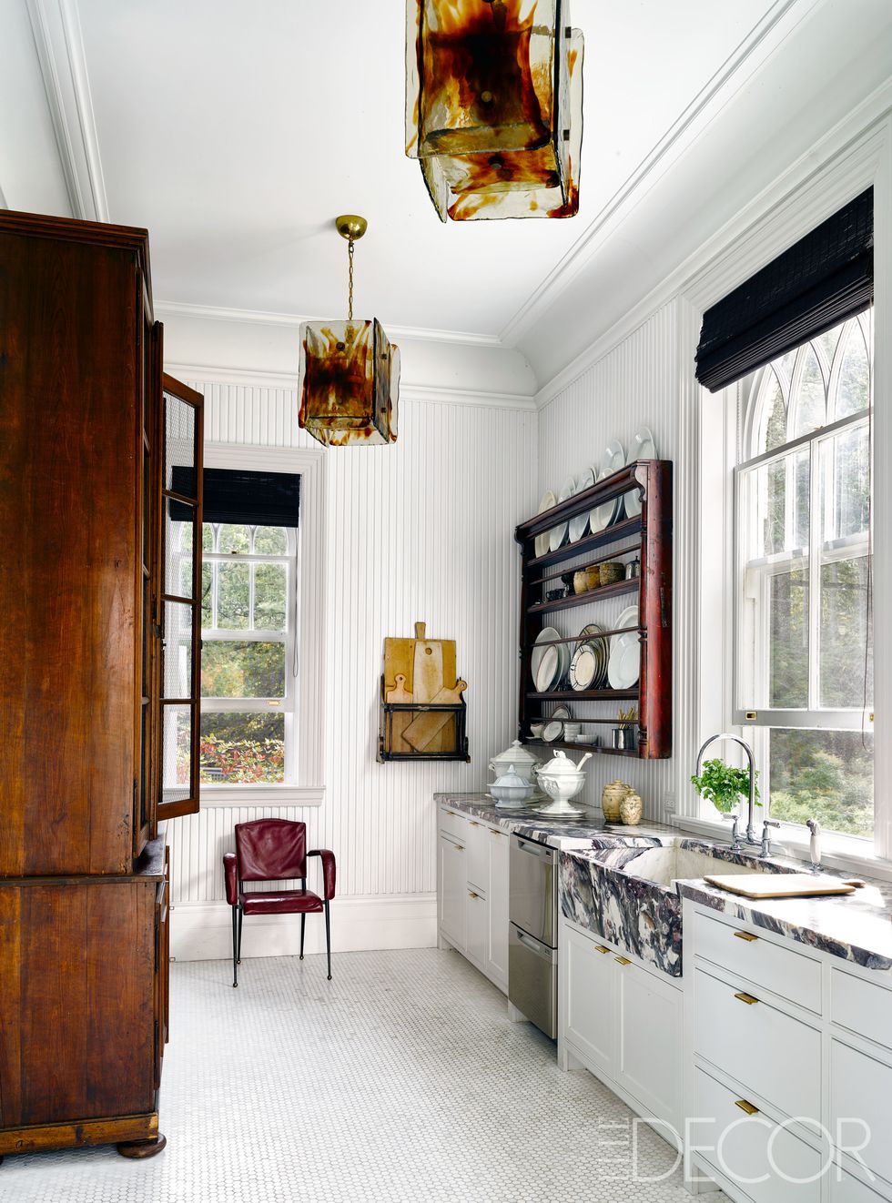
via Elle Decor
The rest of Michael Bruno’s (of 1stdibs) home is equally spectacular.
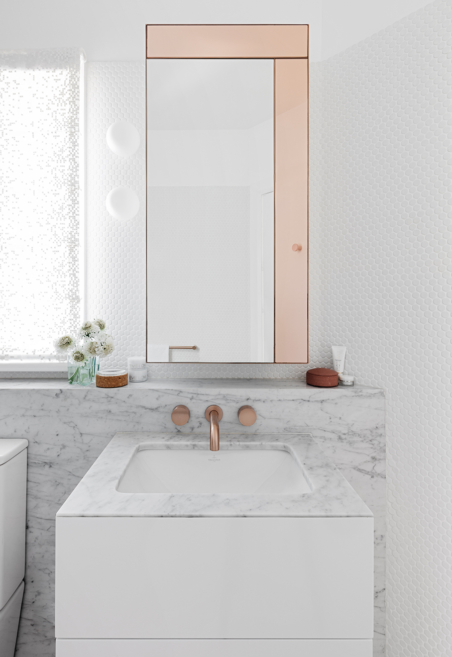
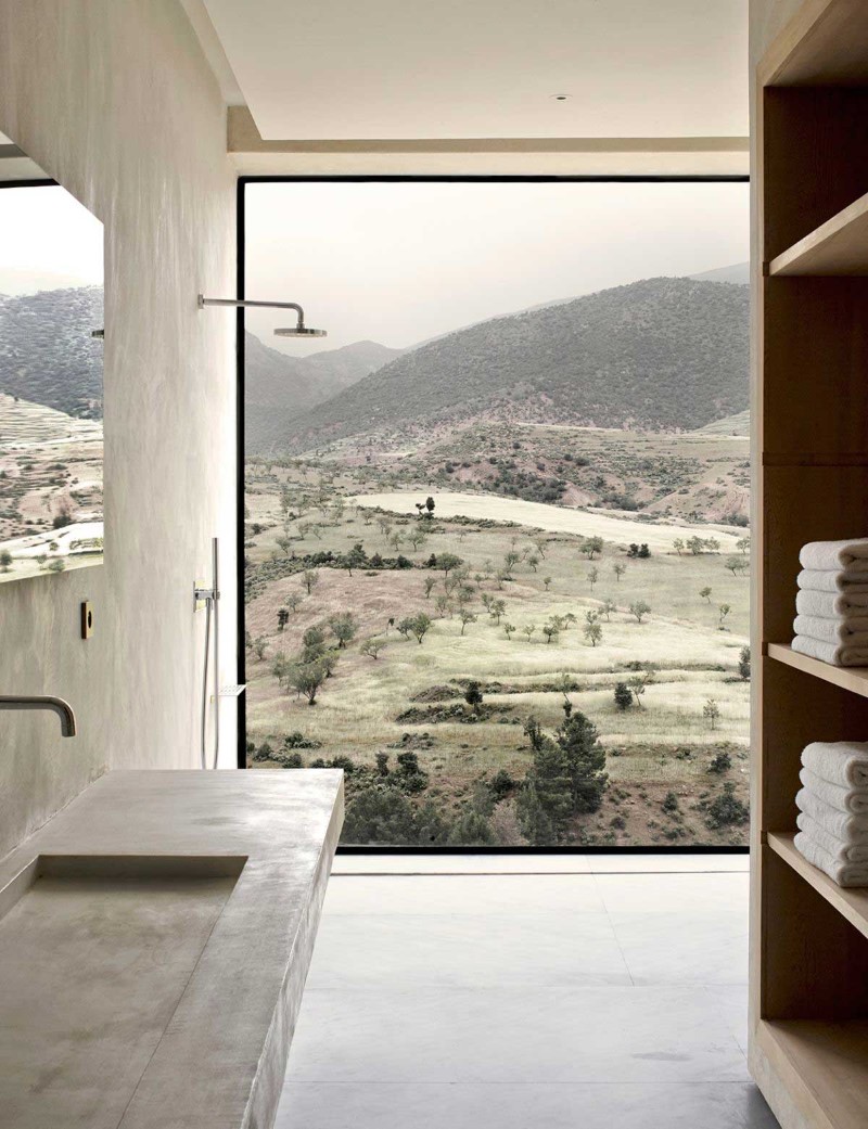
These bright, white bathrooms have caught my attention. Whether it’s the leaded glass windows, the marble sink surround, a lovely curvy tub, or the view, each of these bathrooms comes with something unique.
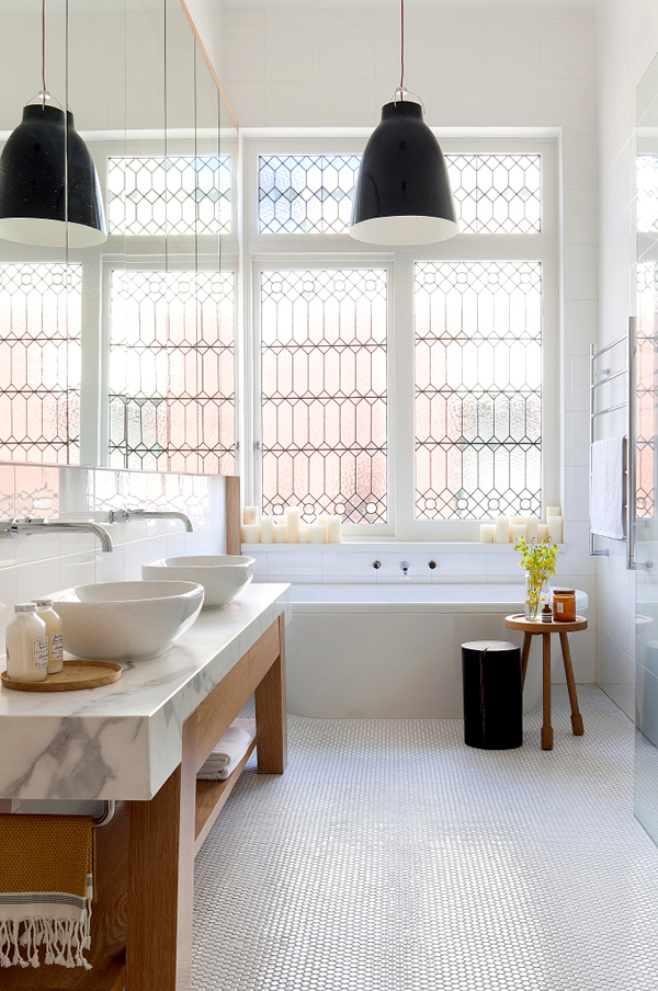
via Style Files
Studio KO, via Home World Design