The Friday Five: The Beauty of the Ampersand

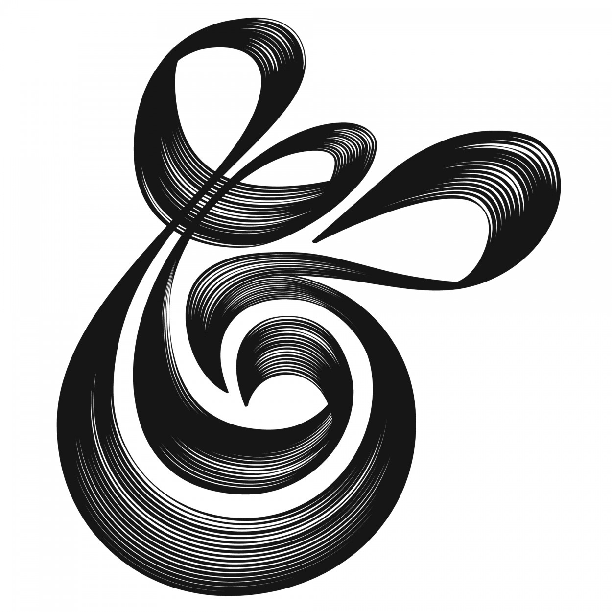
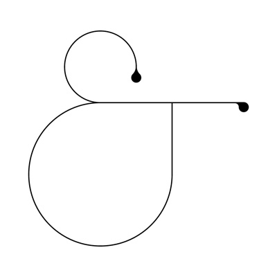
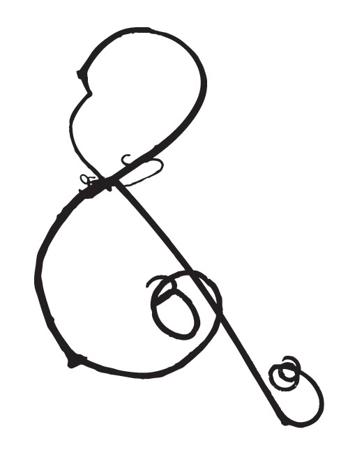
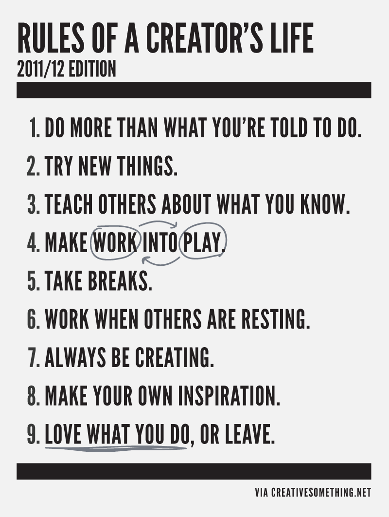
Today I’m featuring a bit of typography…the simplicity and the interesting form of the ampersand to be exact. I have never been able to actually write it accurately (does anyone else have this problem?) but it does look pretty cool in various typefaces.

via The Proper Stranger

via Friends of Type

by Jude Landry

Helvetica ampersand print, $2.95, via BKS Design & Print

via Little Somethings

More ampersands here and here.

Type event in Toronto this Thursday

Rest assured, you’re not alone with your type love.

Creative Type is holding its fourth typography exhibition in Toronto this Thursday, May 24 (tomorrow!) at 6pm at Cooper Cole Gallery.

The exhibition is a curated show of artwork selected by Creative Type’s founding members, designers Carla Poirier, Jacqueline Lane and Blair Johnsrude. This year’s theme, “History”, brings “informal cohesion to some of the most compelling typographic work to date.”

Check out the show and mingle with local artists, illustrators, graphic designers and type thinkers interested in how words and letters affect visual expression and messaging. More details and to rsvp for the event, check out the Creative Type four event page on Facebook.

Hot on Jordana's trail

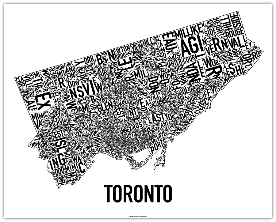
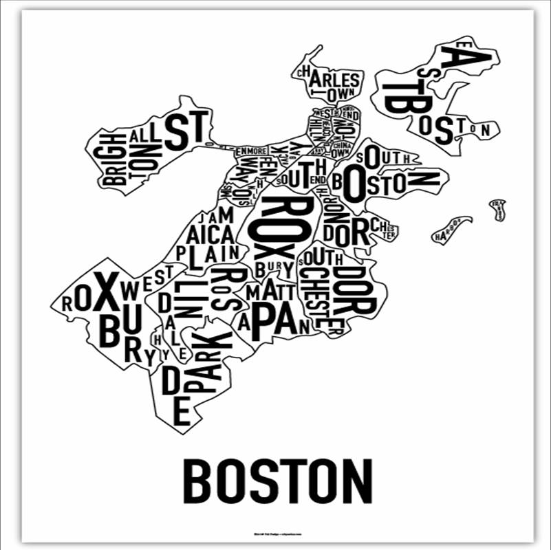
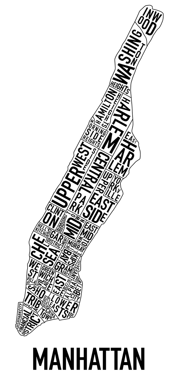
Since Jordana’s travels have been “crossing” the USA this week, I thought it would be fun to showcase her trajectory via the ever-fun typographic city neighbourhood maps known as Ork Posters by artist Jenny Beorkrem.

Jenny’s story about how she started to make these is so cool: back in 2007 she was looking for a good typographic map of Chicago- another one of Jordana’s favourite cities- and couldn’t find one. Read Jenny’s interesting need-turned-business success story here.

Toronto’s Telegramme Prints & Custom Framing– a lovely print shop with locations in Leslieville and on Ossington) offers the prints for $25 a pop, which is so perfect for a just-because gift to a friend.

Jordana’s travels to the USA this week probably started in Toronto:
And I think she then headed straight to Boston:
Jordana ended her trip in lovely and second-hometown to her, NYC! 
All images courtesy of Ork Posters
Typography: Photocopied Hands

I remember in my younger days how I used to get a kick out of photocopying my hands (and – gasp – face) whenever I encountered a photocopier. It was so cool to see all the lines of my palms and fingers. Who’s with me?

Although the novelty wore off for me, it hasn’t for one creative graphic designer in Germany. JosĂ© Ernesto Rodriguez has taken this activity to a whole new level with his photocopied hands typography. Handschrift, as Rodriguez names it (rough translation is, I believe, hand font), is literally, handmade typography. Cool, right?

Handschrift by José Ernesto Rodriguez

The process did take some thought as Rodriguez demonstrates through his sketches.

Handschrift sketch by José Ernesto Rodriguez

I first came across Handschrift via Fast Company.

1 3 4 5 6 7